
 By Neng Nana
By Sharon Atefi
Published by Foundr
Main Facts: The Email Dashboard Delusion
Open your email marketing dashboard right now and take a look at the numbers staring back at you.
Open rate. Click rate. Click-to-open rate. Bounce rate. Unsubscribe rate. List growth. Revenue per email. Spam complaints.
For most business founders and digital marketers, looking at this wall of percentages triggers a standard psychological response: you glance at one or two familiar figures, feel vaguely fine or vaguely worried depending on the color coding, and immediately close the tab to get back to actually running the business.
Who can blame you? The modern marketing dashboard is designed to overwhelm. It presents a dizzying array of data points that often obscure more than they reveal. But while most of those metrics deserve to be ignored, a select few genuinely predict where your email program is heading. Worse still, one of the most heavily quoted metrics in the history of email marketing has been quietly broken for years, while marketers continue to read it as if it were still 2019.
Understanding the difference between vanity metrics and actionable business intelligence is no longer optional. In an era where digital acquisition costs are skyrocketing and profit margins are tightening, your email list is often your most valuable proprietary asset. Treating your email analytics like a passive report card rather than an active steering wheel is a recipe for stalled growth.
Chronology: The Evolution (and Breaking) of Email Tracking
To understand why your email dashboard is lying to you, it helps to look at how email analytics evolved over the past two decades.
- The Early 2000s (The Wild West): Email marketing was largely a game of volume. Marketers tracked basic deliveries and crude click counts, relying heavily on images loaded from external servers to register opens.
- The 2010s (The Golden Age of Open Rates): For roughly a decade, open rate was crowned king. It was intuitive, easy to track via a 1×1 invisible pixel embedded in HTML emails, and served as the primary benchmark for subject line success. Marketers obsessively A/B tested subject lines based almost entirely on this single metric.
- 2021 (The Privacy Watershed): Apple introduced Mail Privacy Protection (MPP) with iOS 15. This single update fundamentally altered the landscape of email analytics. MPP pre-loads email content—including tracking pixels—on Apple’s servers before the user even opens the message. Suddenly, a massive percentage of "opens" were generated by automated scripts rather than human eyeballs.
- Present Day (The Reckoning): Marketers are forced to look beyond legacy metrics. Platforms like Omnisend and others have had to adapt, shifting the industry focus away from inflated engagement metrics toward hard economic realities like revenue attribution and behavioral segmentation.
Supporting Data: Dissecting the Metrics That Make or Break Your Campaign
Let’s separate the signal from the noise. Here is a breakdown of the key metrics dominating your dashboard, ranked by their actual utility to your business.
1. Open Rate: The Broken Speedometer
Let’s address the elephant in the room. Open rate used to be email marketing’s headline metric. Then Apple launched Mail Privacy Protection, and the absolute number stopped meaning what everyone still pretends it means.
If 45% of your list "opened" your last campaign, a meaningful chunk of that traffic is machines. Should you stop looking at it entirely? No, but you must fundamentally change how you read it.
Because Apple’s privacy changes hit every send roughly equally, the trend still tells the truth even when the absolute number doesn’t. If your open rates are sliding for three months straight, something real is happening: your subject lines are fatiguing, your list is cooling down, or you have a developing sender reputation problem.
Rule of thumb: Look at direction, not precision. Open rate is a speedometer with a cracked glass—it gives you a general idea of your speed, but don’t bet your life on the exact dial reading.
2. Click Rate: The One That Can’t Lie
Nobody clicks a link by accident, and no privacy feature clicks on a subscriber’s behalf. That makes click rate the most honest number on your dashboard, and the one you should trust above all others to judge whether your content is landing.
There are two primary flavors of click metrics:
- Click Rate (Total clicks divided by delivered emails): Tells you how the campaign performed overall.
- Click-to-Open Rate (CTOR – Clicks divided by unique opens): Tells you how compelling your content was among the people who actually saw it.
Read these two numbers together for immediate diagnostic power. A low overall click rate paired with a healthy click-to-open rate means your content is fantastic, but your subject lines are underselling it. Conversely, high opens but a weak click-to-open rate means the exact opposite: your subject line wrote a check that your email content simply couldn’t cash.
3. Revenue Per Email: The Grown-Up Metric
Engagement is lovely, but engagement is not a business model. Revenue per email is where your creative efforts meet economic reality.
Calculated as total revenue attributed to a campaign divided by the number of emails delivered, this single metric allows you to compare campaigns, automations, and months apples-to-apples. It has a wonderful way of humbling marketers: the clever, highly artistic campaign you were immensely proud of that generated zero sales is instantly ranked below the straightforward, somewhat boring product announcement that quietly drove thousands of dollars in revenue.
Smart founders also monitor two derived revenue benchmarks:
- Email’s Share of Total Store Revenue: For healthy ecommerce brands, email typically accounts for 20% to 30% of total revenue. If you are sitting well below that threshold, your email program is severely underpowered.
- Campaign vs. Automation Split: Automated flows (welcome series, abandoned carts, post-purchase follow-ups) should generate the lion’s share of your automated revenue because they hit subscribers at the exact moment of highest intent. If your automations contribute only a sliver of your total email revenue, you have identified your most lucrative to-do list item.
4. The Smoke Detectors: Bounce, Unsubscribe, and Spam Rates
You will safely ignore these metrics 95 weeks out of 100, but you will be infinitely grateful you tracked them during the other five.
- Bounce Rate: A hard bounce means an email address does not exist. A rising hard bounce rate indicates that your list hygiene is failing, which internet service providers (ISPs) actively punish. Keep hard bounces under 1% and ensure your email service provider automatically suppresses them.
- Unsubscribe Rate: Often the most misunderstood metric. A steady trickle of 0.2% to 0.5% per campaign is not a crisis; it is your list naturally shedding unengaged users, which protects your overall deliverability. In fact, a 0% unsubscribe rate is a warning sign that your unsubscribe link is too hard to find. What you must watch for is the spike—if a single campaign triples your normal rate, stop and investigate why that specific message alienated your audience.
- Spam Complaints: The metric with razor-sharp teeth. Even a complaint rate above 0.1% can severely damage your sender reputation and push your future emails straight into the junk folder. Spikes in complaints almost always trace back to excessive frequency, poor relevance, or an obscured unsubscribe link that forced frustrated readers to hit the spam button instead.
Official Perspectives: Industry Experts on Analytics Discipline
Marketing veterans and platform architects consistently emphasize that data collection is worthless without a structured review process.
According to data strategists at platforms like Omnisend, the biggest mistake growing brands make is treating analytics as a historical archive rather than a live operational tool. "Most founders suffer from dashboard paralysis," notes industry integration specialists. "They collect gigabytes of behavioral data, but because it’s siloed across different reports—campaigns here, automations there, revenue somewhere else—they never translate insight into execution."
Furthermore, deliverability experts warn that ignoring foundational hygiene metrics like bounce and spam rates in pursuit of vanity open-rate growth is the fastest way to get blacklisted by major inbox providers like Gmail and Yahoo. The industry consensus is clear: data must be unified, simplified, and tied directly to revenue outcomes.

Implications: The Fifteen-Minute Monthly Ritual
Here is where standard analytics advice quietly falls apart: it always ends with the instruction to "monitor these metrics."
Monitoring changes nothing. Deciding changes everything.
To turn your dashboard from a source of anxiety into a strategic asset, implement a strict, repeatable fifteen-minute monthly ritual built around four core questions:
- Which campaigns earned the most revenue per email, and what tactical elements did they share?
- Which sends achieved the highest click-to-open rates, and how did the copywriting or design differ?
- In what direction are our core health metrics (opens, clicks, unsubs) trending over the past quarter?
- Are our automated flows pulling their financial weight, or are they coasting?
Once you have your answers, apply the golden rule of optimization: change exactly one thing. Not five. One.
Rewrite the underperforming welcome sequence. Borrow the subject line framework from your top-earning campaign for your next three broadcasts. Adjust your send frequency for the specific customer segment experiencing higher-than-average unsubscriptions.
Streamlining Your Workflow
Executing this ritual is infinitely easier when your marketing stack connects the dots for you. Modern platforms—such as Omnisend, which offers Foundr readers 50% off their first three months using the code FOUNDR50—tie direct revenue attribution to every individual campaign and automated flow. By breaking performance down by granular customer segments and placing campaigns and automations side by side in a single unified view, spreadsheet archaeology becomes a thing of the past.
Moreover, for brands looking to migrate away from clunky legacy systems, dedicated migration teams can transfer entire subscriber lists, historical flows, and customized templates in a matter of days—often reducing monthly software overhead while providing advanced SMS marketing capabilities starting at just fractions of a cent per message.
Final Thoughts
Your email marketing dashboard is not a monument to be admired; it is an instrument to be argued with.
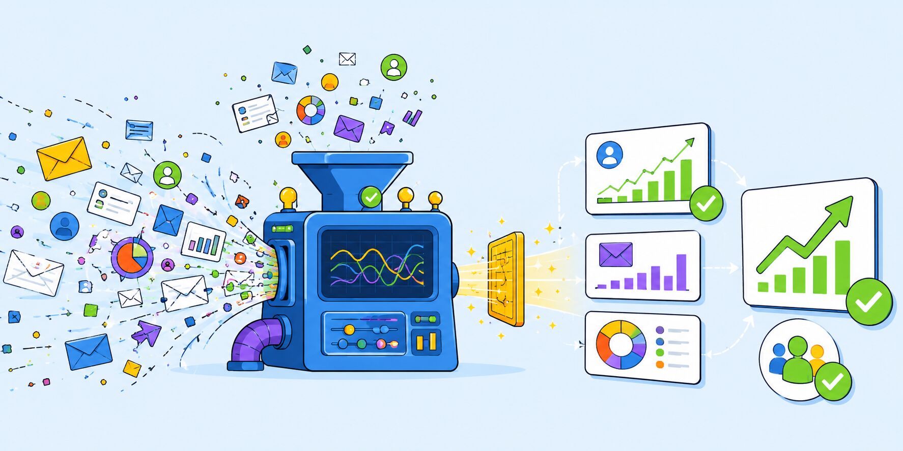
Let clicks tell you the unvarnished truth about your content. Let revenue tell you what your audience’s attention is actually worth. Let your bounce and spam metrics act as smoke detectors warning you of impending danger. Treat everything else as background noise.
By dedicating just fifteen minutes a month to disciplined review and single-variable optimization, your email program transforms from a chaotic chore into a predictable, high-performing revenue engine that you actively steer rather than passively watch.
 Basiran
  Sagoh
Sagoh 