
From the sage-green, minimalist storefronts of modern specialty coffee shops to the pristine, white-walled retail temples of Apple, the tech and lifestyle sectors have long relied on specific design languages to signal "the future." For years, we have lived in an era defined by clinical minimalism, glass-heavy architecture, and the "Corporate Memphis" style of illustration. However, a new, pervasive design trend has emerged—one that has quickly moved from the pages of architectural digest magazines to the backdrops of high-stakes AI keynotes.
It is the era of the vertically slatted wood wall. Whether you choose to label it a bastardized version of "Japandi" or the more cynical "Sauna Core," this aesthetic is now unavoidable. Yet, as the look proliferates across everything from OpenAI product launches to luxury retail facades, a growing chorus of critics on social media is pushing back, labeling the trend as "soulless," "low-effort," and the definitive design eyesore of the 2020s.
The Anatomy of the Trend: What Is "Sauna Core"?
To the untrained eye, the trend is simple: thin, uniform strips of timber arranged in vertical rows, often used as wall paneling or decorative acoustic baffles. It represents a pivot from the stark, cold surfaces that defined the mid-2010s.
Historically, this look borrows heavily from Japandi—a portmanteau of Japanese minimalism and Scandinavian functionality. In its original form, Japandi is meant to evoke warmth, tranquility, and a connection to nature. However, when adopted by corporate entities, the design philosophy loses its soul. The "hygge" elements—the hand-woven rugs, the soft wool throws, the flickering candles—are stripped away, leaving only the clinical, repetitive geometry of the slats.
The result is "Sauna Core." It is a cold, calculated attempt to make technology feel "human" by applying a thin veneer of nature over environments that remain fundamentally industrial.
A Chronology of Ubiquity
The rise of the wooden slat has been both rapid and relentless. While interior design trends typically move at a measured pace, the adoption of this specific look by the world’s most powerful tech companies has accelerated its visibility exponentially.
- 2021–2022: The aesthetic begins appearing in high-end boutique co-working spaces and "lifestyle" coffee chains, signaling a move away from the "industrial chic" exposed-brick look that dominated the early 2010s.
- 2023: Luxury retail brands, including names like Hermes, begin utilizing slatted wood in store interiors, associating the material with premium pricing and sophisticated minimalism.
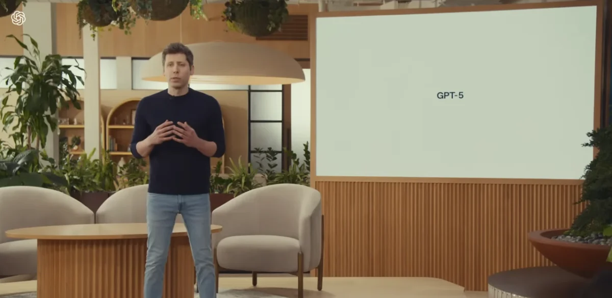
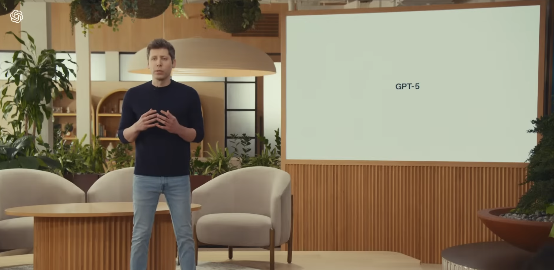
- 2024: The trend hits the tech mainstream. It becomes a staple in product packaging (notably Nvidia’s hardware boxes) and, more importantly, in the presentation design of major tech companies.
- 2025–2026: The look reaches critical mass. It is now the default "professional" backdrop for AI keynotes. As the technology sector struggles to humanize artificial intelligence, the warm, organic tones of wood have become the preferred visual shorthand to suggest that a machine is "warm," "approachable," and "safe."
The "US Graphic Company" Intervention
The backlash reached a boiling point in mid-2026 when industry observers, specifically the infographics experts at US Graphic Company, highlighted the sheer absurdity of the trend’s ubiquity. By juxtaposing a screenshot from an OpenAI keynote, a high-end hardware box, and a luxury storefront, they illustrated that the design has become a singular, homogenized visual language used by entities that share almost no other common goals.
The response on social media was immediate and visceral. The consensus was clear: the public is tired of the facade. One X user remarked, "One of the worst trends in modern architecture, and that is saying a lot. Completely bland, most times the ‘wood’ used screams cheap." Another user added, "The ‘wooden lines’ aesthetic will be remembered as the worst visual element of the 2020s. Soulless. Low effort."
Economic Efficiency vs. Aesthetic Value
Why are some of the world’s wealthiest companies gravitating toward a design that has triggered such a strong negative reaction? The answer, as is often the case in corporate design, lies in economics rather than artistry.
Industry analysts suggest that the "Sauna Core" look is a triumph of labor-cost minimization. Thin wooden strips are inexpensive to manufacture, easy to ship, and can be installed with minimal skilled labor. They are essentially a "plug-and-play" solution for office interiors and retail design.
As one observer noted on social media: "My theory is this look minimizes labor and material costs while looking decent, as the thin wooden strips are cheap and mostly fabbed off-site. I think this is also why wholecut slab tabletops are so common: little woodworking skill required but flashy compared to traditional methods."
By adopting this aesthetic, companies are not just chasing a trend; they are engaging in cost-effective visual signaling. They want to appear high-end, organic, and grounded, all while keeping their overheads low.
The "Humanizing" Paradox
The irony of the current design landscape is that companies are increasingly obsessed with "humanizing" their products at the exact moment they are becoming less human.
We are currently witnessing an industry-wide pivot in AI branding. Just as these companies have moved toward serif fonts—which are perceived as more "traditional" and "authoritative"—they have turned to the warm hues of timber to distract from the cold, binary reality of server farms and machine learning models.
However, this strategy is beginning to backfire. When the consumer encounters the same wooden slats in a luxury store, a coffee shop, and an AI presentation, the "warmth" evaporates. Instead of feeling comforted, the consumer feels marketed to. The design ceases to be a feature and becomes a trope—a visual cliché that signals a lack of original creative thought.
Implications for the Future of Tech Design
What happens when an aesthetic reaches the point of satire? If history is any indicator, the death of the "Sauna Core" trend is imminent.
We have seen this cycle repeat itself multiple times over the last two decades. Consider:
- Millennial Pink: Once the defining color of the digital age, it eventually became so ubiquitous that it was viewed as a symbol of vapid, venture-capital-funded retail.
- Corporate Memphis: The flat, simplified, "joyful" character illustrations that dominated tech marketing for years were eventually rejected by the public as infantilizing and generic, leading to a massive shift toward more diverse and complex visual identities.
The wooden slat trend is now on a similar trajectory. It is moving from "aspirational" to "dated" at a record pace. The implications for designers are clear: if you are using this aesthetic to differentiate your brand, you are actually doing the opposite. You are folding your brand into a mass of corporate monotony.
Conclusion: The Need for Authenticity
The rise and fall of "Sauna Core" serves as a masterclass in why superficial design solutions fail. Architecture and interior design are at their best when they respond to the specific needs of a space and the culture of the people within it. When they are used as a uniform—a way to make a brand look "correct" based on current trends—they inevitably fail the test of time.
As we move further into the second half of the 2020s, the tech industry will likely need to find a new visual language. The challenge will be to move away from the "cheap, fast, and easy" solutions of today and toward designs that feel genuinely intentional. Until then, the wooden slat remains a testament to a decade that was, perhaps, a little too obsessed with looking the part, and not enough with actually being it.
Whether the industry will listen to the criticism remains to be seen. But if the internet’s current mood is any indication, the "Sauna Core" era is already over—it just hasn’t finished taking down its walls yet.
