

For over a century, the aesthetic of the "ALL CAPS" headline has served as the visual shorthand for authority, urgency, and raw power. From the sensationalist front pages of the Victorian era to the aggressive, algorithm-driven clickbait of the modern social media landscape, the uppercase letter has been the designer’s primary weapon for grabbing attention. Yet, in our hyper-connected, saturation-heavy digital culture, the constant roar of capital letters has begun to lose its impact. When everything is shouting, nothing is heard.
Recognizing this fatigue, type designer Jamie Clarke has unveiled Reel, a typeface that challenges the binary choice between "loud" capitals and "quiet" lowercase. By introducing a groundbreaking "Flexi-case" system, Clarke is offering designers a way to reclaim the structural integrity of high-impact typography without the aggressive tone that has come to define the status quo.
The Evolution of the Shout: A Brief Chronology
To understand the significance of Reel, one must look at the history of how we prioritize letterforms. While the modern consumer might associate all-caps with the internet age, the obsession runs much deeper. Working alongside researcher Doug Wilson—renowned for his documentary work on the history of type, Linotype: The Film—Clarke traced the societal fixation on capital-heavy design back to at least 1856.
- 1856–1900s: The rise of industrial printing and sensationalist journalism saw the increased use of bold, condensed uppercase letters to dominate newsstands and broadsheets. It was the birth of the "shouty" headline.
- Mid-20th Century: The development of Swiss design and the rise of modernist sans-serifs refined the use of capitals, turning them into a symbol of corporate stability and architectural precision.
- 2010s: The digital revolution turned all-caps into a standard for mobile interfaces and social media marketing. It became the default setting for "engagement."
- 2024–Present: A cultural "lowercase turn" has emerged. Artists like Taylor Swift, Charli XCX, and Bad Bunny have eschewed the traditional uppercase album title in favor of lowercase aesthetics, signaling a shift toward intimacy, authenticity, and a rejection of the performative aggression that defines modern political and social discourse.
The Flexi-case System: A New Typographic Paradigm
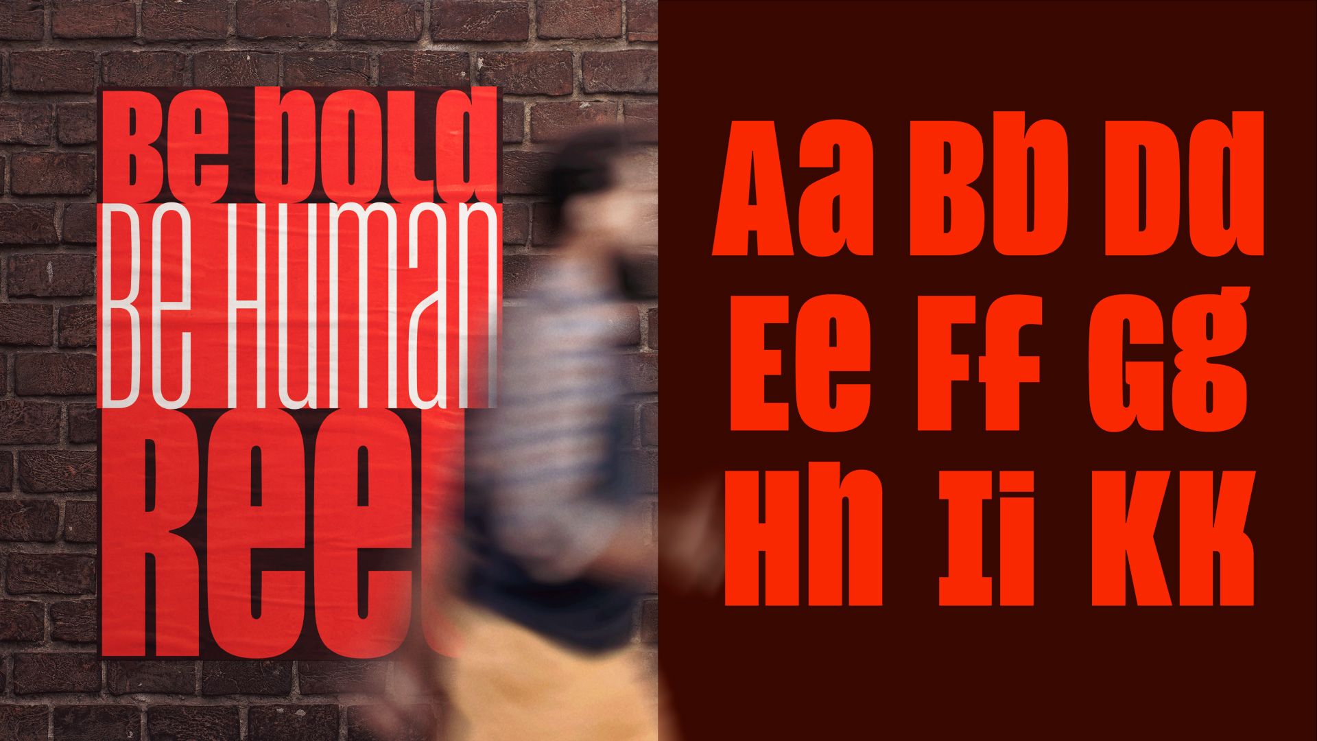
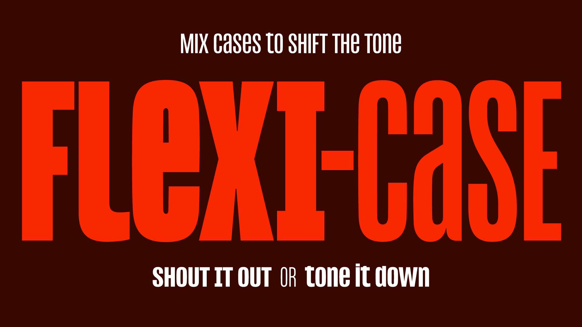
The core innovation of Reel is its "Flexi-case" system. Traditional typefaces operate on a strict hierarchy: uppercase letters are tall and dominant, while lowercase letters are smaller and more conversational. This separation usually forces a designer to choose between two distinct "modes" of communication.
Clarke’s Reel dismantles this barrier. By crafting lowercase letters that share the same height and visual weight as their uppercase counterparts, the typeface allows for a seamless, rhythmic integration of both cases within a single word or sentence.
"Reel is designed to be expressive, not oppressive," Clarke explains. "I wanted to see if a typeface could still have strength while feeling more conversational and human."
This technical feat is not merely a stylistic flourish; it is a structural challenge. Condensed, high-impact headline fonts rely on a precise, rectangular consistency. When a designer introduces varying heights—or mixes cases—the "color" of the line (the overall grey tone of the text block) often breaks. Reel manages to maintain this consistency, ensuring that the rhythm remains stable even when the casing shifts from a formal cap to a fluid lowercase letter.
The Psychology of the Lowercase Turn
Why does this matter to the average consumer or brand manager? Because typography is a psychological trigger. The move toward lowercase in branding is not accidental; it is a response to a world that feels increasingly combative.
In a social landscape where public communication is dominated by polarized debates and alarmist headlines, the "all-caps" aesthetic has become synonymous with bullying. Conversely, the lowercase aesthetic has become a design signal for transparency. It suggests a brand—or an artist—that is approachable, vulnerable, and human.
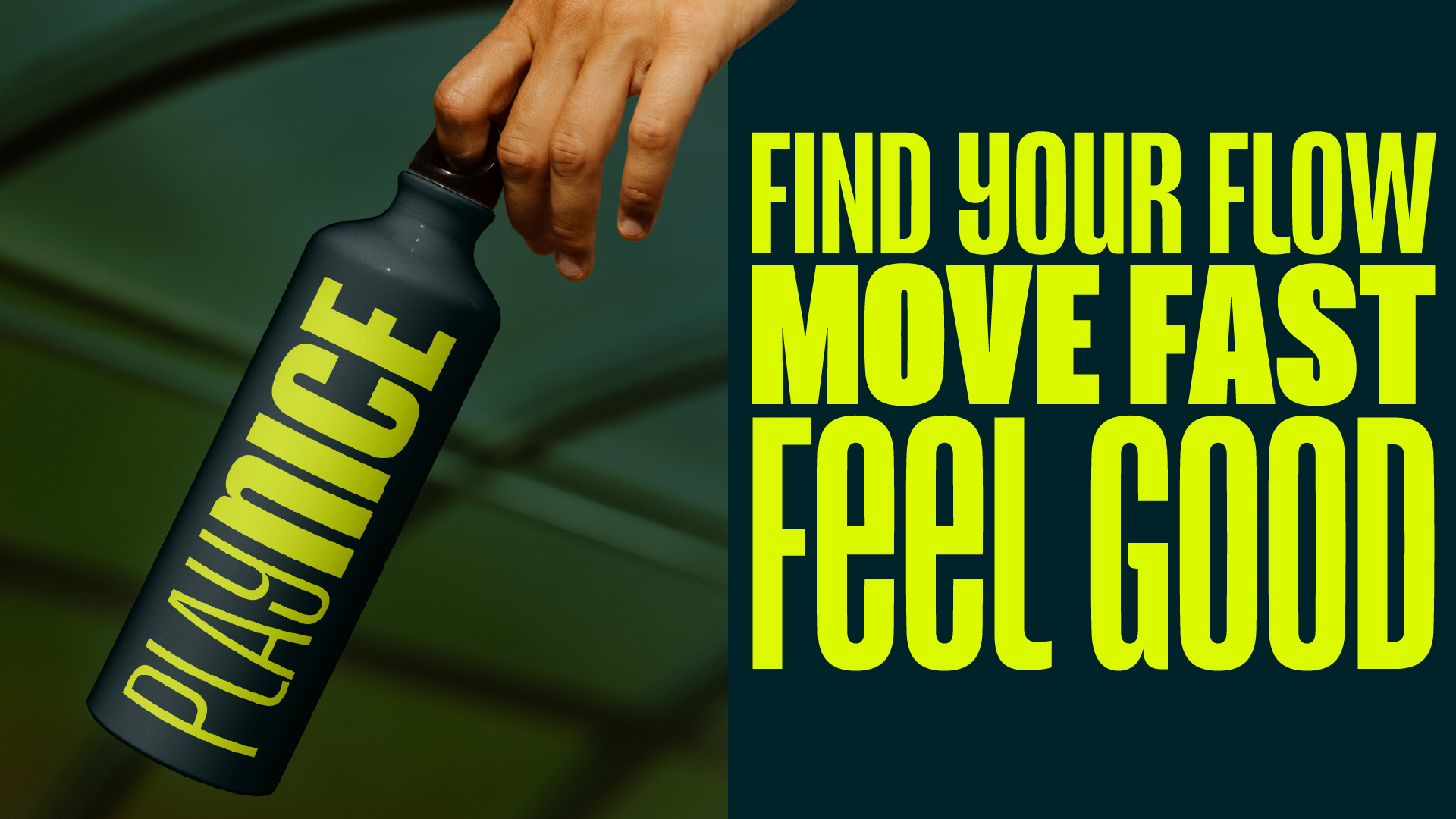
By using Reel, a designer can calibrate the "temperature" of a headline. They can start a campaign with the punchy, authoritative strength of a condensed capital, and then gracefully taper into the warmth of lowercase characters. It provides a spectrum of intensity rather than a toggle switch, allowing for a more nuanced storytelling approach.

Practical Implications for Branding and Editorial Design
For the professional designer, Reel represents a significant utility upgrade. The current market is flooded with typefaces that attempt to look "bold," but few offer the flexibility of a multi-register family that remains coherent.
1. Unified Brand Voice
In the past, to transition a brand’s tone from a corporate announcement to a human-centric blog post, a designer would often need to swap font families. Reel allows for a single brand voice to oscillate between these states, creating a cohesive visual identity that can adapt to the emotional needs of the copy.
2. Space Efficiency
Condensed typefaces are essential for modern web design, where screen real estate is at a premium. Because Reel maintains the high-impact density of a narrow typeface while allowing for lowercase, it allows for longer, more descriptive headlines to fit into tight UI containers without sacrificing readability or emotional impact.
3. Cultural Relevance
Brands are increasingly wary of "shouty" marketing. As consumers become more cynical toward traditional advertising, the ability to tone down the visual volume while maintaining a professional, high-end look is a competitive advantage. Reel offers a way to be heard without being overbearing.
The Expert Perspective: Why Reel Matters
Jamie Clarke’s career, marked by high-profile work for organizations like Aardman Animations and Disney+, has uniquely positioned him to solve this problem. He understands that a typeface is not just a collection of shapes; it is a tool for problem-solving.
"Headline type lives or dies on its ability to command attention," says an industry insider. "Most designers know how to make a font loud. Very few know how to make a font ‘smart.’ What Clarke has done with Reel is build a bridge between the two."
The research conducted with Doug Wilson provides the necessary academic and historical weight to the project. By identifying that our obsession with capitals is a 19th-century vestige rather than an eternal design rule, Clarke gives modern creatives permission to experiment with lowercases without feeling like they are sacrificing professional credibility.
Looking Ahead: The Future of Headline Treatments
As we look toward the 2026 design landscape, the shift toward "humanized" digital interfaces is only expected to accelerate. We are moving away from the era of the "shouting machine" and toward an era of meaningful, nuanced interaction.
For those briefing in new headline treatments, the lesson is clear: don’t just ask for "bold." Ask for a typeface that understands the context of the message. If a brand wants to be perceived as authentic, it must look the part. Reel serves as a poignant reminder that in design, as in life, the most powerful statements are often the ones that know when to lower their voice.
How to Get Involved
For designers looking to push their work to the next level, the opportunity to demonstrate this balance of authority and warmth is high. Projects that master this nuance are often the ones that stand out in competitive spaces.
If you believe your recent branding work captures this spirit of modern, expressive, and thoughtful design, the Brand Impact Awards (BIA) 2026 are now open for entries. Recognizing excellence in global branding, the BIA offers a platform for designers to showcase how they use typography and visual language to navigate the modern cultural landscape. Entries are open until July 9, and the industry is watching to see how the next generation of designers will respond to the changing tides of communication.
In conclusion, Reel is more than just a font; it is a cultural artifact. It captures a specific moment in time where we are collectively deciding that we’ve had enough of the shout. By providing a technical solution that enables a more conversational aesthetic, Jamie Clarke has given us the tools to communicate with both strength and empathy—a combination that is increasingly rare in the modern, noisy world of visual design.
