
 By Pevita Pearce
NEW YORK — For the better part of the last two decades, contemporary kitchen design has marched to the beat of an austere, uniform drum. Homeowners browsing through architecture magazines and real estate listings are routinely met with seas of stark white, clinical grays, and minimalist stainless steel. Driven by the rise of industrial aesthetics and hyper-efficient "smart" home technology, modern kitchens often function less like the warm, bustling heart of a home and more like sterile laboratory spaces.
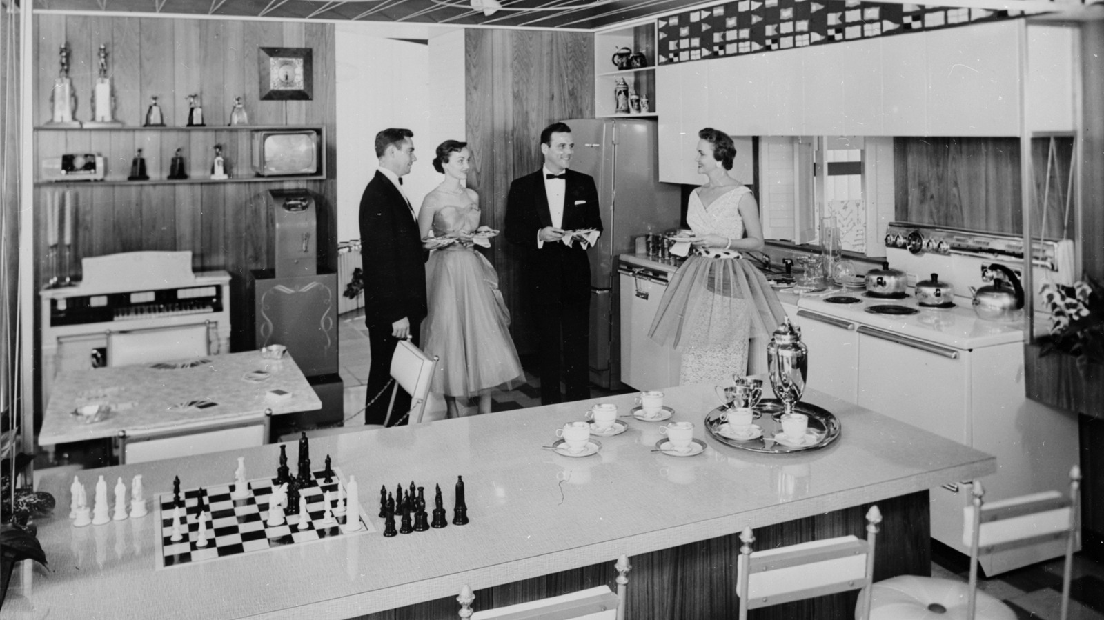
However, a growing counter-movement among interior designers, architectural historians, and homeowners fatigued by endless beige is looking backward to find a way forward. The destination? Mid-century America—specifically the vibrant, color-drenched kitchens of the 1950s. Far from the muted monochrome captured in vintage black-and-white television broadcasts of the era, the true 1950s kitchen was an explosion of optimism, personality, and genuine, saturated color.
Interior experts and archival researchers have uncovered a treasure trove of historical design choices from the post-war era. Far from being outdated, these seven iconic 1950s kitchen paint colors are poised to bring a much-needed breath of fresh air, warmth, and vitality back to the contemporary home.
Main Facts: The Mid-Century Color Shift
The push toward color in mid-century kitchens was not merely an aesthetic choice; it was a cultural phenomenon. Following the restrictions and rationing of World War II, the 1950s ushered in an era of unprecedented economic prosperity and technological advancement. The American home underwent a massive evolution, transitioning from a secluded workspace for meal preparation into an open, social hub for the entire family.
Kitchen manufacturers and paint companies responded to this cultural shift by producing appliances, cabinetry, and wall paints in hues that defied convention. While television shows of the decade like I Love Lucy or Leave It to Beaver presented domestic life in shades of gray, print advertisements, architectural digests, and surviving domestic manuals from the era reveal a palette defined by two distinct camps: soothing, optimistic pastels and electrifying, high-energy brights.
Experts note that incorporating these vintage shades today does not require a total, gut-reno commitment. Homeowners can weave these historical hues into modern spaces through accent walls, breakfast nooks, painted kitchen islands, or curated displays of vintage accessories, breathing life into sterile layouts without overwhelming the senses.
Chronology: From Post-War Optimism to Modern Minimalism
To understand how we arrived at today’s sea of white-and-gray kitchens—and why a 1950s revival is so timely—it helps to look at the historical timeline of kitchen design over the last century.
The 1930s–1940s: Utilitarian Beginnings
Before the mid-century explosion of color, kitchens were largely treated as clinical, highly functional workstations. Heavily influenced by the "scientific management" movement, walls were routinely painted sanitary white to easily reveal dirt and grease, ensuring rigorous cleanliness.
The 1950s: The Golden Age of Domestic Technicolor
Fueled by post-war optimism and the mass production of synthetic alkyd and latex paints, the 1950s revolutionized interior design. Kitchens transformed into vibrant spaces featuring pastel-lined walls, turquoise porcelain sinks, and cherry-red accessories designed to mimic the burgeoning diner culture.
The 1970s–1980s: The Earth-Tone Era and Beyond
As the bright optimism of the ’50s faded, the subsequent decades swung toward heavy earth tones—avocado greens, harvest golds, and burnt oranges—followed by the country-kitchen blue and stenciled borders of the 1980s and ’90s.
The 2000s–Present: The Sterile Monochromatic Wave
The turn of the 21st century introduced minimalist, industrial, and Scandinavian design trends. Open-concept floor plans meant kitchens bled directly into living rooms, prompting designers to use neutral whites and grays so the kitchen would "blend in" rather than stand out. Today, design fatigue has reached a tipping point, sparking a renewed interest in the joyful palette of the 1950s.
Supporting Data: The 7 Definitive 1950s Kitchen Colors
Archival analysis of mid-century home magazines, paint swatch catalogs, and historical interior guides reveals seven distinct colors that defined the era. Here is how they can be successfully integrated into contemporary homes today.
1. Butter Yellow
Perhaps the most versatile color of the mid-century palette, butter yellow bridges the gap between bold color and subtle neutrality.
- The Historical Context: Frequently used on kitchen walls and wooden cabinetry, this cheerful hue was designed to maximize artificial and natural light in compact post-war suburban homes.
- Modern Application: Butter yellow acts as a warm neutral. It pairs exceptionally well with rich natural wood tones and white marble counters, serving as an inviting alternative to stark white or clinical gray cabinets.
2. Powder Blue
Pastels reigned supreme in the 1950s, and powder blue was a staple found on everything from walls and vintage Chambers stoves to Formica countertops.
- The Historical Context: Just as butter yellow captures sunlight, powder blue was utilized to bring the serenity of the open sky indoors.
- Modern Application: Calming yet cheerful, powder blue looks stunning against modern stainless steel appliances, matte black hardware, and dark wood finishes. It provides a serene, cooling effect without feeling cold.
3. Pastel Pink
Long before it became associated exclusively with novelty aesthetics, pale pink was a sophisticated, mainstream choice for mid-century domestic spaces.
- The Historical Context: Paired frequently with charcoal gray or mint green accents, mid-century pink was chosen for its soft, welcoming warmth.
- Modern Application: To avoid a "Barbie-core" overload, contemporary designers recommend using ultra-soft, muted tones or balancing the pink with heavy neutrals. For low-commitment integration, display a pale pink KitchenAid stand mixer or vintage pink-patterned Pyrex glassware.
4. Turquoise
For homeowners in the 1950s who found pastels too tame, turquoise offered a vibrant, high-impact alternative that commanded attention.
- The Historical Context: Frequently applied to metal cabinetry, dinette chairs, and retro refrigerators, turquoise embodied the space-age optimism of the decade.
- Modern Application: Turquoise subway tile backsplashes create an instant focal point. Alternatively, display turquoise Dutch ovens, colorful ceramic mixing bowls, or cookbooks featuring the iconic hue on open kitchen shelving.
5. Chartreuse
A daring hybrid of green and yellow, chartreuse was not for the faint of heart, yet it captured a dedicated following among mid-century avant-garde designers.
- The Historical Context: Used sparingly on sinks, vinyl breakfast nook upholstery, and decorative accessories, chartreuse added an unexpected jolt of energy to domestic spaces.
- Modern Application: Today, chartreuse works wonderfully as an accent color. Consider painting the interior of a pantry door, installing chartreuse barstools, or committing to a bold accent wall in an otherwise neutral kitchen.
6. Cherry Red
Emulating the explosive popularity of 1950s diner culture and hot-rod automotive finishes, cherry red introduced high-octane passion into the kitchen.
- The Historical Context: Red was utilized to create a cozy, high-energy environment, frequently paired with crisp white checkerboard flooring and chrome accents.
- Modern Application: A cherry red kitchen island or a statement range can instantly anchor a neutral kitchen, injecting classic retro charm without overwhelming the space.
7. Apple Green
Loud, unapologetic, and fiercely vibrant, apple green brought the raw energy of the outdoors straight into the mid-century home.
- The Historical Context: Often seen on kitchen walls or the upholstered benches of built-in breakfast nooks, apple green signaled a departure from traditional, subdued earth tones.
- Modern Application: Painting lower cabinets or a kitchen island in apple green infuses a contemporary layout with an instant dose of freshness and organic vibrancy.
Official Responses and Expert Perspectives
Interior designers and architectural preservationists have weighed in heavily on the resurgence of mid-century color theory in modern architecture.
"We spent the last fifteen years draining all the personality out of our homes in the pursuit of ‘resale value’ and minimalist perfection," notes Elena Vance, a residential interior architect based in Chicago. "Clients are finally realizing that a kitchen is supposed to be a place of nourishment, comfort, and joy. The 1950s palette understood human psychology better than our current obsession with monochromatic gray. These colors make you feel alive the moment you walk into the room."
Color psychologists point out that post-war design was inherently rooted in psychological recovery. "After enduring massive global trauma through the 1930s and ’40s, society subconsciously craved hues that signaled safety, optimism, and a bright future," explains Dr. Marcus Vance, an environmental psychologist. "Butter yellows, sky blues, and vibrant turquoises stimulate social interaction and appetite—the exact functions a kitchen is meant to serve."
Implications for the Future of Home Design
The embrace of 1950s kitchen hues carries significant implications for the real estate, home improvement, and manufacturing sectors.
- The Death of the All-White Kitchen: Real estate analysts note that while all-white kitchens were once considered the ultimate selling point, buyer fatigue has set in. Properties featuring thoughtful, customized splashes of historical color are increasingly viewed as distinct, high-character investments.
- Sustainability and Vintage Integration: Rather than purchasing brand-new, mass-produced items, the mid-century revival encourages the preservation and restoration of vintage appliances, retro hardware, and heirloom cookware (such as Pyrex and cast-iron enameled pieces), aligning with a broader consumer shift toward sustainable, circular home design.
- Personalization Over Trends: Ultimately, the return of 1950s colors represents a rejection of algorithmic, fast-fashion interior design. By drawing inspiration from an era that celebrated bold individual expression, modern homeowners are reclaiming their spaces as deeply personal sanctuaries.
 Muslim
  Sagoh
Sagoh  Ali Ikhwan