
 By Jia Lissa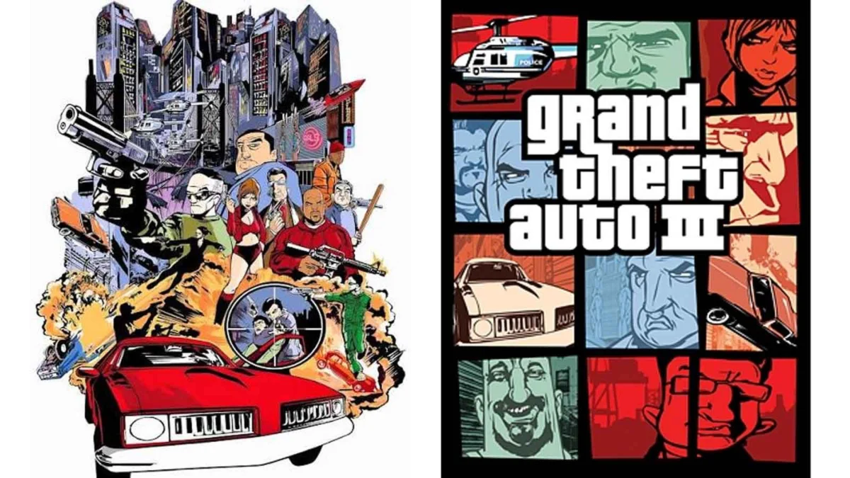
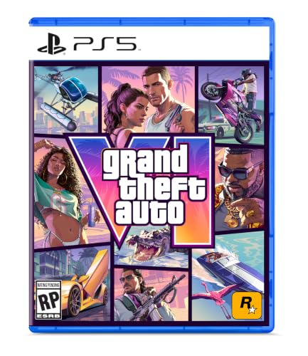
To the casual observer, the box art for Grand Theft Auto 6 is instantly recognizable, even before the iconic stylized logo comes into view. It is a visual language defined by a frantic, high-contrast collage: small, rectangular windows brimming with chaotic snapshots of characters, high-performance vehicles, and the gritty, neon-soaked debris of criminal life. For over two decades, this "comic book grid" layout has served as the definitive branding for one of the most successful entertainment franchises in history.
However, this design language—a cornerstone of video game marketing—was never part of a long-term strategic roadmap. It was, in fact, a reactive, eleventh-hour pivot born from the shadow of the September 11 terrorist attacks.
A Legacy Born from Crisis
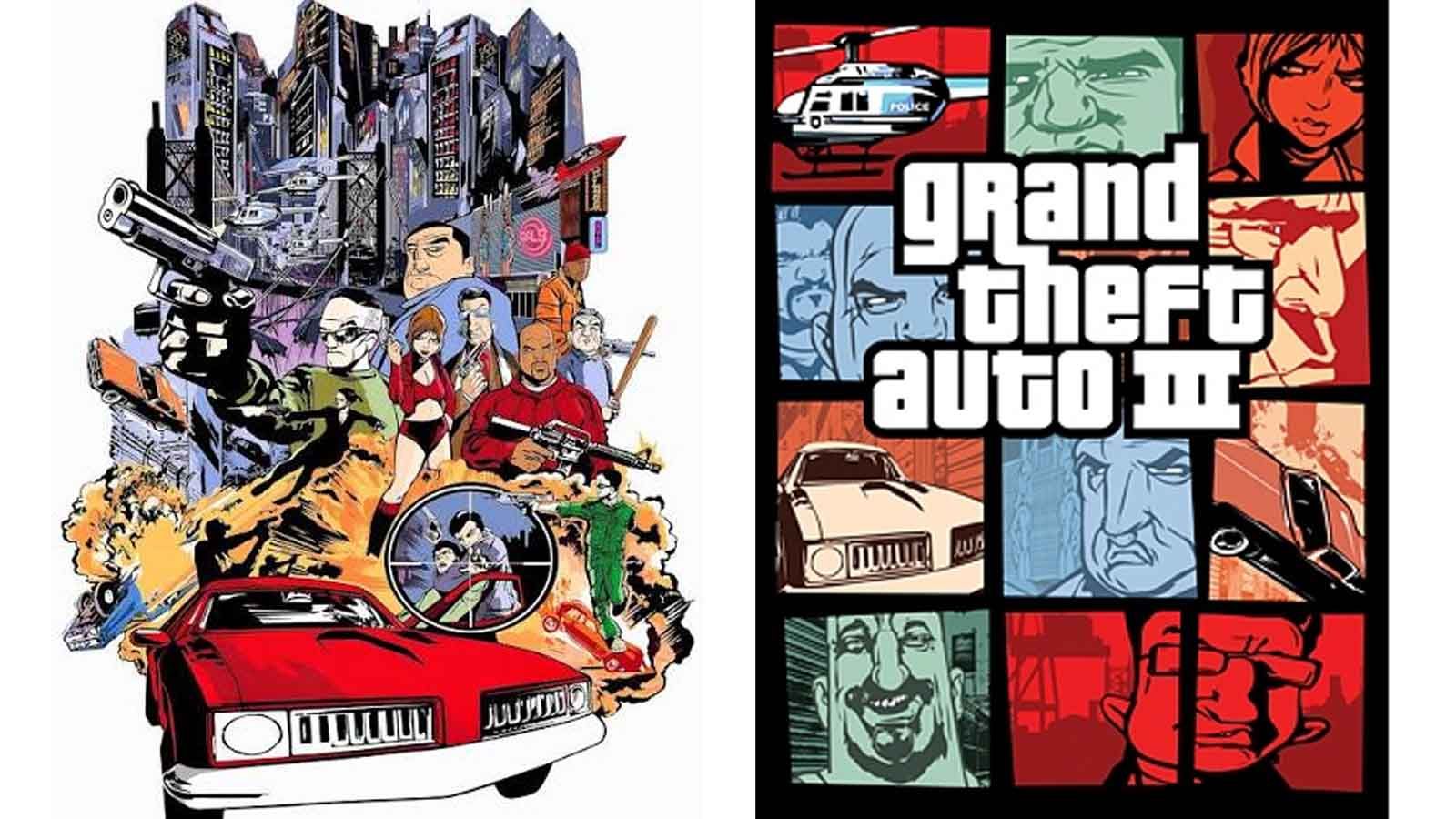
The narrative of how Grand Theft Auto III (2001) received its iconic cover is one of the most fascinating pieces of video game industry lore. For years, the story circulated that the cover was a "rush job" completed in just two evenings. While the timeline is debated by those involved, the consensus remains that the original artistic vision for the game was abandoned due to the sensitivity of the global political climate in the autumn of 2001.
In the wake of the 9/11 attacks, the atmosphere in New York City—where Rockstar Games is headquartered—was profoundly altered. The company, which had been preparing to launch a game predicated on urban crime and lawlessness, found itself in a precarious position. The original cover art, which featured a cinematic, movie-poster-style composition, depicted a bridge being blown up, police firing into the air, and aggressive helicopter maneuvers. In the immediate aftermath of the tragedy, this imagery was deemed too volatile, too raw, and potentially insensitive to the public mood.
The Chronology of a Design Shift
To understand the significance of the change, one must look at the pressure cooker environment of 2001. Rockstar Games was preparing for a critical release that would effectively transition the Grand Theft Auto series from its top-down, 2D roots into a fully realized 3D open-world experience.
The Abandoned Vision
The initial cover art for GTA III had been in development for roughly six months. It was intended to be a singular, high-impact image that captured the cinematic scope of a gritty crime drama. It leaned heavily into the aesthetics of the late 90s action film—explosive, linear, and singular in focus.
The "Panic" Pivot
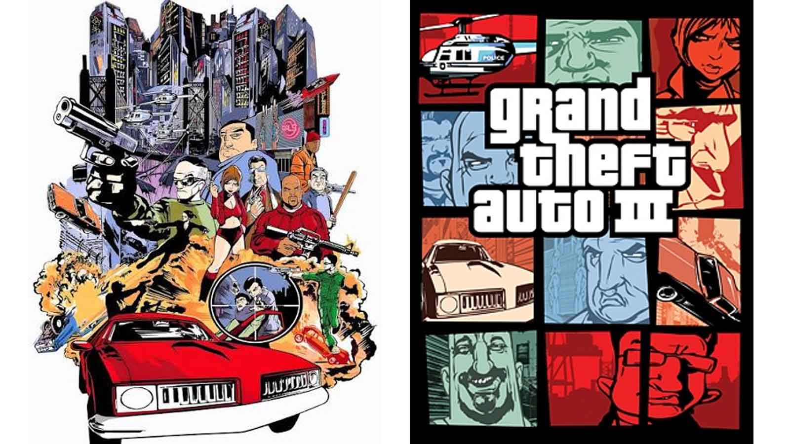
Following the decision to scrap the original art, artist Stephen Bliss was tasked with an emergency redesign. According to Rockstar co-founder Dan Houser, the resulting grid-style layout was hammered out in an incredibly short span of time—a claim that Bliss has since qualified, suggesting he was granted approximately one week to deliver the new iteration. Regardless of the exact hour count, the transformation was radical: the single, explosive scene was replaced by the now-legendary mosaic of panels.
The European Exception
One of the most intriguing aspects of this history is that the original, more violent cover art was not universally discarded. While North America adopted the new, segmented aesthetic, the European market—including the United Kingdom—retained the original, action-heavy artwork. This resulted in a split legacy where two generations of players possess fundamentally different physical copies of the same seminal title, a quirk that has made the European version a prized artifact among game collectors today.
Analyzing the "Rockstar Template"
The grid layout is more than just a stylistic choice; it is a masterclass in visual communication and information density. By segmenting the artwork into distinct frames, Rockstar achieved three things:
- Characterization: The grid allows the player to meet the ensemble cast before even booting up the game. Each frame provides a "vignette" of personality, from the stoic protagonist to the colorful, often unhinged supporting cast.
- Contextual Breadth: Where a single image struggles to represent the complexity of an open-world game, the grid captures the diversity of the setting. It showcases vehicles, city skylines, weapons, and diverse environments simultaneously.
- Brand Identity: The consistency of the layout across Vice City, San Andreas, GTA IV, GTA V, and now GTA 6 has turned the layout itself into a logo. It creates an immediate sense of "family resemblance" that signals a premium, sprawling experience to the consumer.
The Evolution of the Rockstar Aesthetic
The design philosophy has remained remarkably consistent because it successfully gamifies the act of looking at a box. Fans spend hours dissecting these covers, looking for hints about the game’s narrative, the geography of the map, and the specific weapons or vehicles featured. It invites the audience to become detectives before they have even purchased the product.
This approach stands in stark contrast to most mainstream video game marketing, which often relies on a singular, polished shot of a hero character. By sticking to the grid, Rockstar has maintained an indie-art-house aesthetic while operating at the scale of a global blockbuster. Even as technology has allowed for more complex, dynamic, and realistic graphics, the reliance on this somewhat retro, comic-book-inspired layout serves as a grounding force—a reminder of the series’ humble, subversive origins.
Official Perspectives and Industry Impact
The shift in 2001 served as a major turning point for how developers approach the marketing of "mature" titles. It forced Rockstar to consider the cultural impact of their imagery in a way that few other developers had done at the time. Dan Houser’s candid discussions regarding the 9/11 influence on their marketing highlight a moment of corporate maturity: the recognition that a brand’s aesthetic can be both iconic and responsive to its environment.

Critics and designers have often noted that the "GTA Grid" is arguably the most recognizable piece of graphic design in the history of interactive entertainment. It transcends the medium of gaming; it is often compared to the iconic, consistent branding of classic film series like James Bond or the visual identity of legendary rock albums.
The Implications for GTA 6
With the impending release of Grand Theft Auto 6, the usage of the classic grid layout is being met with a sense of relief and anticipation. There was, at one point, speculation that Rockstar might move away from the established design language to signify a new era of the series. However, by leaning back into the Vice City-inspired nostalgia and the classic panel structure, Rockstar is signaling continuity.
The implications for GTA 6 are clear: it is a homecoming. The design suggests that while the graphics will be state-of-the-art and the scope unprecedented, the "soul" of the franchise—the irreverent, neon-drenched, chaotic energy of the early 2000s—remains intact.
Conclusion: A Design That Won’t Die
It is rare in the fast-paced world of digital media for a design choice to survive twenty-five years, let alone remain the gold standard. The story of the Grand Theft Auto cover art is a reminder that some of our most "calculated" brand identities are often the result of sudden, desperate necessity.
By forcing a pivot away from the violent, singular imagery of the original GTA III concept, the circumstances of 2001 inadvertently gave Rockstar a gift: a modular, infinitely adaptable template that could grow with the series. It turned a box art requirement into a visual hallmark, ensuring that whenever a new Grand Theft Auto title is announced, the community knows exactly what to look for. The grid is not just a container for art; it is the frame through which we view the evolution of one of gaming’s most important legacies. As GTA 6 prepares to hit shelves, it serves as a testament to the fact that when you get the design right, it becomes a permanent part of the cultural landscape.
 Nana
Nana  Nana Muazin
  Ali Ikhwan