
 By Nana Muazin
Main Facts: The Resurgence of Disco-Era Design
The 1970s interior design landscape was far from subtle. Defined by vibrant shag carpets, sunken living rooms, and maximalist accents, the decade made bold, unapologetic statements within the home—none more so than in the kitchen. Far from merely being utilitarian spaces for whipping up convenience foods like Hamburger Helper, ’70s kitchens served as profound reflections of personal identity, rebellion, creative expression, and a daring enthusiasm for color that modern, minimalist interiors struggle to match.
While contemporary interior design has largely favored sterile whites, cool grays, and monochromatic palettes over the past decade, a growing design movement is looking backward for inspiration. Today’s homeowners and interior designers are rediscovering the warmth and character of retro palettes. Everything from bright greens to cheery reds, rustic oranges, and muted earth tones once dominated American domestic spaces. During this era, major kitchen appliances—refrigerators, wall ovens, and dishwashers—alongside counters, islands, and cabinets, were routinely manufactured to match the trending color of the moment.
Though some of these chromatic choices may feel dated to modern eyes, a select group of seven retro shades possesses timeless architectural merit. These classic hues deserve to be brought back to life in contemporary kitchen remodels, offering a infusion of vintage magic, psychological warmth, and sensory nostalgia.
Chronology: The Evolution of Kitchen Aesthetics From the 1960s to the 1980s
To understand how ’70s color schemes captured the public imagination, it is necessary to examine the decade’s stylistic origins and its evolution through the late twentieth century.
The Shift from Mod to Mother Nature
The late 1950s and 1960s were characterized by the space-age futurism of Mid-Century Modern design, bright psychedelic tones, and high-contrast geometric patterns (often referred to as the "Sputnik" and "Mod" eras). By the dawn of the 1970s, a cultural counter-movement began to take hold. Driven by the environmental movement, the first views of Earth from outer space, and the emotional hangover of turbulent sociopolitical events, homeowners and designers pivoted sharply away from synthetic futurism toward organic grounding.
The hippie movement and a general yearning for back-to-the-land lifestyles heavily influenced home decor. Dreamy turquoise greens and bright butter yellows gave way to grounded, cozy, and warm earth tones.
The Corporate Standardization of Color (1968–1980s)
The transformation of the kitchen landscape was accelerated by major manufacturing companies. In 1968, General Electric introduced "Harvest Gold," a pivotal moment that prompted competing appliance manufacturers like Whirlpool, Frigidaire, and Westinghouse to abandon basic white in favor of color-coordinated product lines.
Throughout the 1970s, this trend expanded into what design historians call total-coordination environments. Consumers did not merely buy a refrigerator; they bought an entire suite of matching avocado green or coppertone appliances, pairing them with complementary laminate countertops, linoleum flooring, and patterned wallpaper.
The Transition to Muted Neutrals (Late 1970s–1980s)
As the decade drew to a close, the explosive brightness of burnt orange and poppy red began to soften. By the late ’70s and well into the 1980s, consumer fatigue with hyper-saturated hues led to a demand for softer, more transitional tones. The market saw a massive surge in neutral, soft beige and almond colorways designed to blend seamlessly with natural oak cabinets and darker wood finishes. This transitional period bridged the gap between the earthy rebellion of the ’70s and the pastel-heavy or stark white aesthetics of the 1980s and ’90s.
Supporting Data: The Big Seven Retro Shades
Analyzing the color palette of the 1970s reveals a sophisticated spectrum of design choices that offered distinct psychological and aesthetic benefits. Here is a detailed breakdown of the seven iconic kitchen paint and appliance colors from the era that are primed for a modern revival:
1. Avocado Green
While green was crowned a major color trend in recent interior design forecasting, this fruit-inspired shade represents something entirely unique. Avocado green was arguably the definitive color of the early-to-mid ’70s. It was ubiquitous across appliances, backsplashes, and wall paint.
- The Inspiration: Heavily influenced by the dawn of the space age and environmental consciousness following the moon landings, households sought to bring the rich, deep tones of the natural world indoors.
- The Pairing: Avocado green served as a striking visual complement to the era’s signature knotty pine cabinets, heavy wood paneling, and groovy, large-scale floral wallpapers.
2. Harvest Gold
As the companion to avocado green, harvest gold defined the domestic landscape of the decade. Rather than a harsh, metallic gold, this shade was a subtle, warm-hued corn yellow.
- The Cultural Footprint: Introduced by GE in 1968, harvest gold remained a dominant force for well over a decade. As one nostalgic commenter on the online community Reddit noted, "Pretty much everything was gold—house exterior, living room and [interior] hallways… and shag carpet to go with the appliances."
- The Application: Paired frequently with dark wooden cabinetry and patterned vinyl or linoleum flooring, harvest gold created an enveloping, sunlit warmth that modern all-white kitchens often lack.
3. Earthy Browns
Moving away from the high-contrast drama of the ’60s, earthy browns dominated every nook and cranny of the ’70s kitchen. From butcher-block countertops and wood-slat ceilings to rustic cabinetry, brown was the ultimate grounding element.
- Design Context: As design historians note, the earth-tone rustic look was a direct reaction against the hyper-artificial Mod styles of the previous decade. It offered a "hippie version" of home decor that prioritized comfort, texture, and tactile authenticity over slick synthetic surfaces.
4. Burnt Orange
For homeowners looking to make a definitive stylistic statement, burnt orange provided a warm, bold alternative to avocado green and harvest gold.
- Versatility: This muted, autumnal mix of brown, red, and orange bled into fashion, automotive design, and fine art. In the kitchen, burnt orange manifested in laminated countertops, drop-down pendant lighting fixtures, and statement appliances. It allowed homeowners to express individuality while maintaining the overarching cozy aesthetic of the era.
5. Coppertone
Often ranking just behind avocado green and harvest gold in consumer popularity, coppertone (sometimes marketed under names like coffee or cocoa) established a strong foothold on ovens, refrigerators, and sinks.
- Practicality Meets Style: Beyond its aesthetic appeal, coppertone offered unmatched functional benefits. As Reddit users frequently recall, the rich, metallic brown hue possessed a unique superpower: it hid culinary stains, grease, and fingerprints remarkably well. It offered a neutral, deeply homey feel that could anchor complex spatial designs without demanding undue attention.
6. Poppy Red
For those finding earthy browns and muted oranges too conservative, poppy red injected a vibrant, high-energy splash of color into the culinary space.
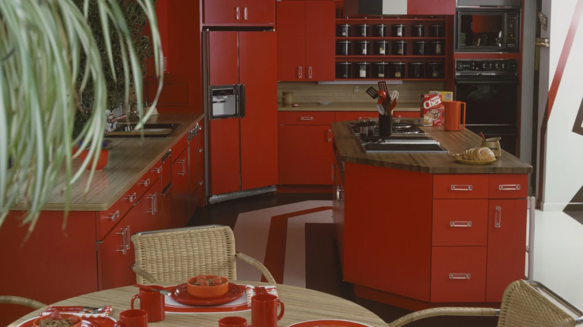
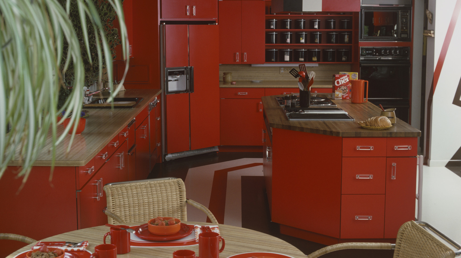
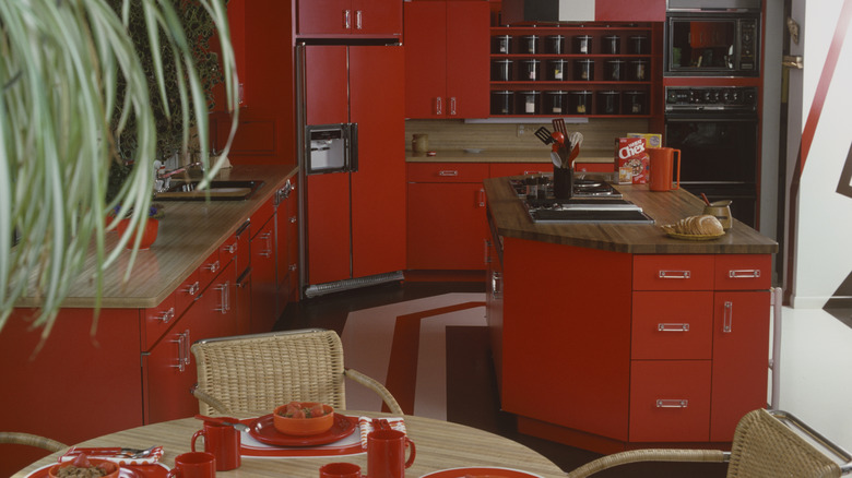
- Daring Accents: More vibrant than the standard earth tones, this orangey-red hue was applied selectively to kitchen islands, accent cabinetry, and retro range hoods. While it never achieved the ubiquitous saturation of avocado green, its scarcity today makes it a prime candidate for adventurous homeowners seeking a mid-century or retro-pop focal point.
7. Almond
Rounding out the spectrum, almond tones captured the transition toward the end of the decade. Soft whites, warm beiges, and toasted almond shades offered a soothing retreat from the heavier saturations of earlier years.
- Industry Adoption: Countertop manufacturers such as VT Industries capitalized on the trend by launching specialized almond surfaces designed to coordinate with matching almond appliances. Furthermore, iconic culinary tools, such as the 1977 KitchenAid stand mixer, embraced almond as a core colorway, proving its enduring appeal in transitional design.
Official Responses and Expert Design Perspectives
Interior designers, architectural historians, and color theorists increasingly view the revival of ’70s palettes not as a nostalgic gimmick, but as a legitimate design solution for modern spatial challenges.
The Psychology of Warmth
Modern architectural psychologists note that the cultural swing toward sterile minimalism (typified by the "millennial gray" trend of the 2010s and early 2020s) has created a subconscious hunger for tactile warmth and psychological comfort. The earthy, saturated tones of the 1970s stimulate feelings of security, nostalgia, and groundedness—traits that are highly sought after in post-pandemic residential design.
Contemporary Design Integration
Leading interior design firms suggest that bringing ’70s colors into modern kitchens does not require recreating a historical time capsule. Instead, designers recommend a strategic, high-low integration:
- Cabinetry: Painting kitchen islands or lower perimeter cabinets in a sophisticated, muted avocado green or burnt orange, balanced by clean white upper walls.
- Hardware and Appliances: Utilizing modern appliances finished in custom bronze, copper, or warm almond tones to break up the monotony of stainless steel.
- Textiles and Accents: Introducing retro hues through easily swappable elements such as ceramic backsplashes, pendant lighting fixtures, and artisanal dishware.
Implications: What a ’70s Revival Means for Modern Home Remodeling
The re-emergence of 1970s kitchen color palettes carries significant implications for the home renovation industry, real estate market, and manufacturing sectors.
1. Shift in Materiality and Manufacturing
For decades, stainless steel and stark white dominated appliance manufacturing. The rising interest in retro palettes pressures appliance and fixture brands to expand their color portfolios. Consumers are increasingly willing to pay a premium for custom-colored ranges, refrigerators, and range hoods that express individual personality rather than corporate neutrality.
2. Sustainability and the Longevity of Design
Embracing vintage and retro aesthetics aligns closely with sustainable design principles. Rather than tearing out functional cabinetry and countertops in favor of fleeting trends, homeowners are discovering that applying a rich, heritage-inspired paint color or swapping out hardware can dramatically transform a space. This adaptive reuse reduces landfill waste and honors the craftsmanship of older homes.
3. Emotional Real Estate Value
In real estate, homes that feature thoughtful, unique design elements consistently outperform cookie-cutter properties in emotional engagement. A kitchen that features a tasteful nod to 1970s earth tones—updated with modern quartz countertops, high-efficiency lighting, and smart appliances—strikes a rare balance between historical charm and contemporary luxury.
By looking back at the bold, expressive, and deeply comforting kitchens of the 1970s, modern homeowners can transform the heart of the home into a space that is not only visually striking, but rich with narrative, warmth, and timeless character.
 Nana
 Basiran
 Layla Zulfa
