

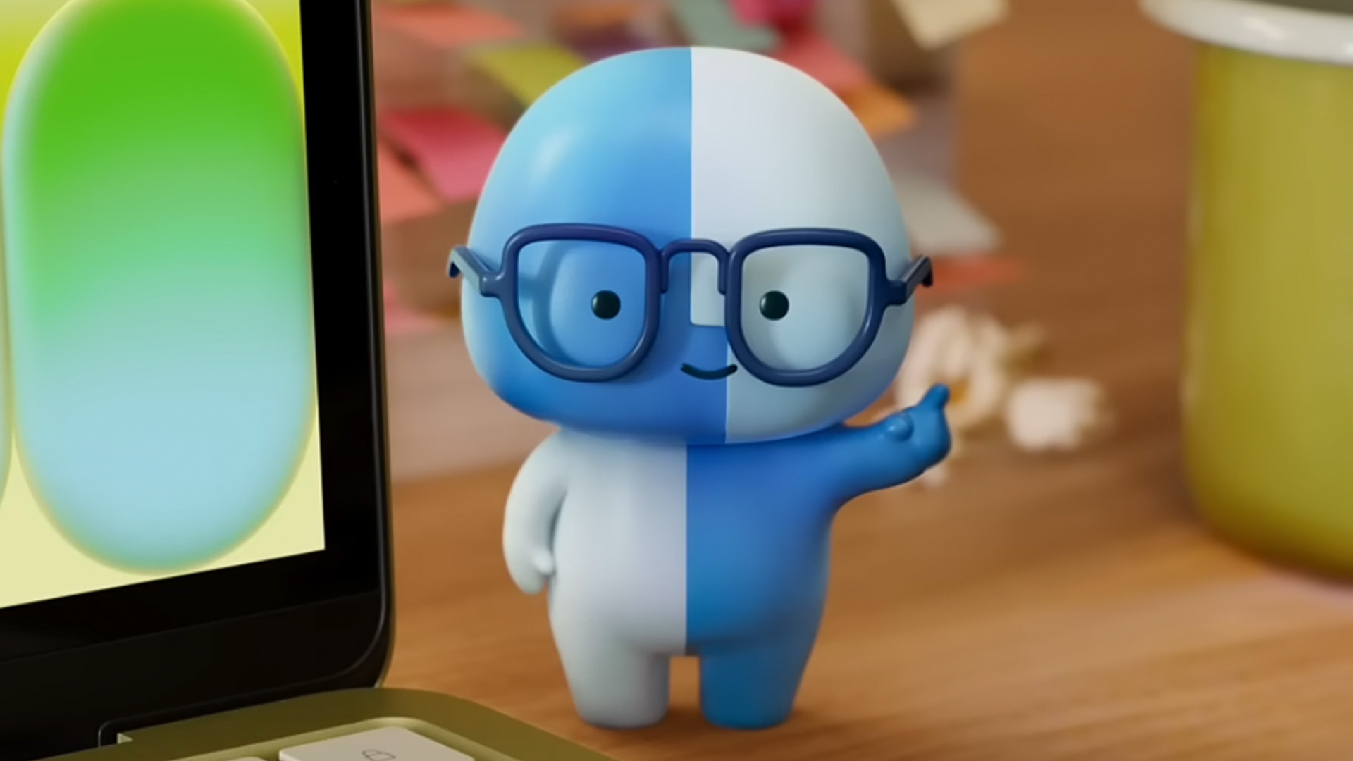
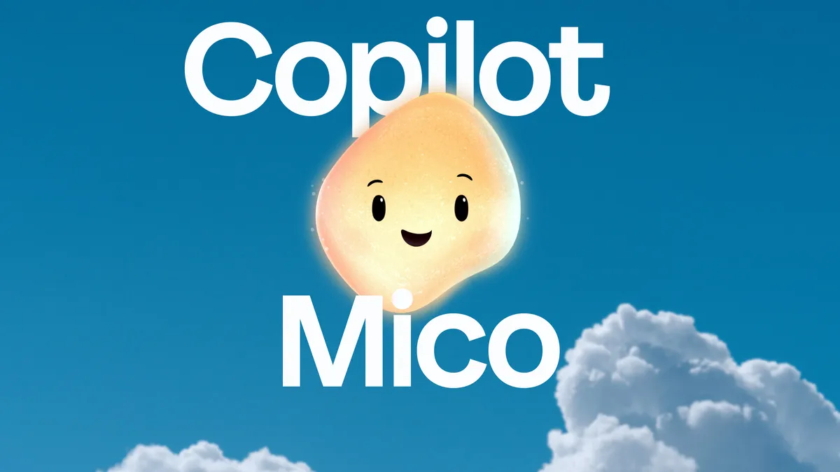
In the fast-evolving landscape of artificial intelligence, a curious trend has emerged. From the blinking eyes of Apple’s "Little Finder Guy" to the friendly digital puppy, Mico, powering Microsoft’s design tools, tech giants are increasingly turning to anthropomorphic mascots to serve as the face of their generative AI systems. As these corporations race to integrate complex, often opaque algorithms into the fabric of daily life, the strategic deployment of cute, approachable characters has become a central pillar of their user experience design.
But behind the cheerful animations and oversized eyes lies a complex question: Are these mascots legitimate tools for user engagement, or are they a sophisticated form of "corporate camouflage" designed to mask the anxieties surrounding the rapid adoption of AI?
The Rise of the Digital Companion
The resurgence of the digital mascot represents a pivot in UI/UX strategy. For decades, the interface was meant to be invisible—a sterile, functional conduit between the user and the software. Today, the interface has a personality.
Microsoft’s Mico is perhaps the most prominent example of this shift. Designed as a playful, cartoonish canine, Mico is intended to guide users through complex creative workflows. Similarly, Apple’s revitalized Finder mascot and various animated avatars across Mozilla’s suite are designed to be "sticky"—elements that encourage users to interact with software not as a tool, but as a peer.
This design philosophy is not entirely new. It draws inspiration from the early days of personal computing, where mascots like the original Finder icon or Microsoft’s ill-fated "Clippy" sought to humanize the daunting prospect of digital interaction. However, the stakes in the generative AI era are vastly different. These are not static icons; they are dynamic, responsive agents that represent a significant leap in how software behaves.

Chronology of Anthropomorphism in Tech
The trajectory of the "friendly face" in technology can be traced through several distinct eras:
- The Early Utility Era (1980s–1990s): Computing was inaccessible. Icons were designed to simplify navigation. The original Apple Finder icon provided a visual anchor for the Mac operating system, transforming a technical machine into a manageable environment.
- The "Clippy" Backlash (Late 1990s–2000s): Microsoft’s Office Assistant, Clippy, became a cautionary tale in user experience. While intended to be helpful, its intrusive, unsolicited nature made it a symbol of annoying, over-eager software, leading to a decade-long retreat from character-based design.
- The Silent Interface Era (2010s): As mobile computing took over, the "flat design" movement championed minimalism. Trust was built through clean lines, transparency, and efficiency. The "black box" of the algorithm became the standard.
- The AI Anthropomorphic Era (2023–Present): With the explosion of Large Language Models (LLMs), the "black box" is now seen as too intimidating or untrustworthy. Tech companies have resurrected the mascot, this time with sophisticated animation and personality-driven scripts, to act as a bridge between cold code and human emotion.
Supporting Data: Does Cuteness Drive Adoption?
Market research offers a compelling, if somewhat cynical, argument for this trend. A study highlighted by the BBC suggests that campaigns featuring mascots are 37% more likely to drive growth in market share. While this data predates the current AI boom, the psychological principles remain constant: humans are hard-wired to project agency and personality onto anything with eyes.
However, the efficacy of this strategy is debated. Critics point out that while a mascot might increase initial engagement, it does little to address the "trust deficit" inherent in AI systems. According to recent surveys on public sentiment toward AI, users are increasingly skeptical of data privacy, algorithmic bias, and the loss of human agency. The inclusion of a friendly, waving character—while visually pleasing—does nothing to mitigate these systemic concerns. In fact, for many users, the contrast between the "cute" interface and the "powerful", potentially intrusive back-end creates a cognitive dissonance that may actually heighten suspicion.
The Design Perspective: Hiring, Not Designing
Patrick, a veteran of the creative studio forpeople, argues that the industry is looking at the problem through the wrong lens. Having worked on sophisticated projects like NIO’s in-car AI assistant, Nomi, he suggests that a successful AI mascot should be treated like a new employee, not a graphic element.
"If you treat a mascot as a logo, it will always feel like a logo," Patrick explains. "When we designed Nomi, we didn’t just ask what it should look like. We asked what its role was. We defined its behavior, its moments of silence, its ability to be proactive versus reactive. We gave it the capacity to ‘withdraw’ when the user is tired or when children are sleeping. That is how you build a relationship—through consistent, respectful behavior."
From this perspective, the "cute vs. creepy" debate is a distraction. The real metric of success is long-term utility. A character that cracks jokes while the user is trying to perform sensitive financial analysis is not an assistant; it is a distraction. A successful mascot must exhibit "professionalism" in its digital form: it must understand context, adapt to the user’s emotional state, and, crucially, know when to stay silent.
Implications: The Ethics of the "Companion"
The drive to make AI a "companion" has profound ethical implications. By designing interfaces that mimic human behavior—complete with moods, animations, and conversational quirks—tech companies are intentionally blurring the lines between human and machine.
This raises significant concerns regarding emotional manipulation. If an AI is designed to make a user feel heard, supported, or even "loved," it creates a dependency that is unprecedented in consumer technology. The danger is not just that a mascot might be annoying, but that it might become a "corporate megaphone," masquerading as a friend while prioritizing the interests of the platform owner over the user.
Furthermore, the "companion" framing can lead to a false sense of security. A user may be more likely to share sensitive personal information or trust an AI’s output if it is delivered by a non-threatening, animated character. This "softening" of the AI’s presence serves to disarm the user, potentially lowering their defenses against the collection and utilization of their data.
Conclusion: The Path Forward
The future of AI interface design lies in a more mature approach to human-computer interaction. The current deluge of mascots is likely a temporary, reactionary phase—an attempt to make the overwhelming complexity of generative AI feel manageable.
To succeed in the long term, tech companies must move beyond the "cute" factor. They must shift their creative briefs from "How do we make this mascot look approachable?" to "How do we make this agent act in a way that is trustworthy, consistent, and respectful of the user’s intelligence?"
Building true connection requires more than just high-quality animation. It requires a commitment to transparency, the agency for the user to control the character’s behavior, and, perhaps most importantly, a recognition that the user does not want an AI "companion." They want a tool that functions effectively, behaves predictably, and respects the boundaries of their digital life.
As the industry matures, we may find that the best mascots are the ones that have the good sense to disappear when the work is done.