
 By Laily UPN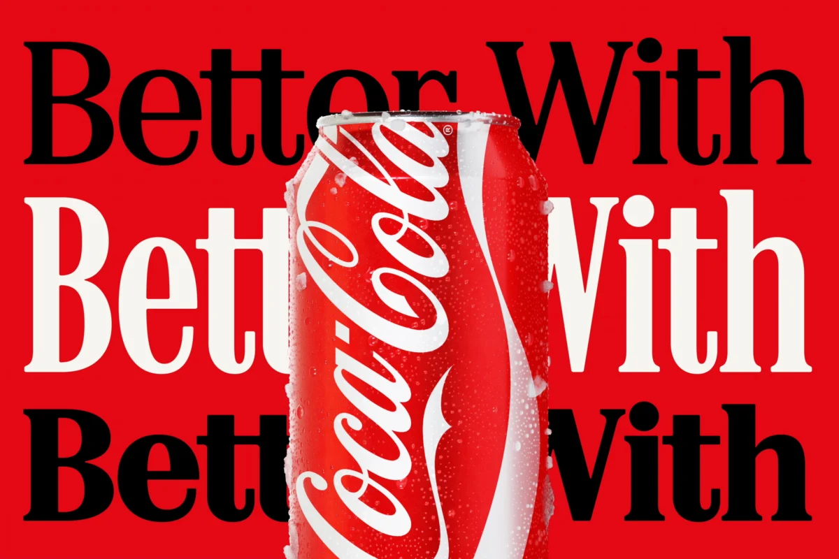
In the high-stakes world of global branding, consistency is the ultimate currency. Yet, for The Coca-Cola Company, a recent attempt to modernize its visual identity through a typography-heavy overhaul has triggered an unexpected, and arguably ironic, public relations conversation. The soft drink giant’s rollout of its new "Better With" typeface—a serif font designed to evoke heritage and movement—has been met with widespread comparisons to the iconic, stark branding of Marlboro cigarettes. As social media users dissect the visual similarities, the design community is left questioning how a multi-billion-dollar brand identity project could inadvertently echo the aesthetic of the tobacco industry.
The Anatomy of the Rebrand: A Typographical Pivot
The controversy centers on the "Better With" typeface, commissioned by Coca-Cola and developed by the renowned London-based studio Brody Associates in 2023. Initially conceptualized for a festive holiday campaign, the font was intended to serve as a cornerstone of the brand’s visual storytelling. According to the design brief, the goal was to craft a serif family that expressed the brand’s "unique personality, movement, and playfulness."
By pulling inspiration from the company’s extensive historical archives, Brody Associates aimed to synthesize Coca-Cola’s rich typographic heritage with modern functional requirements. The resulting typeface is elegant, retro-leaning, and highly legible—a deliberate move away from the purely utilitarian sans-serif fonts that have dominated the digital space for the past decade. However, the very attributes that provide this "heritage" feel—the high-contrast strokes and sharp, authoritative serifs—are exactly what have drawn the ire and amusement of the public, who see a striking resemblance to the classic Marlboro wordmark.
A Chronology of the Aesthetic Clash
The timeline of this branding shift is essential to understanding the intensity of the backlash:
- 2023: Brody Associates completes the "Better With" typeface, specifically for Coca-Cola’s seasonal marketing efforts.
- Early 2026: Coca-Cola announces a comprehensive brand identity overhaul, executed by the agency JKR, signaling a strategic shift toward a more sophisticated, archive-inspired look.
- July 2026: As the rollout hits major retail markets, eagle-eyed consumers on X (formerly Twitter) and TikTok begin drawing direct comparisons between the new packaging and vintage cigarette advertisements.
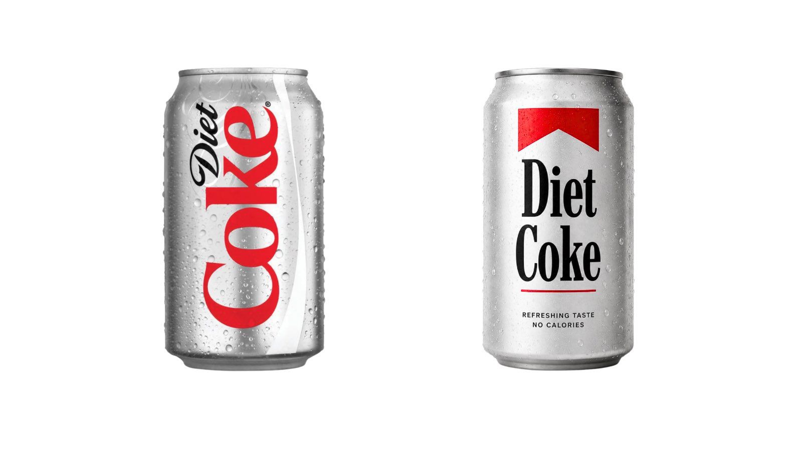
- Late July 2026: Viral posts featuring mock-ups of Diet Coke cans rendered in "Marlboro-style" branding begin to circulate, with users jokingly labeling the drink a "fridge cigarette."
The transition from a holiday-specific font to a global brand standard provided a platform for this comparison to explode. While the design was technically sound from a branding perspective, it failed to account for the subconscious visual associations of the modern consumer.
The "Fridge Cigarette" Phenomenon: Cultural Context
To understand why this is happening, one must look at the cultural zeitgeist. Recently, a viral meme has gained traction on social media, defining Diet Coke as a "fridge cigarette"—a tongue-in-cheek term for the addictive, habit-forming nature of the beverage. The meme suggests that for many consumers, the ritual of opening a cold Diet Coke provides a similar psychological "crutch" or sensory break to that of a smoker stepping outside for a cigarette.
When Coca-Cola released its new branding, which happens to utilize a red-and-white color palette that mirrors the tobacco industry’s most recognizable player, the internet did not hesitate to connect the dots. The "Better With" font, with its bold, authoritative serif structure, inadvertently validated the "fridge cigarette" narrative. For many, it felt as though the brand had finally, and perhaps too honestly, leaned into its reputation as a lifestyle vice.
Supporting Data: Why Serif Matters
Typography is a psychological trigger. Research in brand semiotics consistently demonstrates that serif fonts are perceived as "traditional," "authoritative," and "established," whereas sans-serif fonts are viewed as "modern," "accessible," and "clean."
Coca-Cola’s decision to move toward a more heritage-focused serif is a classic move for legacy brands looking to insulate themselves against the volatility of trend-driven design. However, the "Marlboro effect" highlights a classic failure in brand testing: the "contextual drift."
When testing a font in isolation, it may look timeless. When placed on a red-and-white can, however, the font enters a pre-existing semantic field. Because Marlboro is perhaps the most famous user of a high-contrast red-and-white serif identity, any brand entering that space—even one as large as Coca-Cola—runs the risk of being absorbed into the viewer’s existing mental schema for tobacco packaging.
Official Responses and Corporate Silence
As of this writing, neither The Coca-Cola Company nor JKR have issued a formal statement addressing the visual similarities. In the world of high-level corporate branding, silence is often a strategic choice. Engaging with the "Marlboro" comparison risks legitimizing a narrative that the company would likely prefer to avoid—namely, any association with the health-related stigmas of the tobacco industry.
Industry analysts suggest that the company is unlikely to pull the branding. The cost of a global rollout is astronomical, and "Better With" is deeply integrated into the company’s current marketing infrastructure. Instead, it is probable that Coca-Cola will wait for the initial wave of social media commentary to subside, betting on the fact that consumer recognition of their own logo will eventually override the transient comparisons to a cigarette brand.
The Broader Implications: Branding in the Age of Scrutiny
The situation offers a critical lesson for global brands: in a hyper-connected, meme-literate world, visual identity is no longer owned exclusively by the corporation. It is co-created by the consumer.
1. The "Sugar Tax" Context
The timing of this design choice is particularly delicate. With many nations, including the UK, implementing stringent "sugar taxes" and stricter regulations on the marketing of high-calorie products, the public is already primed to view soda companies with skepticism. Associating, even accidentally, with the aesthetic of the tobacco industry—a sector that has faced decades of aggressive public health crackdowns—is a brand manager’s nightmare.
2. The Limits of "Heritage" Branding
The "Better With" typeface is a testament to the power of history, but it also serves as a warning. Relying on "the archive" can lead to stylistic outcomes that are inadvertently retro. When that retro aesthetic overlaps with the branding of industries that have been heavily regulated or vilified, the brand’s image can suffer from an unintended "guilt by association."
3. The Power of Social Media Analysis
The speed at which these comparisons spread highlights a new reality for designers. The "court of public opinion" now has the tools to overlay, compare, and critique brand assets within minutes of their release. Brands can no longer rely on the assumption that their internal design teams have identified every potential association.
Conclusion: A Lesson in Visual Semiotics
Coca-Cola’s recent branding mishap is not a failure of design quality—the "Better With" font is, by all professional accounts, a beautifully executed piece of typography. Rather, it is a failure of semiotic foresight.
The company intended to evoke the nostalgia of their past, a time of simplicity and soda fountains. Instead, they hit a nerve that resonates with the modern, perhaps cynical, consumer who views their beverage choices through the lens of addiction and health-conscious skepticism. Whether the "fridge cigarette" meme fades away or becomes a permanent fixture of the brand’s identity, Coca-Cola’s experience serves as a stark reminder: when you design for the public, the public will design the meaning for you.
As the brand moves forward, the success of this rebrand will likely depend on whether they can distance themselves from the tobacco comparison through consistent, positive, and forward-looking messaging. Until then, the red-and-white cans will continue to draw stares—not just for the refreshment they provide, but for the unintentional story they tell.
 Nana Muazin
  Raul Delapena Setiawan
  Ammar Sabilarrohman