
 By Neng Nana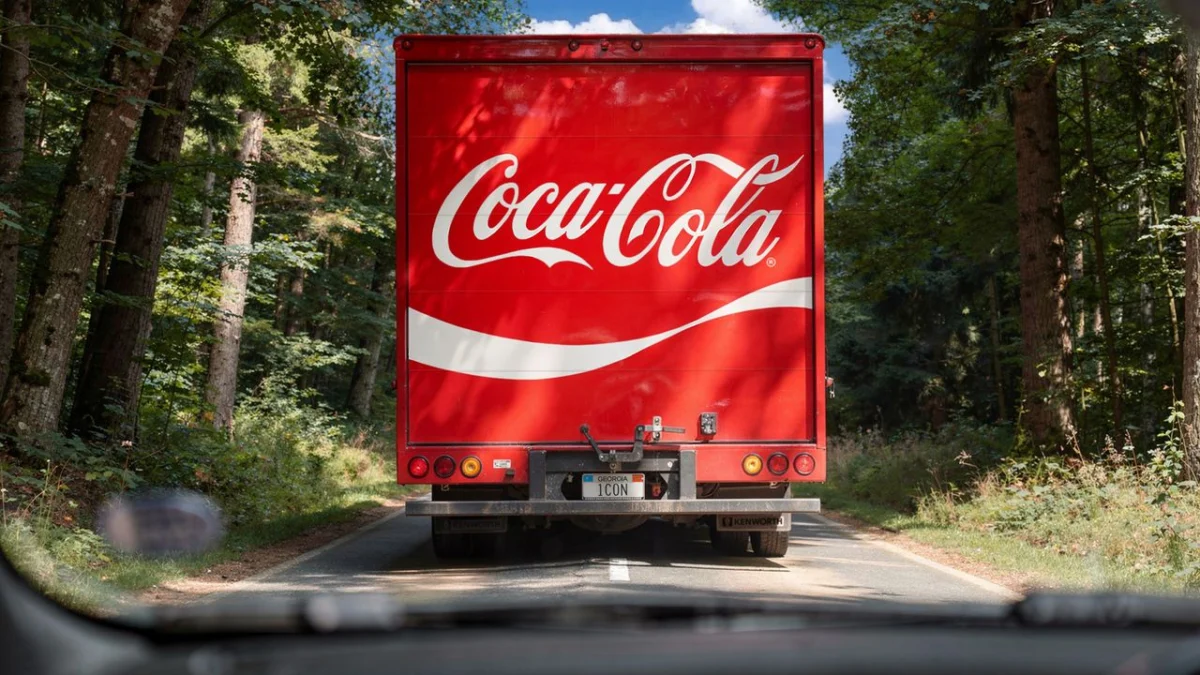
In the world of global branding, few visual identities are as recognizable—or as burdened by history—as the Coca-Cola script. Recently, the beverage giant embarked on a strategic mission to unify its visual identity across global territories and disparate consumer touchpoints. The directive given to design agency Jones Knowles Ritchie (JKR) was deceptively simple: “Make Coca-Cola more Coca-Cola.”
This initiative was not a revolution, but an evolution—a meticulous refinement aimed at amplifying the core elements that define the brand’s century-old heritage. By stripping away visual noise and refocusing on the brand’s most potent assets, JKR has provided a masterclass in how legacy brands can stay relevant in a fragmented digital marketplace.
The Core Mandate: Understanding the "More Coca-Cola" Brief
When a brand possesses the equity of Coca-Cola, the instinct is often to protect the status quo. However, in an era where the brand must thrive on everything from traditional billboards to high-resolution mobile app icons, consistency becomes the primary challenge.
The mandate given to JKR was rooted in the concept of "amplification." The design team was tasked with identifying the "holy trinity" of Coca-Cola’s visual assets: the iconic Spencerian script, the specific vibrant red, and the proprietary bottle silhouette. The goal was to ensure that, regardless of where a consumer encountered the product—be it in a dusty convenience store in rural Asia or a high-end digital advertisement in New York City—the "Coca-Cola-ness" of the experience remained absolute.
A Chronological Perspective: Evolution of the Script
To understand the weight of this project, one must look back at the history of the Coca-Cola logo. Since its inception in 1886 by Frank Mason Robinson, the logo has undergone subtle, yet meaningful, shifts.
The Formative Years (1886–1940s)
Initially, the logo was a handwritten script that underwent several stylistic experiments. It wasn’t until the early 20th century that the now-famous Spencerian script began to solidify into the standard we recognize today. During this era, the brand established its core visual identity, relying heavily on the flowing elegance of the lettering to convey a sense of premium quality and refreshment.
The Mid-Century Modernization (1950s–1980s)
As the brand expanded globally, the logo was adapted to accommodate new printing technologies and packaging materials. The introduction of the "Dynamic Ribbon"—the white swoosh that accompanies the script—became a pivotal design element, providing a visual anchor that complemented the fluid motion of the logo.
The Digital Era and Simplification (1990s–Present)
The rise of digital media necessitated a new kind of visual clarity. The latest refinement by JKR marks the culmination of a decade-long trend toward "reductive design." By removing unnecessary drop shadows, gradients, and excessive beveling, the current iteration of the Coca-Cola identity returns to the purity of the original design, ensuring that it remains legible even when scaled down to the size of a smartwatch screen.
Supporting Data: Why Consistency Matters
Branding experts often point to the "Power of Recognition" as the primary driver of market share. For a company like Coca-Cola, which spends billions on global marketing, visual inconsistency is more than an aesthetic issue; it is a financial drain.
Recent market studies indicate that brands with highly consistent visual identities experience an average revenue increase of 23%. Coca-Cola’s recent efforts are directly tied to this metric. By unifying their design system, they are reducing the "cognitive load" on the consumer. When the brain can instantly identify a product without reading the text, the speed of purchase decision increases.
Furthermore, JKR’s approach involved an exhaustive audit of brand touchpoints. They analyzed thousands of regional variations—some of which had drifted significantly from the core guidelines over the decades—and synthesized them into a singular, cohesive design language. This process not only reinforces brand equity but also streamlines production costs for regional offices, who no longer need to reinvent the wheel for every campaign.
Official Responses: The Philosophy of JKR
In recent interviews, the creative leads at JKR highlighted that the project was less about "designing" and more about "curating."
"We weren’t inventing something new," the agency noted. "We were looking for the ‘truth’ of the brand. We asked ourselves, what is the one thing that, if removed, would make it not Coca-Cola? That answer became our North Star."
The collaboration between JKR and the Coca-Cola internal brand team was characterized by a "back to basics" philosophy. By studying the archives and the original pen-and-ink drawings of the logo, the team was able to refine the stroke weight and the spacing of the letters to ensure that the logo appeared "bolder" and "more vibrant" without changing its inherent geometry.
The agency’s ‘making of’ content, which features archival footage and behind-the-scenes sketches, serves as an educational tool for the design community. It demonstrates that even the most successful brands in the world must periodically pause to sharpen their identity, ensuring that the legacy remains the hero of the story.
Implications: The Future of Global Branding
The implications of this refresh extend far beyond the beverage industry. Coca-Cola is setting a precedent for how global entities should handle brand maintenance in the 21st century.
1. The Rise of "Quiet" Rebranding
We are moving away from the era of radical rebrands—where companies would suddenly adopt entirely new fonts or color palettes—and moving into an era of "quiet" refinement. Brands are realizing that their history is their most valuable asset. The trend now is to "de-clutter" rather than "re-invent."
2. Digital-First Design
By prioritizing scalability, Coca-Cola has ensured its logo works in every digital format. This is a critical lesson for modern startups: if your logo doesn’t look iconic at 16×16 pixels, it is not optimized for the modern internet.
3. Cultural Unification
In a globalized world, the ability to maintain a singular, recognizable image across different cultures is a competitive advantage. Coca-Cola’s move to unify its identity helps reinforce the brand as a universal symbol, transcending linguistic and cultural barriers.
Conclusion: The Endurance of the Icon
Coca-Cola’s decision to "make Coca-Cola more Coca-Cola" is a testament to the power of focus. In a world saturated with ephemeral design trends and fleeting aesthetic fads, the company has chosen to double down on its foundational strengths.
By stripping away the unnecessary and highlighting the iconic, JKR has ensured that the Coca-Cola brand remains as relevant today as it was in the late 19th century. For designers and brand strategists, the project serves as a profound reminder: the most effective way to innovate is often to look backward, find the core truth of your subject, and amplify it with uncompromising clarity.
As Coca-Cola continues to navigate a rapidly changing consumer landscape, this refreshed visual identity provides a sturdy anchor. It is a reminder that while the world around us changes, the essence of an icon remains constant, provided it is handled with the sensitivity and respect it deserves. Whether on a glass bottle, a digital billboard, or a social media feed, the "more Coca-Cola" approach ensures that the world’s most famous script will continue to be read, recognized, and refreshed for generations to come.
 Nana Muazin
  Raul Delapena Setiawan
  Ammar Sabilarrohman