
![]()
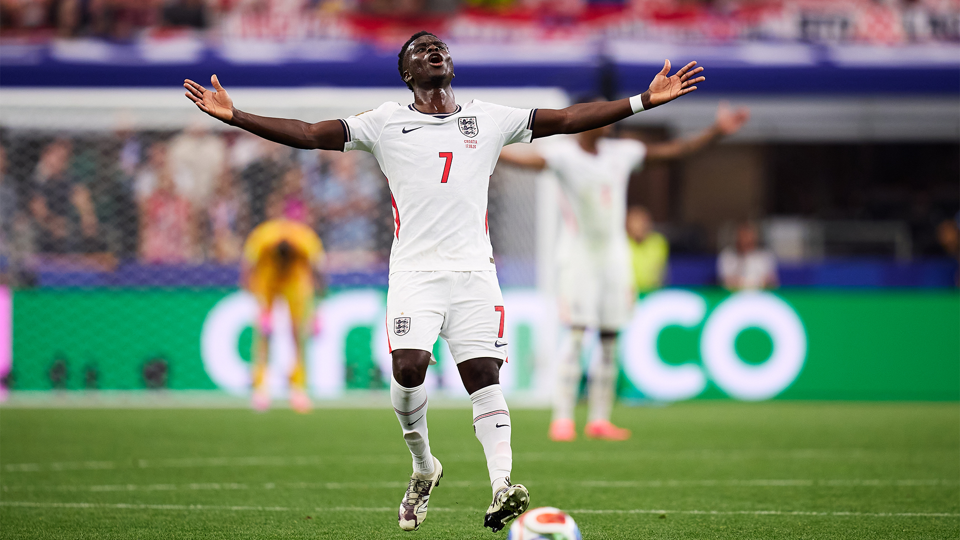
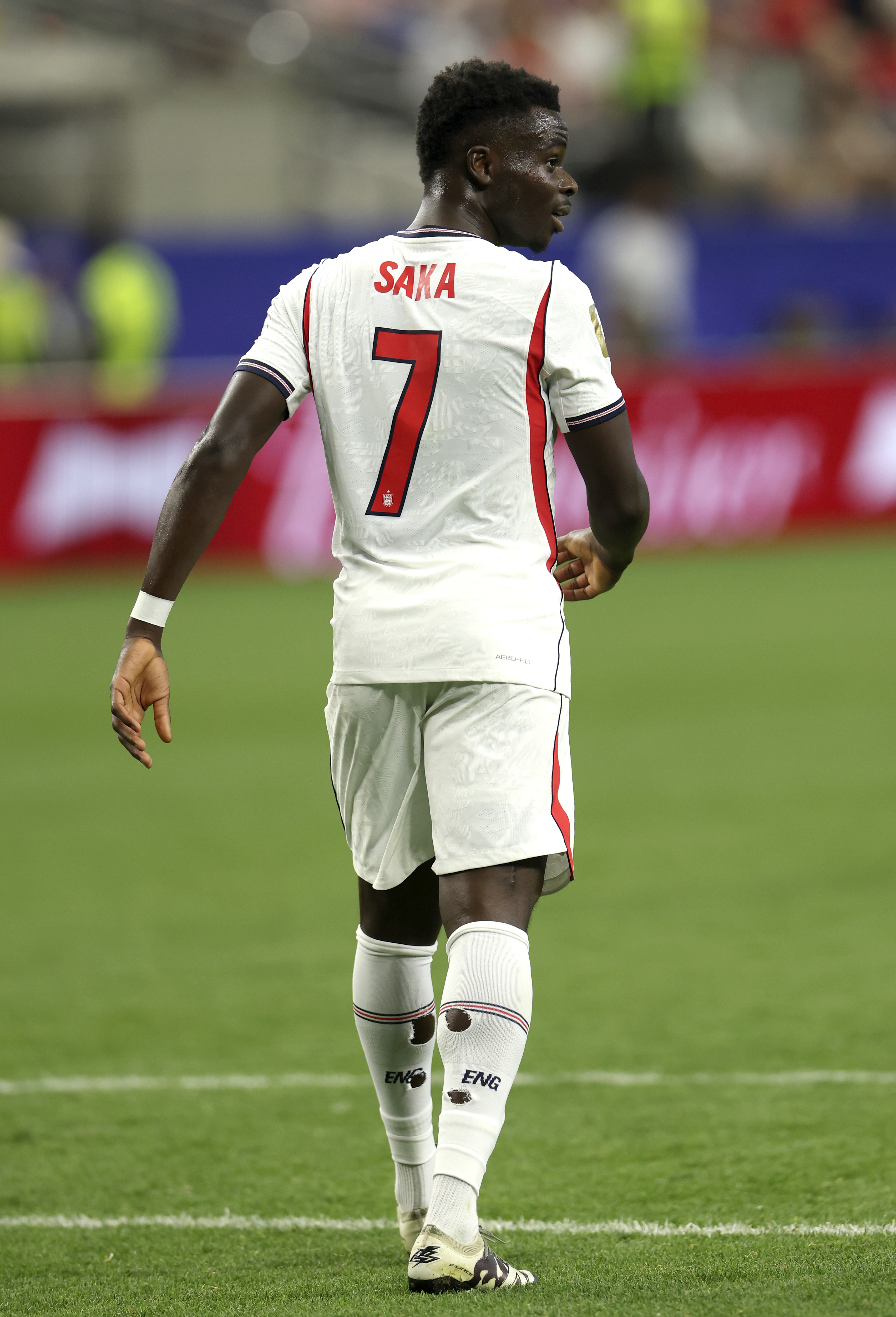
In the high-stakes arena of modern professional football, where the lines between elite athleticism and global lifestyle branding blur, Bukayo Saka has taken a definitive step forward. During the intensity of the FIFA World Cup 2026, the England and Arsenal talisman quietly debuted a personal logo—a visual shorthand for his burgeoning identity as a global icon. Appearing on his exclusive Stone Island x New Balance collaboration, the logo is not merely a piece of apparel branding; it represents the solidification of a personal brand that has been years in the making.
The Main Facts: A Silhouette of Success
The reveal was subtle, appearing on the Stone Island x New Balance Furon Elite FG v9 boots during the tournament. For most, the focus remained on the pitch, but design enthusiasts and eagle-eyed fans were quick to notice the departure from standard kit markings.
The logo itself is a masterclass in modern minimalist design. It features a stylized, sharp-edged rendition of Saka’s initials, "BS," cleverly abstracted into a lightning-bolt motif. The design avoids the cluttered tropes often associated with athlete branding, opting instead for clean lines and a high-contrast geometric form. This visual identity is a collaborative effort between the athlete and the design teams at Stone Island and New Balance, signaling a shift toward a more curated, luxury-sport aesthetic.
A Chronology of a Partnership
To understand the significance of this logo, one must look at the timeline of Saka’s ascent within the commercial landscape.

- 2021: The Initial Alignment: Bukayo Saka signed a major endorsement deal with New Balance. At the time, he was already established as a premier talent, but this partnership marked his transition into the upper echelon of sponsored athletes who command significant influence over product development.
- 2023-2024: The Creative Integration: Throughout this period, Saka began working closely with New Balance’s design labs. This phase involved more than just wearing the gear; it involved feedback loops, material testing, and discussions about personal branding.
- 2025: The Stone Island Collaboration: The announcement of the Stone Island x New Balance partnership served as the perfect incubator for the logo. Stone Island, a brand synonymous with technical innovation and cult-like fashion status, provided the ideal canvas for a more "premium" athlete logo.
- 2026: The World Cup Debut: The global stage of the 2026 World Cup served as the ultimate launchpad. By integrating the logo into his performance footwear during the most watched sporting event on the planet, Saka and his partners ensured maximum visibility without needing a heavy-handed advertising campaign.
Supporting Data: Why Athlete Branding Matters
The economics of modern football are no longer dictated solely by salary caps or transfer fees. According to sports marketing analysts, the "personal brand premium" can account for up to 40% of an elite athlete’s total annual earnings.
In the case of Saka, the move to a bespoke logo is a calculated play for long-term relevance. Data suggests that athletes who possess a distinct, recognizable visual mark—much like the "CR7" or "Jumpman" logos—see a significant uptick in consumer engagement for co-branded merchandise. The collaboration with Stone Island is particularly strategic; by tapping into the "gorpcore" and high-fashion streetwear demographics, the logo elevates Saka from a "footballer" to a "lifestyle icon."
The design philosophy behind the "BS" lightning bolt also aligns with contemporary trends in corporate identity. In a digital-first world, logos must be legible at small sizes (on a phone screen) and versatile enough to be embroidered, printed, or embossed on everything from performance wear to luxury lifestyle items. The "lightning bolt" aesthetic implies speed, energy, and intensity—traits that directly mirror Saka’s playing style on the wing.
Official Responses and Creative Vision
While official statements from the parties involved have been measured, the intent is clear. A spokesperson for New Balance noted that the collaboration with Stone Island was "designed to push the boundaries of what performance footwear can be," adding that the introduction of personal iconography for Saka was a natural progression of his role as the face of their football division.
From a design perspective, the logo has been praised for its restraint. In an era where many athletes opt for overly complex designs that attempt to combine too many elements, Saka’s logo remains a minimalist standout. It avoids the temptation to include footballs, boots, or kits, focusing instead on the abstract energy of the initials. This approach suggests a confidence in the athlete’s own name—a sign that he has moved beyond needing to prove his profession through a graphic icon.
The Broader Implications: A New Era for Footballers
The unveiling of the logo carries deeper implications for the business of football. We are currently witnessing a shift where players are increasingly treated as independent creative entities rather than mere assets of their clubs.
1. The Power of Intellectual Property
By formalizing his initials into a trademarked logo, Saka is securing his intellectual property. This allows for greater control over how his image is used and sets the stage for future solo ventures. Whether it is through fashion lines, digital content, or philanthropic initiatives, having a "visual brand" allows for a consistent identity that transcends his time on the pitch.
2. The Influence of Streetwear
The partnership with Stone Island is a tacit acknowledgment that football fans are also fashion consumers. By merging the technical performance of New Balance with the aesthetic pedigree of Stone Island, the collaboration targets a sophisticated consumer base that values rarity and design language. Saka’s logo acts as the "stamp of authenticity" for this specific segment of the market.
3. Future-Proofing the Career
Professional football careers are notoriously short. The transition from "active player" to "brand ambassador" is often fraught with difficulty. However, by establishing a visual identity early, Saka is building a foundation that can sustain him long after he hangs up his boots. The logo acts as a bridge between his athletic achievements and his future career, ensuring that his brand equity remains intact regardless of the specific team or league he plays for.
Conclusion: The Quiet Revolution
Bukayo Saka’s new logo is a microcosm of the modern professional athlete’s journey. It is a calculated, well-executed, and aesthetically sound move that balances the demands of performance with the realities of global marketing.
As the World Cup 2026 continues to dominate the headlines, the "BS" lightning bolt serves as a reminder that the game is played on two fields: the one with the grass, the lines, and the ball, and the one where brand value, design, and influence are fought over in the minds of millions of fans. For Saka, the transition to being a brand unto himself has officially begun, and if this logo is any indication, he is approaching this new chapter with the same precision and flair that has defined his career on the pitch.
As fans continue to analyze every aspect of the World Cup, from the kits to the tactical shifts, they would do well to look down at the boots. There, etched in the materials of the future, lies the next phase of one of football’s brightest stars. The logo is not just a symbol—it is a signal that Bukayo Saka has arrived as a titan of the design and style world, ready to leave his mark on history, both inside and outside the stadium.
