
As Sporting Clube de Portugal (SCP) commemorates its monumental 120th anniversary, the legendary Lisbon-based club is doing more than just reflecting on its storied past. In a strategic maneuver that bridges its rich heritage with a bold, forward-thinking future, the club has unveiled a comprehensive brand evolution. Developed in collaboration with the renowned global branding agency JKR, this identity refresh is not merely a cosmetic update; it is a profound re-codification of the club’s DNA, designed to resonate with a new generation of fans while honoring the supporters who have stood by the "Leões" (Lions) since 1906.
The Core Transformation: Decoding the Club’s Symbols
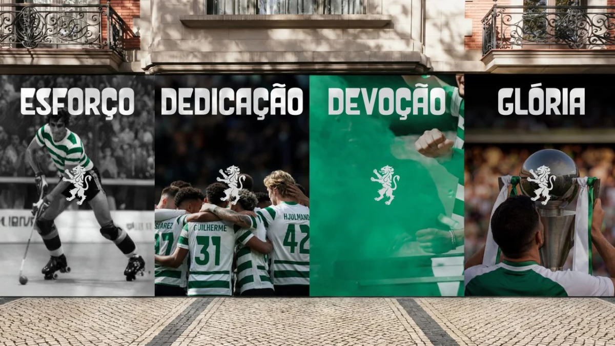
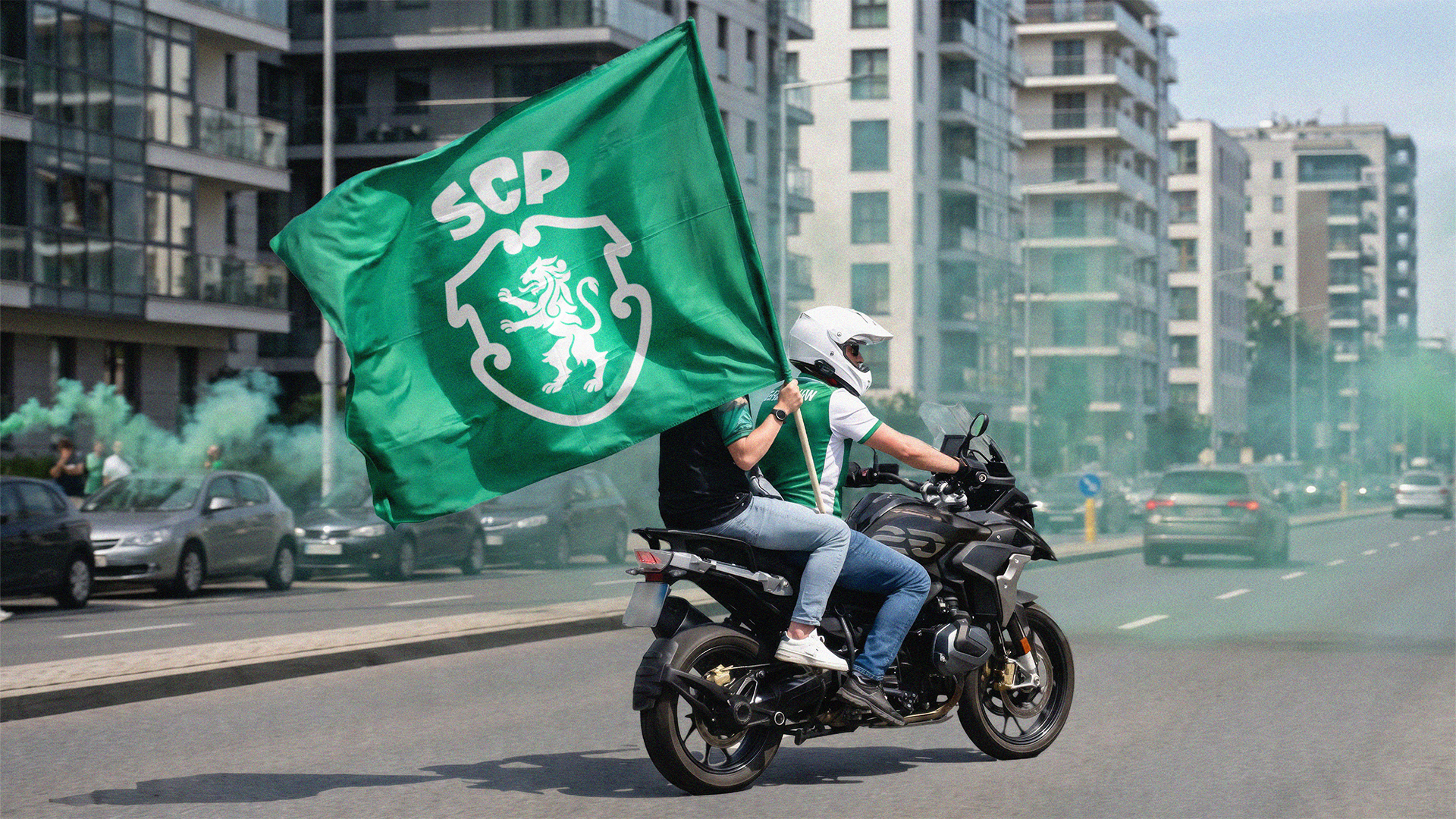
At the heart of this identity shift is the concept of the "Club’s Code"—a visual and narrative framework that distills the essence of Sporting CP into five foundational symbols. These elements have been carefully curated and modernized to form a cohesive brand system that feels both ancient and contemporary.
The five pillars of the new identity include:
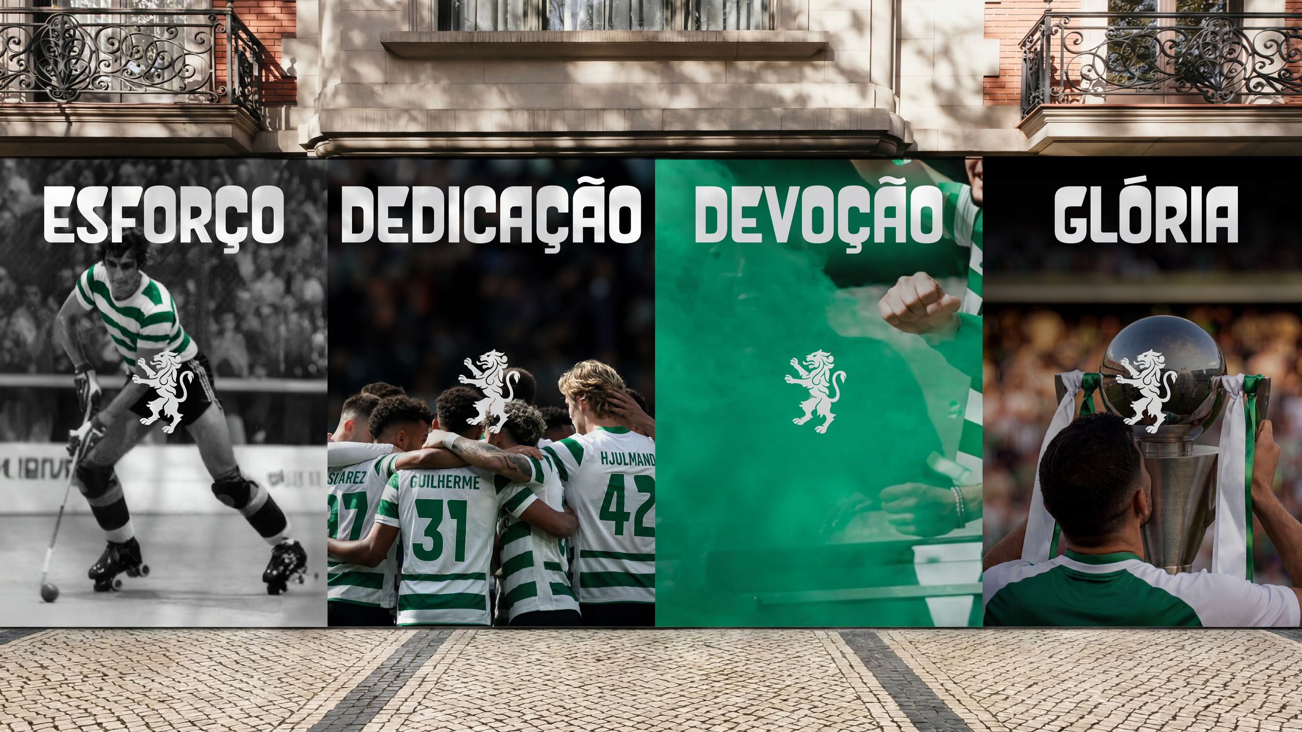
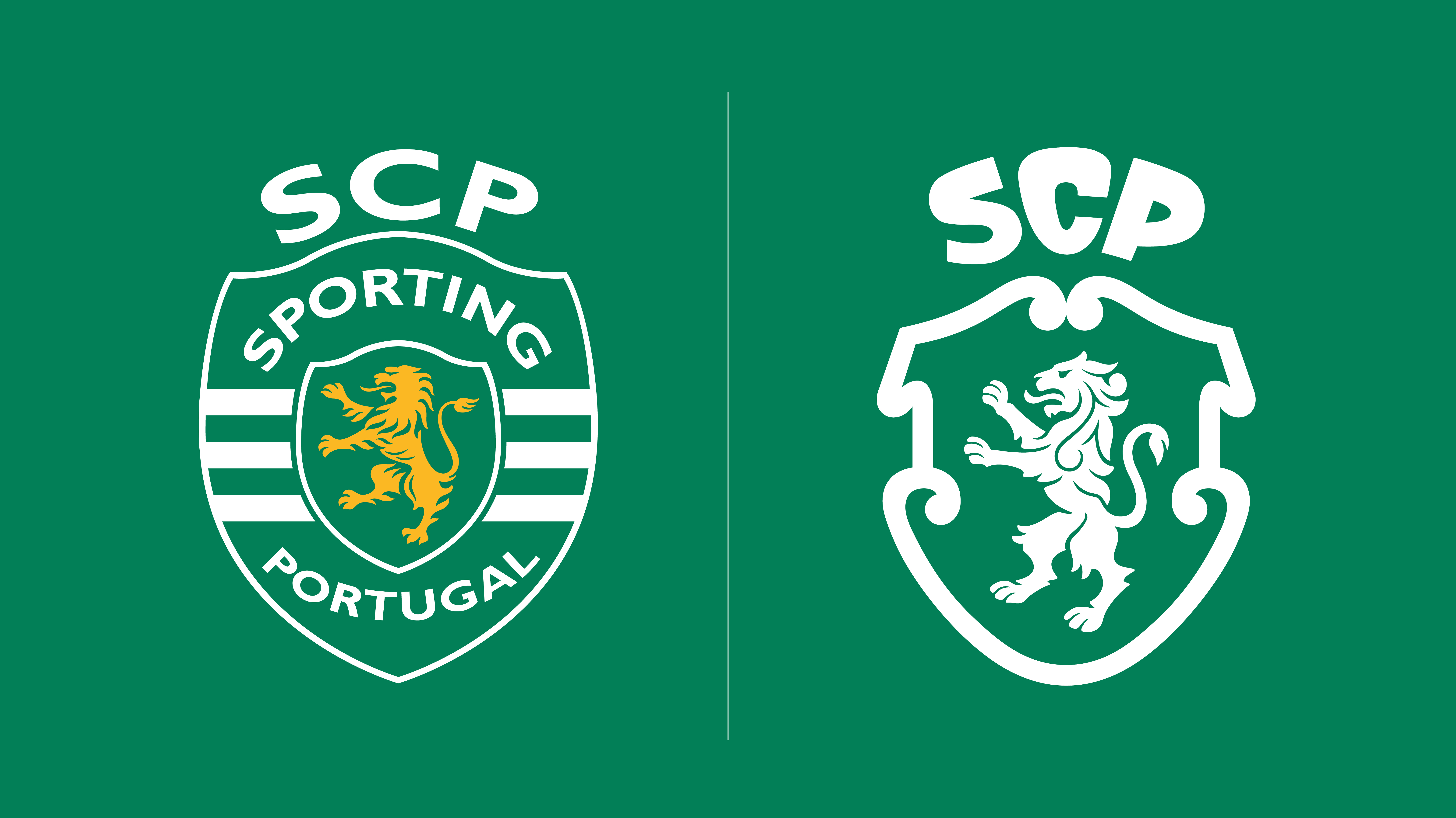
- The Lion: Serving as the quintessential emblem of the club’s spirit and its fan base, the lion has been refined to reflect strength and agility, drawing inspiration from the evolution of the crest across the club’s previous iterations.
- The Shield: A nod to the club’s deep-rooted Portuguese heritage, the shield serves as the structural anchor of the new crest.
- The Crown: Positioned prominently, the crown now elegantly incorporates the "SCP" acronym, rendered in the bespoke new typeface, Sporting Sans.
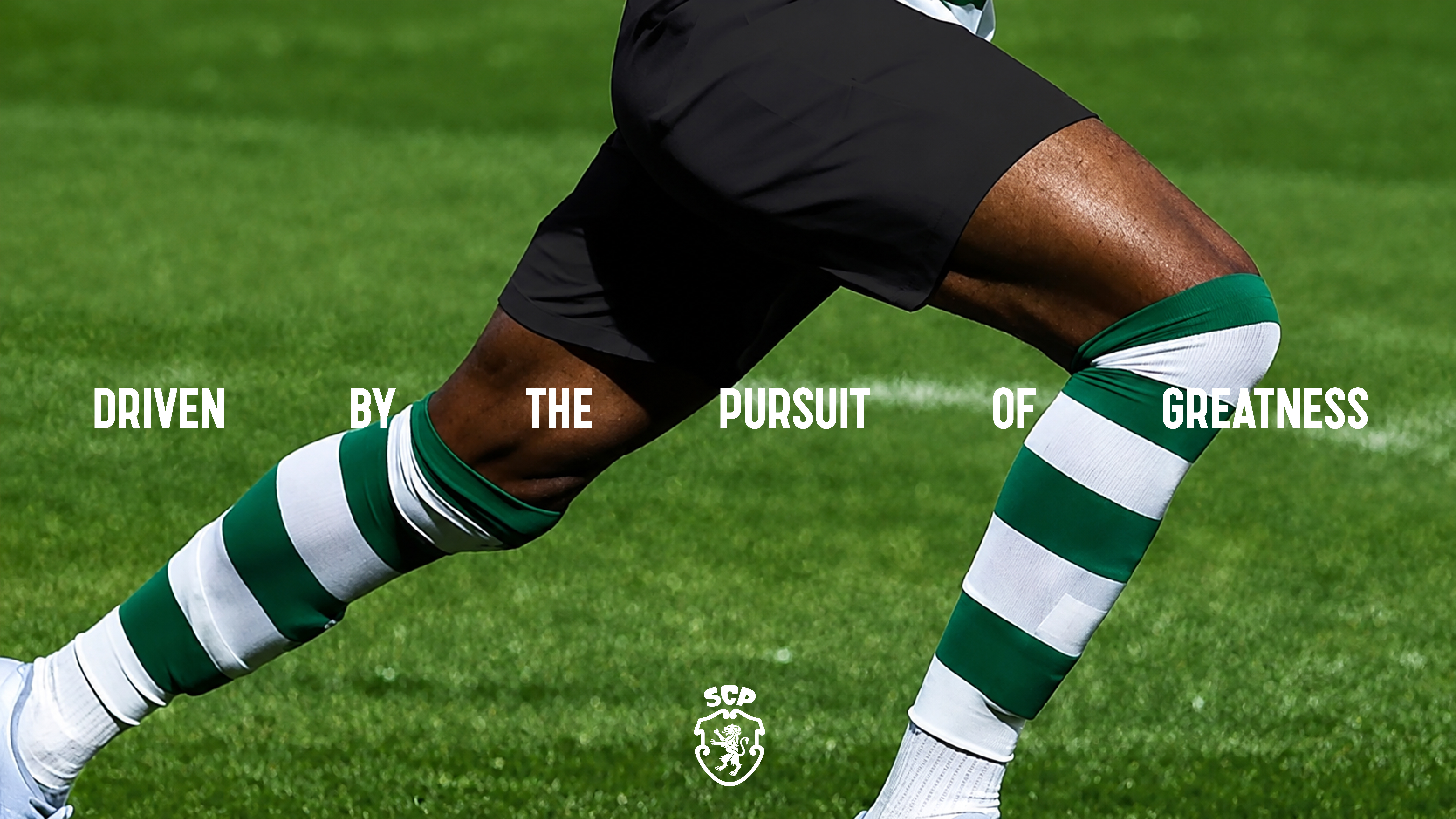
- The Stripes: The iconic green and white stripes—the visual signature of the club—have been reimagined to drive the brand’s dynamic motion design, appearing in various digital and physical applications.
- Porta 10-A: Perhaps the most symbolic addition, this element is inspired by the iconic gate at the Estádio José Alvalade where players enter the pitch, serving as a constant reminder of the bridge between the fans and the glory of the game.
A Chronology of Identity: From 1906 to the Present
To understand the significance of this rebrand, one must look at the timeline of Sporting CP’s visual evolution. Since its founding in 1906, the club’s crest has undergone several iterations, each reflecting the aesthetic sensibilities of its era while maintaining the core tenets of the club’s identity.
- The Early Era (1906–1940s): The initial logos were focused on athletic simplicity, establishing the green and white color palette as the permanent visual language of the club.
- The Classic Era (1945): The 1945 emblem serves as the primary inspiration for the current project. Its composition was considered the "gold standard" for the club’s heraldry, providing a balanced geometric foundation that JKR sought to restore and sharpen.
- The Modernization (1990s–2010s): As digital media became the primary medium for sports marketing, the club’s crest moved toward flatter, bolder designs. However, over time, the visual identity suffered from a lack of cohesion across various platforms.
- The 120th Anniversary Evolution (2024): This latest transition is a strategic consolidation. Rather than reinventing the wheel, the agency opted for "evolutionary design," stripping away unnecessary clutter to ensure the crest is legible on everything from a giant stadium screen to the tiny avatar on a social media profile.
The Design Philosophy: "No Limits, Just Legacy"
The collaboration with JKR was centered on a philosophy of "respectful innovation." Sean Thomas, Global Executive Creative Director at JKR, articulated the vision behind the project: "This was not a case of starting from scratch. It was about staying faithful to the club’s legacy and true to its loyal fans, while attracting and remaining relevant to the next generation and wider culture. Our job was to build a brand system that carries the spirit of Sporting CP forward without limits."
The introduction of Sporting Sans is particularly noteworthy. Typography in sports branding is often overlooked, yet it is the primary vehicle for brand voice. Sporting Sans is a highly legible, clean, and aggressive typeface that complements the sharp angles of the new crest. It allows the club to maintain a consistent tone of voice across match-day posters, merchandise, and digital content, creating a professional and unified aesthetic that rivals the most successful brands in world football.

Supporting Data: Why Rebranding Matters in Modern Football
In the current landscape of European football, a club’s crest is its most valuable asset. It is the centerpiece of revenue-generating merchandising, the face of international digital broadcasts, and the ultimate symbol of brand equity.
Studies in sports marketing have consistently shown that clubs with "simplified" or "scalable" logos experience higher engagement rates on digital platforms. When a logo is too complex, it loses impact in small-format digital environments (such as mobile apps or social media icons). By reducing the visual noise and emphasizing the core five symbols, Sporting CP has ensured that its brand remains "future-proofed."
Furthermore, the integration of motion design—using the green and white stripes as a core kinetic element—allows the club to occupy more space in the digital consciousness. Whether it is an animated transition during a broadcast or a loading screen on the club’s official app, the brand is now built to move, not just to sit statically on a jersey.
Official Perspectives: The Board and the Agency
The club’s leadership has emphasized that this move was a necessary step to align the organization’s visual output with its athletic ambitions. Sporting CP has long been a powerhouse of talent production—famously producing legends like Cristiano Ronaldo and Luís Figo—and the board felt that the club’s brand should project the same level of global prestige as the talent it develops.
For JKR, the challenge was balancing the "traditionalist" faction of the fan base with the "digital-native" generation. By basing the redesign on the 1945 emblem, they successfully utilized the "nostalgia factor" to placate traditionalists, while the cleaner, more aggressive geometric lines satisfy the modern aesthetic demands of global sports design.
Implications for the Future
What does this mean for the future of Sporting CP?
Firstly, it signals a shift toward a more aggressive international marketing strategy. By cleaning up the visual identity, the club is making it easier for global partners and sponsors to integrate the Sporting brand into their own marketing collateral. A cleaner logo is more "pluggable" into international campaigns.
Secondly, it sets a new standard for the Portuguese Primeira Liga. Sporting CP is effectively challenging its rivals to modernize their own identities. In a league that is often characterized by its deep traditional roots, Sporting is positioning itself as the vanguard of a new, globalized era of Portuguese football.
Finally, the brand evolution serves as a recruitment tool. In the eyes of young athletes, a club that invests in its brand, its aesthetics, and its digital presence is a club that cares about its standing in the world. It frames the club as a modern, ambitious, and professional environment.
Conclusion: A Masterclass in Brand Evolution
The 120th-anniversary rebranding of Sporting Clube de Portugal is a masterclass in how to handle legacy in the 21st century. It avoids the pitfall of "design for the sake of design," opting instead for a deliberate, symbolic, and functional evolution.
By grounding the project in the club’s history—the 1945 crest, the Porta 10-A, the classic green and white stripes—JKR has created an identity that feels familiar yet entirely new. As the club enters its next decade, it does so with a visual armor that is as sharp and distinctive as the playstyle on the pitch. The "Code" has been rewritten, and the result is a brand that is, in every sense of the word, ready for the world stage.
Whether you are a lifelong fan who remembers the glory of the old crest or a new supporter discovering the club’s rich history for the first time, the new Sporting CP identity is a testament to the fact that when you honor your past with purpose, your future becomes limitless.
