
 By Laily UPN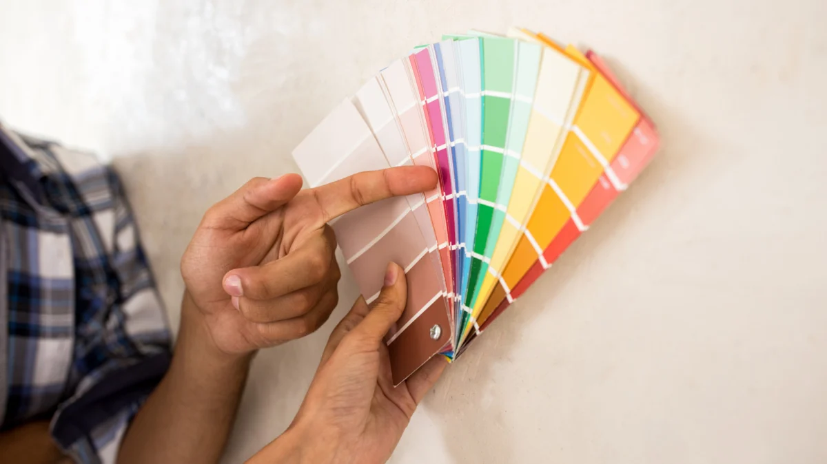
The modern kitchen has undergone a radical transformation over the last decade. After years of the "all-white" aesthetic dominating Pinterest boards and real estate listings, homeowners and designers are pivoting back to the embrace of natural materials. Warm wood tones—from classic honey oak to rich, honey-hued maple—are experiencing a significant resurgence. This shift represents a return to nostalgia, organic textures, and the desire for a kitchen that feels less like a sterile laboratory and more like the beating heart of the home.
However, integrating warm wood into a contemporary color palette is a delicate balancing act. Many homeowners struggle with the "dated" perception of wood cabinetry, often feeling the urge to reach for a paintbrush and cover the grain entirely. Yet, with a foundational understanding of color theory and a strategic approach to wall treatments, those vintage wood tones can be transformed into the star of a sophisticated, high-end interior.
Main Facts: The Science of Complementary Color Theory
The secret to successfully pairing paint with wood lies in the color wheel. Because warm woods—like oak, cherry, and pine—possess undertones of orange, yellow, or deep red, the goal is to choose wall colors that either harmonize through shared warmth or provide a sophisticated contrast.
The primary pitfall many homeowners encounter is "monochromatic overload." When you pair warm-toned wood with yellow or orange-tinted paint, the room becomes visually overwhelming and dated. The wood loses its character, and the kitchen begins to feel flat. Conversely, by selecting colors that sit across from these warm tones on the color wheel—specifically blues and greens—you create a "visual temperature balance." This contrast allows the wood grain to stand out as an organic feature rather than a relic of a past design era.
Chronology of the Wood-Paint Paradigm
The relationship between wood cabinets and wall color has shifted significantly over the last forty years:
- The 1980s and 90s: Honey oak reigned supreme. During this era, cabinets were often paired with "safe" neutrals like beige or stark white. As the cabinets aged and the wood darkened, these spaces often felt yellowed and uninspired.
- The 2010s: The "White Kitchen" movement took hold. Homeowners began painting over high-quality wood cabinets in mass, prioritizing light, airy, and sterile aesthetics.
- The 2020s: A return to "Newstalgia." Designers are now championing the preservation of natural wood. The current trend focuses on "elevated earthiness," where the warmth of the wood is tempered by moody, grounded, or soft organic paint colors that highlight the craftsmanship of the cabinetry.
Supporting Data: Six Paint Colors That Elevate Wood
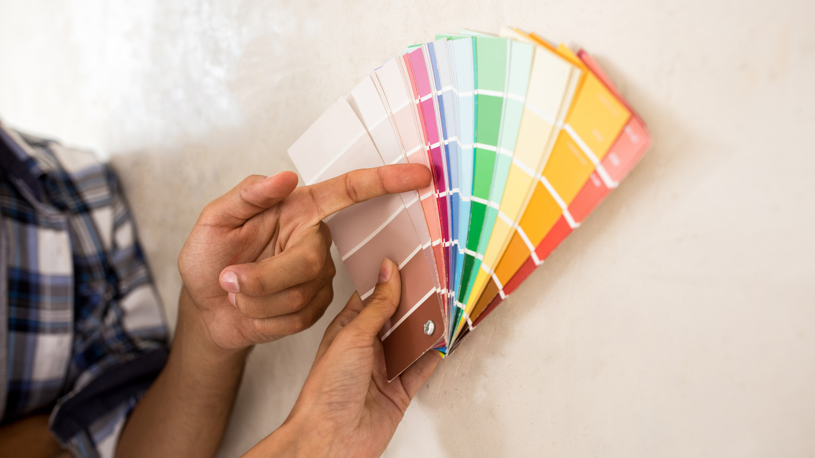
To successfully bridge the gap between vintage cabinetry and a modern aesthetic, consider these six professionally curated color palettes:
1. Soft Sage Green
For those desiring a "cottage-core" or organic aesthetic, soft sage is unmatched. Because green is the direct complement to the red/orange undertones found in many woods, it provides an immediate sense of equilibrium. A shade like Sherwin-Williams’ "Soft Sage" acts as a neutral that brings the outdoors in, highlighting the organic beauty of the grain without creating a jarring contrast.
2. Deep Olive Green
If your goal is drama, move toward deeper, moodier greens. Benjamin Moore’s "Dark Olive" is a transformative choice. It grounds the warm wood, pulling it away from a "yellow" appearance and into a more sophisticated, forest-inspired palette. This is an ideal choice for larger kitchens with ample natural light.
3. Warm White and Cream
Not all whites are created equal. Avoid stark, blue-tinted whites, which can make wood look orange by comparison. Instead, look for creamy, warm whites like Sherwin-Williams’ "Alabaster." These colors act as a soft canvas, allowing the wood to take center stage. Furthermore, cream-toned paints are significantly more practical in high-traffic kitchen environments than pure white, as they are more forgiving of minor scuffs and daily wear.
4. Navy and Midnight Blue
Navy remains the "little black dress" of kitchen design. Because blue sits opposite the warm spectrum on the color wheel, it provides the most striking, high-end contrast possible. Shades like "Naval" (Sherwin-Williams) or "Hale Navy" (Benjamin Moore) add a timeless elegance that immediately modernizes a space. The coolness of the blue acts as a cooling agent for the heat of the wood, resulting in a balanced, luxurious atmosphere.
5. The Taupe Evolution
"Modern Gray" and similar taupes offer a bridge between the traditional gray trend and the need for warmth. Unlike cool, sterile grays, taupe contains enough brown and beige undertones to exist in harmony with wood. It is the perfect selection for homeowners who want a monochromatic, calming, and seamless transition between wall and cabinetry.
6. Deep Brown and Charcoal
For the bold, a deep, dark espresso or charcoal—such as Benjamin Moore’s "Silhouette"—creates a moody, high-end finish. This choice works by leaning into the darkness of the wood. By surrounding honey oak with a charcoal or deep brown wall, you embrace the richness of the room, creating a cozy, "library-like" atmosphere that feels intentional and curated rather than dated.
Official Designer Perspectives and Implications
Industry experts emphasize that the decision to keep natural wood is increasingly seen as a mark of quality. "The trend toward ‘warm minimalism’ means we are seeing less painting of wood and more styling around it," says one lead interior design consultant. "The implication for homeowners is clear: before you reach for the primer, assess the undertones of your wood. If you treat the wood as a neutral element rather than an obstacle, your kitchen becomes a much more dynamic space."
The financial implications are also significant. Refinishing or painting high-quality cabinetry is a labor-intensive and often expensive process that can result in a lower-quality finish if not done by professionals. By simply updating the wall color, homeowners can achieve a total aesthetic refresh at a fraction of the cost.
Conclusion: The Path Forward
The modern kitchen is no longer a monolith. By utilizing color theory to select shades that either complement or ground your warm wood cabinetry, you can avoid the "design disaster" of an uncoordinated space. Whether you opt for the calming presence of sage, the elegance of navy, or the understated warmth of cream, your goal should be to honor the existing architecture of your home.
As design continues to move toward more sustainable, textured, and warm environments, those who have kept their original wood cabinetry are finding themselves ahead of the curve. With the right paint, your "dated" honey oak cabinets can become the most stylish feature in your home.
 Azzam Bilal Chamdy
  Lina Irawan
  Lina Hope