
 By Laily UPN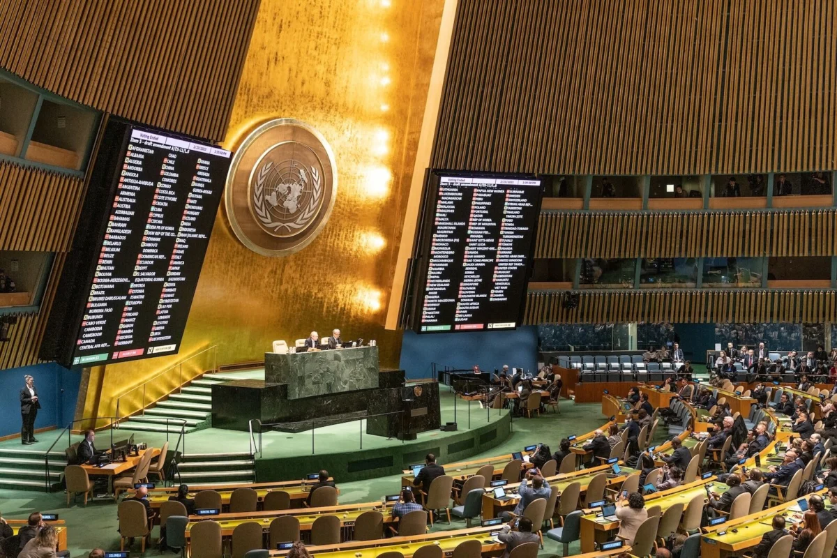
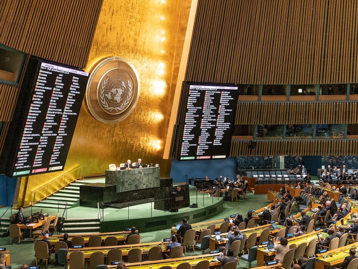
In a landmark decision that challenges centuries of navigational tradition, the United Nations General Assembly has taken a formal stance on how the world is visualized. On September 4, 2026, in a decisive vote of 164 to 1, the assembly adopted a resolution encouraging the international community to adopt cartographic standards that more accurately represent the physical size of the world’s continents—most notably Africa.
While the resolution is non-binding, its overwhelming passage signals a shifting global consensus: that maps are not merely technical tools, but powerful political instruments that shape our subconscious understanding of geopolitical significance.
A Chronology of the Shift
The movement toward "geographic justice" did not materialize overnight. Its origins can be traced back to a growing dissatisfaction with the standard Mercator projection, which has dominated classrooms, offices, and digital interfaces for over four centuries.
- 1569: Gerardus Mercator publishes his world map, designed specifically for maritime navigation.
- 2017: The Boston Public School District announces a move to the Gall-Peters projection, sparking a global debate regarding the pedagogical and political implications of map distortion.
- 2018: Cartographers Bojan Šavrič, Tom Patterson, and Bernhard Jenny publish the "Equal Earth" map, designed to provide an area-accurate representation while maintaining recognizable continental shapes.
- February 2026: The African Union officially adopts the Equal Earth projection, declaring it the preferred standard for the continent’s educational and administrative materials.
- September 4, 2026: The UN General Assembly, led by Togo on behalf of the African Group, votes 164–1 to encourage the adoption of equal-area projections, specifically highlighting the Equal Earth model.
The Tyranny of the Mercator
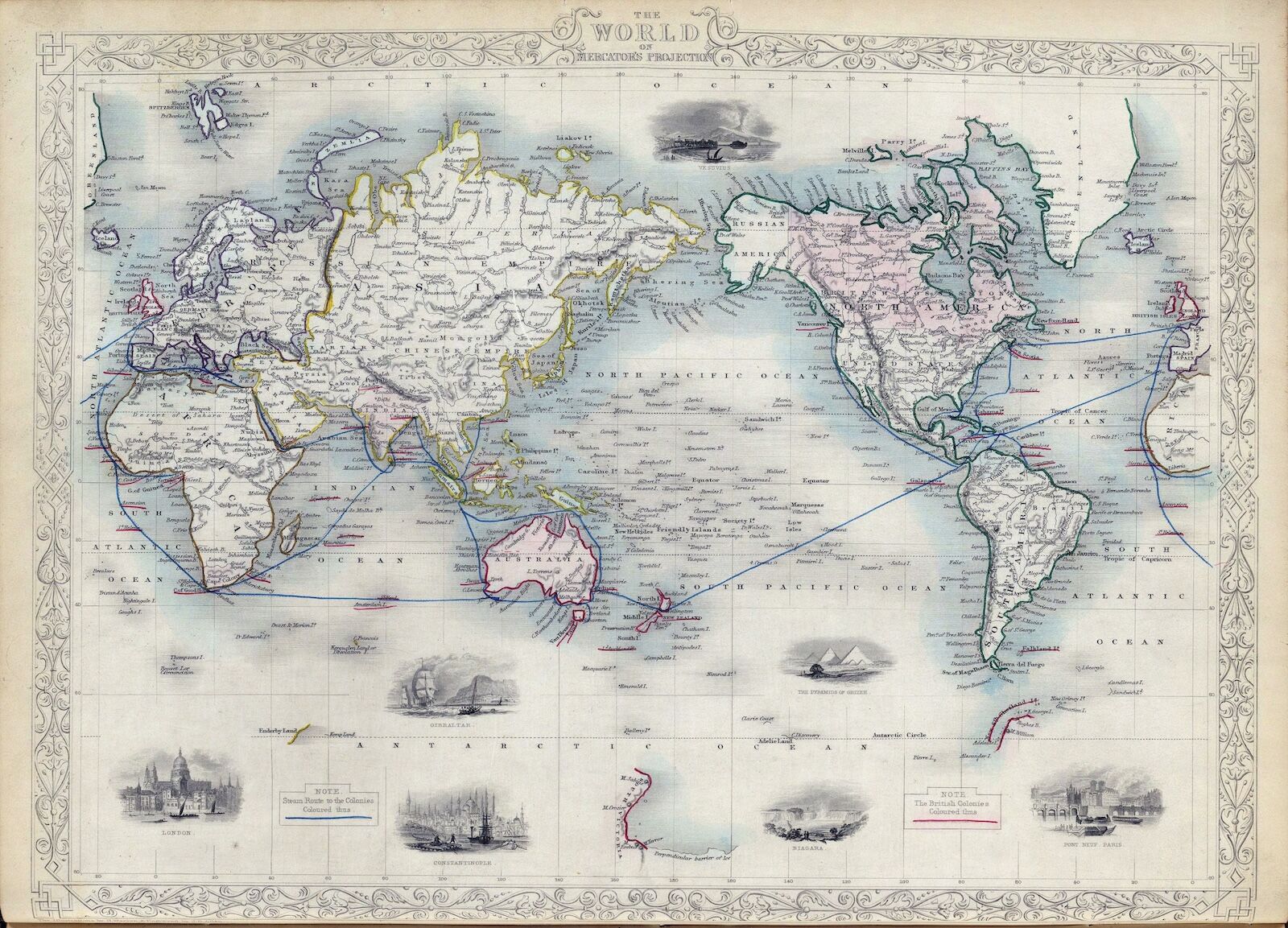
To understand the necessity of this resolution, one must first understand the purpose of the Mercator projection. Created by Flemish cartographer Gerardus Mercator in the 16th century, the projection was a masterpiece of mathematical utility, not geographic realism.
Because the Earth is a sphere, translating its surface onto a flat piece of paper inherently requires distortion. Mercator’s brilliance lay in his ability to maintain "rhumb lines"—lines of constant compass bearing. For a sailor in the 1500s, this was revolutionary; it allowed a navigator to draw a straight line between two points and arrive at a destination simply by holding a steady compass heading.
However, the "cost" of this utility is extreme size distortion. To keep the angles correct, the map must stretch the features of the Earth as they move away from the equator. Consequently, landmasses near the poles, such as Greenland, Russia, and Canada, appear vastly larger than they are in reality. Conversely, landmasses near the equator—most notably Africa—are drastically shrunk. On a standard Mercator map, Greenland appears roughly the same size as Africa, despite the fact that Africa is actually 14 times larger than Greenland.
Official Responses and the Lone Dissent
The resolution, sponsored by Togo and backed by the 54 nations of the African Group, does not seek to ban the Mercator projection. Instead, it invites governments and international institutions to move toward "equal area" map projections where the relative size of landmasses is a critical factor in communication.
The African Union’s position has been clear and vocal. During a high-level event in March 2026, Commissioner Amma Twum-Amoah articulated the symbolic weight of the issue: "The Mercator projection shrinks Africa on the world map. This is not merely an aesthetic choice; it is a distortion that leads the global public to subconsciously underestimate the continent’s economic, cultural, and geopolitical significance."
The vote, while nearly unanimous, was not without friction. The United States stood alone as the sole dissenter. While the U.S. mission has not released an exhaustive manifesto on its objection, critics of the resolution within the U.S. delegation have previously cited the utility of existing navigational standards and the cost-prohibitive nature of replacing millions of maps currently in circulation. However, for the 164 nations that voted in favor, the cost of updating maps is seen as a secondary concern compared to the long-term goal of correcting a colonial-era bias in how the world perceives its own geography.
The Equal Earth Solution: A Technical Evolution
The Equal Earth map, which the UN specifically endorses, serves as a "middle-ground" solution. Unlike the Gall-Peters projection, which is mathematically accurate in area but creates "stretched" or "squeezed" shapes that can look jarring, the Equal Earth projection utilizes a "pseudocylindrical" method.
"We wanted to create a map that was accurate in area but didn’t alienate the user," says one of the projection’s lead designers. "If a map looks too strange, people won’t use it. We needed something that felt intuitive while telling the truth about landmass size."
The result is a projection that retains the recognizable shapes of continents while ensuring that the proportions are correct. Since its 2018 debut, it has already been adopted by major institutions, including NASA’s Goddard Institute for Space Studies for its climate data visualizations and the National Geographic Society for various educational publications.
Geopolitical Implications: Does a Map Change Policy?
The question remains: does changing a map actually change the world? Critics of the UN resolution argue that cartography is a technical discipline and that political entities should not dictate which mathematical models are used. They argue that "all maps are wrong" because they are all two-dimensional representations of a three-dimensional reality.
However, supporters of the resolution argue that this is a "soft power" victory for the Global South. By removing the visual dominance of the Northern Hemisphere, the international community is acknowledging that the previous standard—which favored the colonial powers of the 16th century—is no longer an appropriate default for a globalized 21st-century society.
The psychological impact of seeing a map that properly scales the African continent is difficult to quantify but impossible to ignore. For students in classrooms across the globe, the new maps will present a world where the Global South is not "diminished" by a mathematical artifact.
Moving Forward: The Future of Cartography
The UN resolution acts as a recommendation, not a mandate. It does not mean that every sailor will suddenly discard their GPS-linked navigational charts, nor does it mean that every classroom will immediately throw out their existing wall maps. Instead, it serves as a catalyst for a global conversation about representation.
As we look toward the remainder of the 21st century, the role of digital cartography will only grow. With the rise of dynamic, interactive web-based maps, the transition to equal-area projections is technically easier than ever before. Google Maps, Apple Maps, and other digital interfaces have long utilized a modified Mercator for its web-tiling efficiency, but the UN’s stance may force a rethink among these tech giants.
Ultimately, this is a story about the intersection of science and sociology. The Mercator map was an honest, functional solution for a specific problem in 1569. The Equal Earth map is a response to a different set of problems in 2026. By prioritizing accuracy in scale, the international community is making a statement that the world is, and should be seen as, a place of proportional equality. Whether or not this triggers a total overhaul of the world’s visual diet remains to be seen, but the era of the unchallenged, distorted map is, at the very least, drawing to a close.
 Muslim
  Reynand Wu
  Siti Muinah