
 By Nana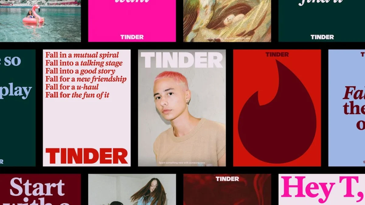
In an era where "dating app fatigue" has become a pervasive cultural phenomenon, Tinder is attempting a dramatic course correction. The world’s most recognizable dating platform has unveiled a comprehensive visual and strategic overhaul, crafted by the design agency Porto Rocha. By moving away from the sterile, purely digital aesthetic that defined the mid-2010s, Tinder is pivoting toward a "tactile, authentic" identity that attempts to bridge the gap between the screen and the real-world connections its users crave.
The Core Transformation: Moving Beyond the "Swipe"
At the heart of the rebrand is a fundamental shift in how the brand communicates. For years, Tinder was defined by its utility—the swipe, the match, the notification. The new strategy, however, centers on a persona known as "T," a metaphorical dating columnist reminiscent of iconic voices like Carrie Bradshaw. This narrative anchor aims to provide the brand with a singular, relatable, and human voice, moving away from the cold, algorithmic branding of its competitors.
The aesthetic shift is equally profound. Porto Rocha has introduced a mixed-media visual language that draws heavily on nostalgia. By incorporating point-and-shoot photography, tactile textures, and even oil paintings, the brand is signaling a desire to feel "zine-y" and offline. It is a visual rejection of the hyper-polished, overly curated perfection often associated with social media, opting instead for a scrapbook-like, raw, and human aesthetic.
A Chronology of the Tinder Identity
Tinder’s visual evolution tracks the history of modern dating itself.

- 2012–2014: The Disruptor Era: Tinder launched with a simple, functional aesthetic. Its primary goal was to normalize the idea of meeting strangers online. The branding was utilitarian, focusing on ease of use.
- 2015–2019: The Mainstream Pivot: As the app exploded in popularity, the branding became sleeker, adopting the "flat design" trends of the era. The iconic flame logo became a global shorthand for modern romance.
- 2020–2023: The Pandemic and Post-Pandemic Shift: During the lockdowns, the app became a lifeline for social connection, but also a site of increasing frustration. Users began to voice "dating app burnout," leading to a period of brand stagnation.
- 2024–Present: The Human-Centric Rebrand: Recognizing the changing tides, Tinder commissioned Porto Rocha to inject humanity into its identity. This current phase marks a departure from pure utility toward an emotional, experience-based branding model.
Supporting Data: The Case for Authenticity
The impetus for this rebrand is not purely aesthetic; it is a calculated response to shifting market demographics. Gen Z, now the dominant cohort on dating platforms, has shown a marked preference for "authentic" digital experiences.
Data from recent market research suggests that:
- Retention vs. Acquisition: Existing users are increasingly critical of the "gamification" of dating apps. Tinder’s new, warmer visual palette—which incorporates blues and greens alongside their signature red—is designed to reflect the wider, often complex spectrum of emotions involved in dating, rather than just the adrenaline of a "match."
- The "Anti-Algorithm" Sentiment: Younger users are increasingly seeking tools that facilitate offline, high-quality interactions. By styling its imagery to look like tangible, "real-life" photography, Tinder is implicitly positioning itself as a conduit to the physical world, rather than a place to stay indefinitely.
- Visual Differentiation: In a crowded market featuring competitors like Hinge (focused on "designed to be deleted") and Bumble (focused on female empowerment), Tinder’s new, bold, and slightly edgy serif typography helps it reclaim a sense of dominance and confidence that had softened over the years.
Official Perspectives: The Design Philosophy
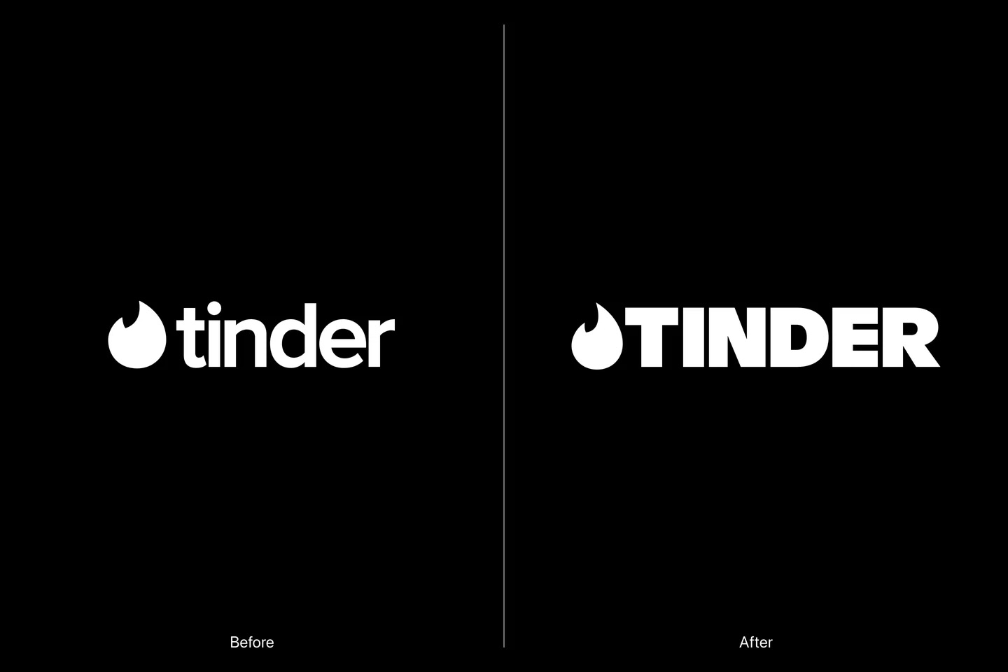
Yedo Han, Senior Designer at Porto Rocha, has been vocal about the intent behind the new design choices. In discussions regarding the overhaul, Han emphasized that the shift to all-caps for the wordmark serves a functional purpose: it balances the "softer, more human" imagery with a sense of authority.
"The headline serif brings in boldness and confidence, and a little bit of edge," Han noted. "It feels a little bit more declarative of how Tinder is now—this new force reclaiming the dating scene."
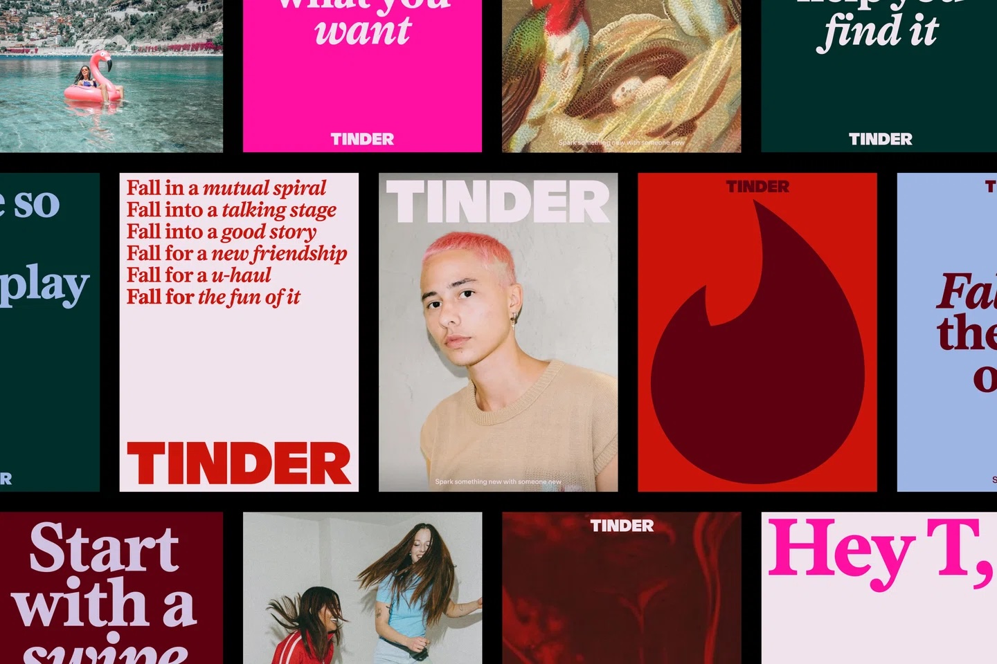
Furthermore, the integration of diverse color hues is a deliberate attempt to move away from the "alert red" that once signaled an urgent, potentially stressful notification. By introducing more balanced tones, the app aims to evoke a more nuanced, "real-life" feeling, moving the user experience closer to the feeling of a curated personal diary or a physical zine.
The Implications: Is This the End of "Swipe Fatigue"?
The success of this rebrand will likely be measured not in downloads, but in the longevity and satisfaction of its user base. By changing the tone of its copy—shifting from app-centric messaging like "swipe right" to result-oriented messaging like "It starts with a swipe"—Tinder is attempting to change the narrative. The app is no longer just a game; it is framed as a starting point for an offline journey.
The Humanizing Hook
The "T" columnist persona is a high-risk, high-reward strategy. While it gives the brand a distinct voice, it also requires the company to maintain a consistent, witty, and empathetic tone across all global markets. If executed well, this creates a community-like atmosphere. If it feels forced, it risks alienating a generation that is notoriously skeptical of corporate attempts to sound "relatable."
Reclaiming the Cultural Conversation
Tinder’s rebrand is an admission that the "dating app" model of 2015 is no longer sufficient to keep users engaged. The market has moved toward niche, values-based dating. By leaning into an "offline-first" aesthetic, Tinder is attempting to position itself as the "OG" of the space—a platform that has the confidence to embrace its past while evolving for the future.
Challenges Ahead
Despite the brilliance of the visual update, the platform still faces the core challenge of any digital matchmaking service: the quality of the interaction. A new font or a nostalgic photo filter cannot fix a broken dating culture, but it can change the environment in which users interact. The implication here is that Tinder is betting on the idea that if the vibe feels more organic, the experience will feel more human.
Conclusion: A New Chapter or a Facelift?
Whether this rebrand will be remembered as one of the best of the 2020s remains to be seen. It is undoubtedly a clever move—a necessary evolution that recognizes the shift from "dating as a game" to "dating as a lifestyle."
By choosing to lean into the messy, complicated, and tactile nature of human connection, Tinder is signaling that it understands the disillusionment of its users. The question remains: can the app deliver the human connection that its new branding so artfully promises? As the platform rolls out these changes, the world will be watching to see if "T" can truly restore the spark, or if this is merely a stylish distraction from the challenges of modern romance.
The digital world is changing, and Tinder has made its move. Now, the outcome depends on whether the users are ready to look up from their screens and believe in the possibility of something more than just a swipe.
 Raul Delapena Setiawan
  Ammar Sabilarrohman
  Muslim