
 By Iffa Jayyana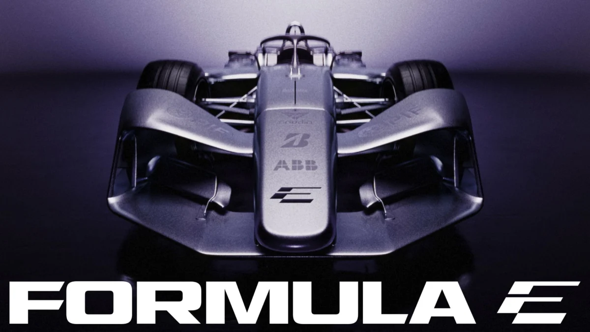
As the ABB FIA Formula E World Championship accelerates toward its highly anticipated GEN4 era, the sport has unveiled more than just new technical specifications. In a bold move to signal its maturity and evolution, Formula E has debuted a comprehensive visual identity that strips away the remnants of its "start-up" years to embrace a sleek, high-performance aesthetic. Designed by the global creative practice MOX, this rebrand is a deliberate departure from the past, engineered to position Formula E as the premier intersection of cutting-edge technology, cultural relevance, and elite motorsport.
The Core Transformation: A New Visual Language
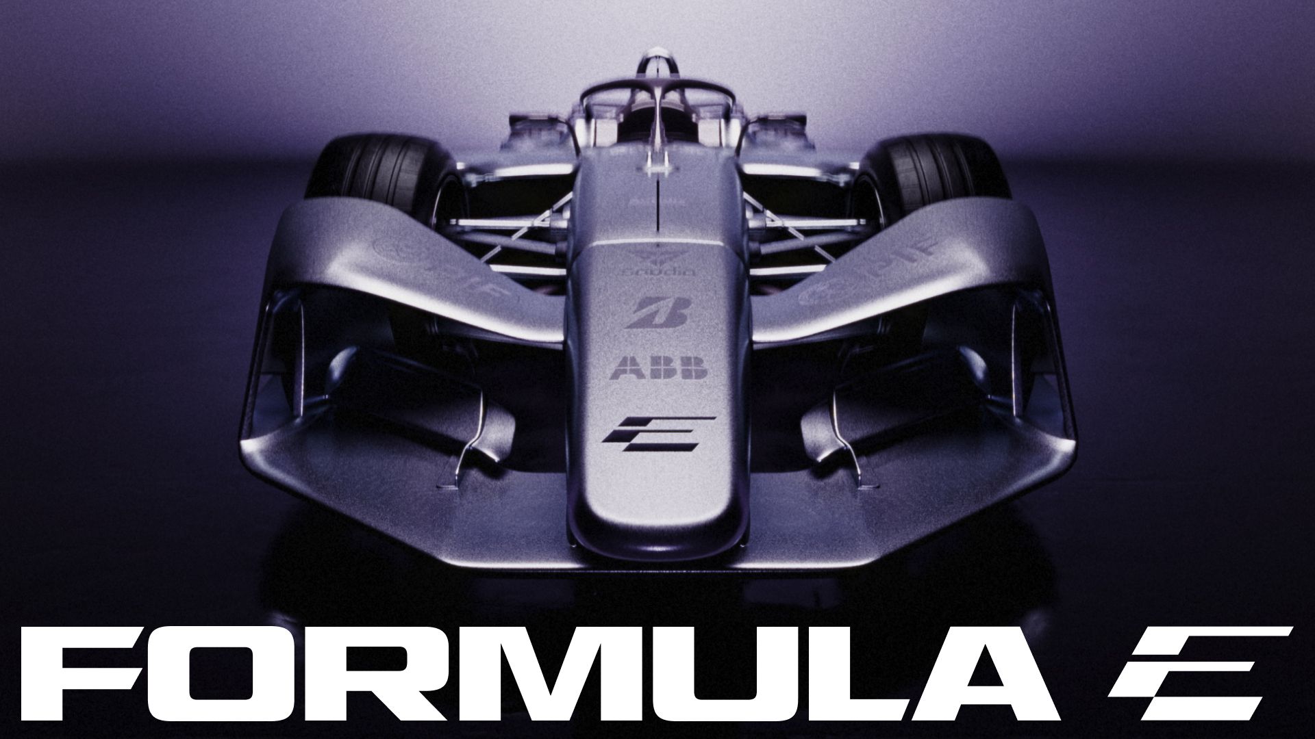
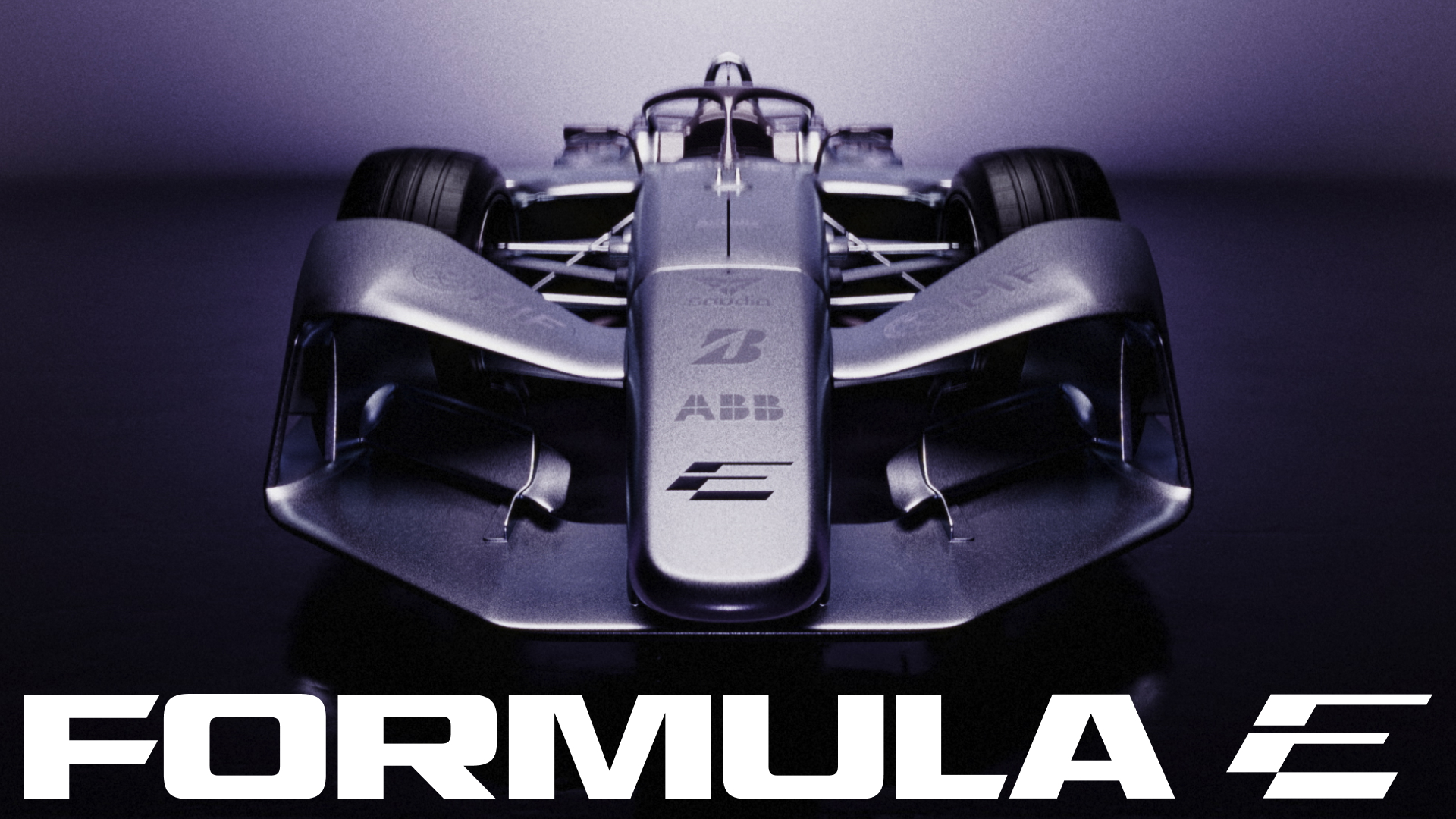
At the heart of the rebrand is a striking, minimalist logomark that utilizes a clever visual double entendre. The new icon—a stylized, interconnected ‘F’ and ‘E’—is set at a precise 30-degree angle, a choice that injects a sense of kinetic energy and constant forward motion into the identity. Unlike its predecessor, which relied on more traditional typographic conventions, this new mark is designed to be instantly recognizable in a digital-first, high-speed environment.
Matt Bolton, creative director and co-founder of MOX, describes the design philosophy as one of "calculated discomfort." The goal was to avoid the immediate, easily digestible designs that often suffer from rapid obsolescence. By creating an icon that is slightly jarring at first glance—a "Marmite" design, as Bolton puts it—the brand ensures longevity. The viewer is drawn to the ‘E’ first, with the ‘F’ revealing itself as a secondary, rewarding discovery. This nuance ensures that the logo remains engaging long after the initial exposure.
Chronology of an Evolution
To understand the significance of this shift, one must look at the trajectory of Formula E since its inception.
- 2014 – The Genesis: Formula E launched with a focus on proving the viability of electric racing. The branding was functional, emphasizing sustainability and the "green" aspect of the sport.
- 2018 – The GEN2 Era: With the introduction of the futuristic "Batmobile" style cars, the brand shifted toward a more aggressive, tech-forward aesthetic, emphasizing the "Gen2" technological leap.
- 2022 – The GEN3 Transition: As the cars became faster and more efficient, the branding became more technical, focusing on the high-performance capabilities of the vehicles.
- 2024 – The Present Rebrand: As the championship prepares for the impending GEN4 era—expected to be the fastest and most technologically advanced generation yet—the identity has been overhauled to reflect a brand that no longer needs to prove it is "electric," but rather asserts that it is the "future of racing."
This progression mirrors the championship’s growth from a niche sustainability experiment into a globally recognized motorsport powerhouse that competes on the same stage as traditional combustion-based racing series.
Supporting Data: Typography and Color as Strategy
The visual identity is bolstered by a bespoke typeface family developed in collaboration with the renowned type foundry All Purpose Studio. The system is built on a custom cut of "AP Gavel," a typeface chosen for its versatility. The font family is divided into specific roles to ensure brand consistency across different media:
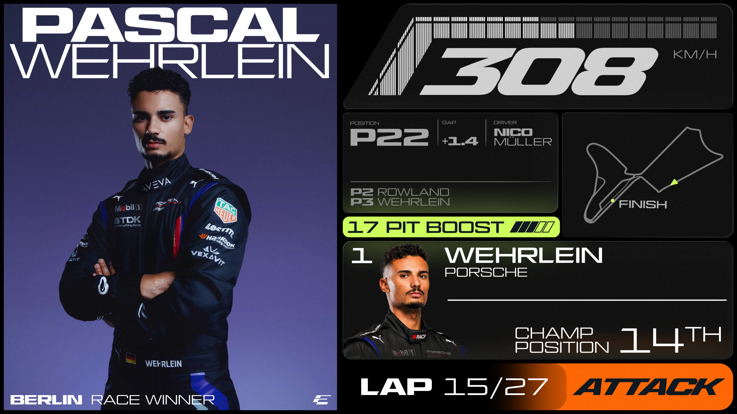
- Turbo Mode: A condensed, italicized version of the typeface, designed specifically to generate a sense of speed and momentum in motion graphics and headers.
- Micro Mono: A utilitarian, technical typeface reserved for data-heavy applications, including timestamps, telemetry, and reference codes, ensuring that the "sporting" side of the data remains legible.
- Inter: Used for long-form editorial content, providing readability and grounding the more expressive elements of the brand.
Equally critical is the new color palette. Formula E has moved away from a strictly "eco-friendly" green-and-blue spectrum toward a more aggressive, high-contrast array. "Surge Purple," "Signal Orange," and "Electric Lime" dominate the new palette, offering a vibrant, high-energy aesthetic that pops on digital screens and television broadcasts. These are balanced by "Pulse" and "Ignite" gradients, which allow the brand to scale across various digital touchpoints, while "Track Grey" and a set of neutral tones provide the necessary grounding for these high-octane colors.
Official Perspectives on the Shift
The transition is not merely cosmetic; it is a strategic business decision aimed at broadening the sport’s appeal. Ellie Norman, Chief Marketing Officer of Formula E, emphasized that the previous identity was designed for a different, earlier stage of the sport’s lifecycle.
"Our previous identity was created for an earlier stage of our journey," Norman stated. "This modern, expressive brand system matches the scale of our current ambition and gives us a powerful platform to lead the next generation of motorsport."
This sentiment is echoed by the creative team at MOX, who viewed the project as an exercise in "future-proofing." By leaning into a design language that feels more akin to a global luxury fashion house or a high-end tech firm than a traditional racing series, Formula E is deliberately distancing itself from the "green alternative" narrative. Instead, it is positioning itself as a premium, culturally relevant entertainment property.
Implications: The Future of Motorsport Branding
The implications of this rebrand extend far beyond a new logo on a race car. By embracing a design-first approach, Formula E is signaling to sponsors, broadcasters, and fans that it is a serious player in the global sports market.
1. Attracting a Younger Demographic
The use of bold typography and a high-contrast, digital-native color palette is a clear play for a younger, Gen-Z and Millennial audience. This demographic prioritizes brand aesthetics that are "shareable" and "Instagrammable." The new, sharp identity is designed to work seamlessly in short-form video content on TikTok, Instagram, and YouTube, where the sport’s most significant growth is currently happening.
2. Setting a New Benchmark for Sporting Identities
Formula E is now setting a standard that other racing series—including F1—may soon feel pressured to match. In recent years, we have seen a trend toward simplified, flat, and scalable logos across the automotive industry (notably McLaren and Lexus). Formula E’s move to a more abstract, iconic mark suggests that the days of literal, descriptive racing logos are waning.
3. A Foundation for the GEN4 Era
The GEN4 era promises to be the most technologically advanced chapter in Formula E’s history. The branding acts as the "wrapper" for this technology. By adopting a "future-forward" look now, the organization ensures that when the new cars hit the track, the visual identity will not feel like an afterthought, but rather a seamless extension of the innovation taking place under the bodywork.
Conclusion: A Championship in Motion
The rebrand of Formula E is a bold, confident statement. It acknowledges that the sport has evolved beyond its origins and is now ready to define the next era of global racing. By blending high-performance typography, a vibrant and aggressive color scheme, and a logomark that demands attention, Formula E has created a visual identity that is as fast, ambitious, and relevant as the racing it represents.
As the grid prepares for the next phase of its evolution, one thing is clear: Formula E is no longer just "the electric alternative." With this new identity, it is cementing its status as a premier, forward-looking global sport, designed not just to participate in the future of mobility, but to lead it. The "Marmite" icon, as described by MOX, may be the most defining feature of all—a design that refuses to be ignored, much like the championship itself.
 Pevita Pearce
  Asep Darmawan
  Ammar Sabilarrohman