
How does an organization tasked with cataloging the prehistoric past effectively communicate its mission in the hyper-modern digital age? For the Association of Applied Paleontological Sciences (AAPS), the answer was not found in the typical tropes of minimalist flat design or corporate abstraction. Instead, it involved a bold, rule-breaking visual strategy that leans into the grit, history, and tactile nature of the science itself.
The AAPS, a vital coalition connecting professional fossil dealers, academic researchers, and dedicated collectors, recently unveiled a rebrand that has caught the attention of the design community. By moving away from a dated, overly institutional aesthetic, the association has embraced a identity that feels more like an archival treasure than a corporate entity, proving that sometimes, the most effective branding is that which chooses storytelling over clinical simplicity.
The Core Facts: A Departure from Tradition
The Association of Applied Paleontological Sciences serves as a nexus for commercial and academic cooperation within the paleontology community. Its membership is diverse, ranging from those who manage the legal and ethical trade of specimens to the scholars who study them. For years, the association utilized a logo that served its purpose but lacked the gravitas and narrative depth required for a modern professional organization.
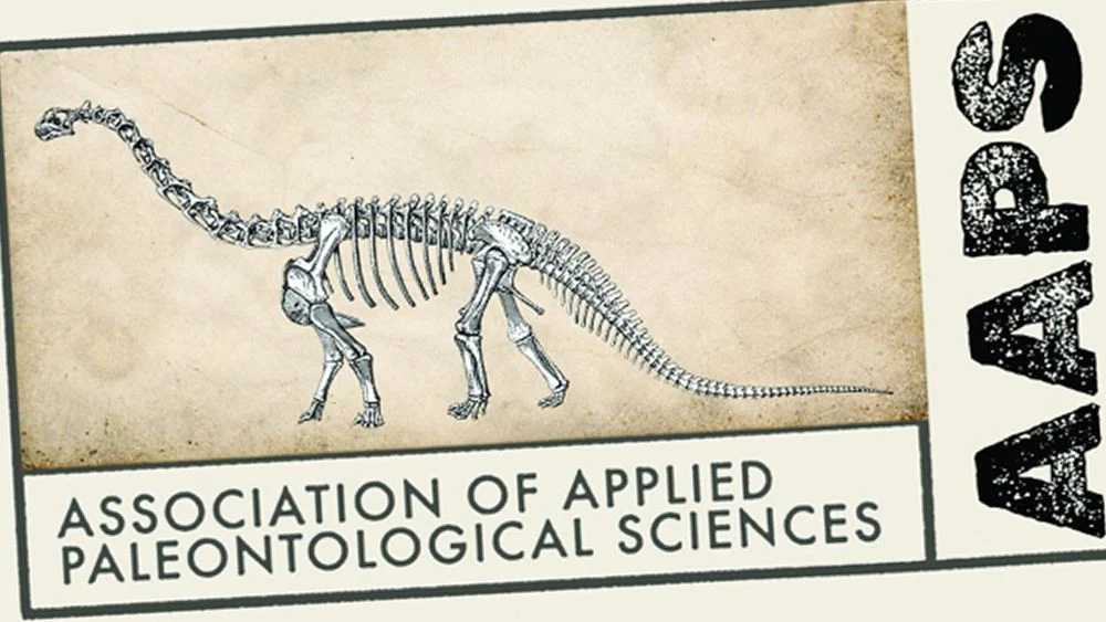
The new visual identity, spearheaded by creative director Grant Sanders of the New England-based SAND Agency, is a radical departure from its predecessor. The logo is not a single, scalable icon in the traditional sense; it is a composition. It blends minimalist contemporary sensibilities with "grungy" typography and a textured, vintage archival aesthetic. It challenges the conventional wisdom that a logo must be simple to be effective, opting instead for a complex, layered narrative that evokes the sensation of discovering an ancient, well-preserved document.
A Chronological Evolution of Identity
To understand the weight of this design shift, one must look at the organization’s trajectory. The AAPS was founded in Tucson, Arizona, with the goal of fostering professional standards in a field often subject to intense scrutiny and complex regulatory landscapes.
Historically, the organization’s branding reflected the utilitarian nature of its origins—functional, straightforward, and perhaps a bit invisible. It was an identity that functioned as a stamp of authenticity, but it lacked a "brand personality."
When the decision was made to modernize, the brief was not to "go digital" in the way many organizations do—by stripping away detail until only a geometric shape remains. Instead, the mandate was to capture the nature of the specimens the association handles. The process involved deep research into the visual language of museum archives, natural history records, and the tactile reality of geological research. The resulting design is a culmination of this study, moving the AAPS from a generic trade group identity to a brand that feels rooted in the very history it protects.
The Design Philosophy: Breaking the Rules
In the contemporary graphic design landscape, the "rules" are often dictated by digital scalability. We are taught that a logo must be legible at the size of a favicon, that it must be infinitely vectorizable, and that it should avoid competing typefaces. The AAPS logo ignores these dictates, and in doing so, it finds its strength.
The Conflict of Versatility and Storytelling
The logo’s composition features multiple typefaces and hierarchical text strings that run in various directions. By traditional metrics, this is a recipe for legibility failure. However, Grant Sanders and his team at SAND Agency prioritized conceptual immersion over universal scalability.
The background of the design features a slightly aged, cream-colored texture, mimicking the parchment of an old field notebook. Over this, hand-applied blue script fonts collide with bold, rugged stencil typography. The stencil font used for the acronym "AAPS" provides a gritty, industrial feel, reminiscent of the wooden crates used to transport fossils from dig sites to research facilities.
The "Specimen" Detail
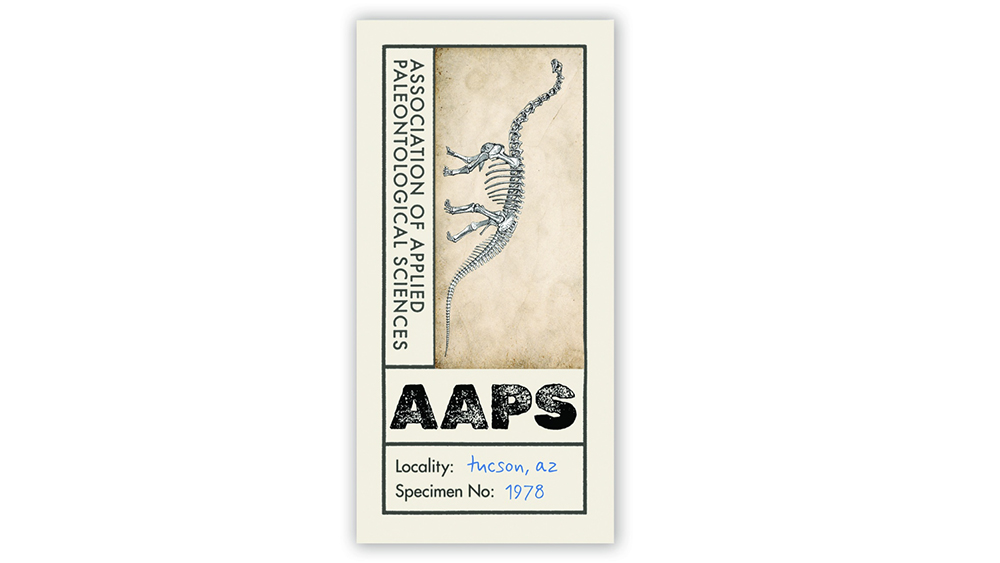
Perhaps the most clever aspect of the new branding is the inclusion of a "Specimen No." tag. In the context of the design, this number corresponds to the year of the association’s founding in Tucson. It is a subtle nod to the professional nature of the membership—these are not just items of curiosity; they are specimens with provenance, history, and scientific value. By framing their own identity as an archival object, the AAPS effectively communicates its role as a curator of the ancient world.
Supporting Data: Why "Unconventional" Works
While the design breaks the rules of "standardized" corporate branding, it excels in a different kind of metric: engagement and thematic resonance. In a world saturated with clean, sans-serif logos that all look remarkably similar, the AAPS rebrand acts as a "pattern interrupt."
Research into visual branding suggests that when an organization deals in the niche, the academic, or the historical, it benefits from a "heritage-forward" aesthetic. By utilizing textures and layered typography, the AAPS is signaling to its audience that they are not a tech startup—they are an organization of deep, historical importance.
To address the limitations of this complex design in digital spaces, the agency created a secondary, simplified avatar. This allows the organization to maintain its complex, storytelling-focused branding on stationery, physical signage, and official documentation, while utilizing a clean, recognizable icon for social media profiles and mobile app icons. This hybrid approach allows the brand to have the best of both worlds: the narrative depth of a legacy institution and the functional versatility of a modern entity.
Official Perspectives and Creative Intent
Grant Sanders has described the project as a balancing act. The goal was never to create a "fashion logo," yet the final result holds a certain aesthetic sophistication that one might expect from high-end heritage brands. By avoiding the "institutional feel"—which often implies coldness, bureaucracy, and sterility—the AAPS has humanized its brand.
The organization’s leadership has noted that the response from members has been overwhelmingly positive. Fossil collectors and academics alike have praised the design for feeling "authentic" to the work they do. For a community that spends its life cleaning dust off of history, a brand that feels "lived-in" and "archival" is infinitely more resonant than a polished, sterile logo.
The Broader Implications for Branding
The AAPS rebrand serves as a timely reminder to the design community: the "rules" of design are often guidelines for efficiency, not laws of nature. In an era where AI-generated logos and template-driven design are becoming the baseline, brands that take risks—brands that prioritize the story, the texture, and the unique history of their mission—will always stand out.
Implications for Academic and Scientific Institutions
For other scientific bodies, the lesson is clear: your branding does not have to be a sterile reflection of your field. It can be a celebration of it. By moving away from the "corporate blue" and "clean sans-serif" aesthetic that plagues most professional associations, the AAPS has set a new standard for how to represent a specialized field with both professionalism and soul.
The Future of "Grit" in Design
We are currently seeing a resurgence of "tactile" design—a reaction against the cold, flat nature of the digital web. The AAPS logo is a prime example of this movement. By incorporating the "grungy" aesthetic, the designers have successfully bridged the gap between the ancient, physical world of fossils and the modern, digital world of professional networking.
Conclusion: A Fossilized Future
The Association of Applied Paleontological Sciences has managed to do something that many brands fail at: they have created an identity that is inseparable from their mission. They have proven that a logo can be a piece of storytelling, a vessel for context, and a bridge to the past, all while maintaining the professional standards required of a modern organization.
The design breaks the rules of scalability and simplicity, yet it thrives in the most important category of all: relevance. In the grand timeline of the Earth’s history, the AAPS is a relatively young organization. But with this new, archival-inspired identity, they have signaled that they are here to stay—not as a faceless institution, but as a dedicated, gritty, and deeply passionate guardian of the deep past.
Sometimes, the best way to move forward is to look back at the textures, the histories, and the stories that define us. The AAPS has done just that, and in the process, they have reminded us all that even the most "modern" organization can find its most powerful identity by digging deep into the archives of its own history.
