
 By Azzam Bilal Chamdy
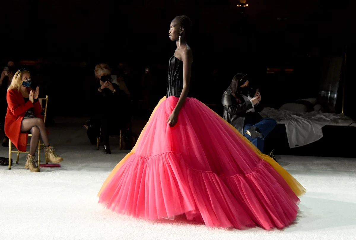
In the intricate world of fashion and design, color is rarely a static constant. It is a chameleon, shifting its identity based on the medium it inhabits—be it the absorbent fibers of cashmere or the slick, reflective surface of treated leather—and, perhaps more importantly, the company it keeps. A vibrant yellow might command attention when set against a deep violet, yet soften into a pastoral whisper when paired with cream.
This fluidity of perception serves as the cornerstone for the latest trend intelligence released by Future Snoops, the trend-forecasting agency formerly known as Fashion Snoops. During a comprehensive webinar held this Thursday, the agency unveiled its vision for the Fall/Winter 2028-2029 season, highlighting three of its five foundational "color shifts." The presentation was timed with strategic precision, arriving just 24 hours before the debut of "FS Color Intelligence," an AI-driven platform designed to navigate the complexities of global color trends through the lens of deep-rooted, proprietary data.
The Contextual Nature of Hue: A Professional Perspective
"So much of what we talked about today comes down to the idea that a color is never just one color," explained Joanne Thomas, director of color at Future Snoops. "It changes so much depending on what sits next to it."
For brands navigating the increasingly crowded and algorithmically-driven fashion landscape, understanding this phenomenon is no longer a luxury—it is a requirement for survival. Future Snoops, which acts as a bridge between cultural zeitgeist and commercial application, emphasizes that the "color shift" is not merely about selecting a palette; it is about curating a narrative that resonates with a consumer base seeking deeper, more authentic connections to the objects they wear and the spaces they inhabit.
The upcoming launch of FS Color Intelligence underscores this mission. While the agency has kept the technical specifics of the AI tool under wraps, the industry expectation is that it will provide brands with a rigorous framework to "make sense of color," moving beyond subjective intuition toward a more data-backed, culturally informed strategy for seasonal collections.

Chronology of a Trend: From Cultural Signals to Market Reality
The journey toward the Fall/Winter 2028-2029 palette began months ago, as the Future Snoops team synthesized global cultural signals—ranging from the rise of anti-capitalist cinema to the shifting social dynamics of gender and craftsmanship. By analyzing these signals, the agency identified five distinct "color shifts," each functioning as a cohesive theme rather than a disconnected set of swatches.
The methodology is rooted in a longitudinal study of consumer behavior. The agency tracks how colors evolve from fringe cultural movements to mainstream adoption. This year, the focus has shifted toward themes of rebellion, quiet strength, and the "slow-living" aesthetic, all of which are reflected in the three primary shifts unveiled this week: Blocked Brights, Pink Standard, and Marinated Tones.
Deep Dive: The Three Pillars of the 2028-2029 Palette
1. Blocked Brights: The Aesthetic of Rebellion
The first shift, "Blocked Brights," is a study in controlled intensity. Hallie Spradlin, director of visionary at Future Snoops, describes this palette as one that delivers a "hard and unapologetic edge, while keeping it grounded in something familiar."
The inspiration for this shift is distinctly counter-cultural. Spradlin pointed to recent cinematic works like Boot Riley’s I Love Boosters, which utilizes monochromatic color blocking as a visual manifestation of rebellion against homogenized, capitalistic structures.
The anchor for this palette is "cornflower"—a shade of blue that manages to feel bright without being sharp. "As one of the most trusted and universally worn hues, it gives the palette permission to take risks elsewhere," Spradlin noted. When paired with "poppy" (a piercing red) and "ultraviolet" (a high-energy purple), the cornflower provides a stabilizing base, ensuring that the final effect is one of "confident rather than chaotic" design.

2. Pink Standard: The Defiance of Softness
In contrast to the assertive nature of Blocked Brights, "Pink Standard" represents a shift toward intentional vulnerability. Spradlin articulated that this color family "carries care and empathy without ever having to say so."
This shift is a direct response to a world that many consumers find increasingly callous. In this context, pink is no longer a signifier of fragility; it is a symbol of defiant empathy. From the normalization of pink in menswear as a subversion of toxic masculinity to its use in women’s fashion as a rejection of rigid body standards, the "Pink Standard" is a refusal to "harden for one or shrink for the other."
The anchor color here is "rose hip." Unlike more common pinks that either "whisper or shout," rose hip occupies a middle ground. It is described as a "true neutral" that remains magnetic enough to lead. It is a color that has shed its gendered history, moving into the home, the closet, and the everyday landscape with a sense of quiet authority.
3. Marinated Tones: The Philosophy of Slowness
The final shift unveiled, "Marinated Tones," is perhaps the most reflective of the current cultural pivot toward "slow fashion" and archival preservation. These green-centric hues celebrate the beauty of patience.
"This is color that’s given time to steep and settle into itself," said Spradlin. "Nothing here is rushed." The palette is inspired by heritage craftsmanship and the growing trend of returning to physical media in an era of "infinitely scrollable and disposable" content.

The anchor for this shift is "pickled fennel," a color that essentially implies a state of waiting. According to Thomas, the pickled fennel colorway stems from "marinated mid-tones," which celebrate hues that have been allowed to deepen over time. It echoes the reliability of the olive and mustard tones that have served as industry staples, but with a modern, more nuanced complexity that suggests depth and history.
Industry Implications and Future Outlook
The implications of these findings for the retail and manufacturing sectors are profound. As brands move toward 2028, the ability to balance these thematic shifts will be critical. The "Blocked Brights" offer an opportunity for high-impact marketing, while "Pink Standard" and "Marinated Tones" cater to the growing consumer demand for products that possess emotional durability and a sense of "lived-in" quality.
Furthermore, the introduction of AI-powered forecasting tools like FS Color Intelligence suggests that the industry is entering an era where color selection will be treated with the same scientific rigor as supply chain management or financial auditing. By removing the guesswork from aesthetic decision-making, agencies like Future Snoops are helping brands optimize their inventory, reduce waste, and create products that truly resonate with the cultural zeitgeist.
However, the human element remains paramount. As Joanne Thomas noted, color is ultimately about the relationship between the observer and the object. "It’s about making sense of color," she reiterated. In a world where consumers are inundated with choices, the brands that succeed will be those that can master the context—understanding not just which colors are "in," but how those colors interact to tell a story that feels both relevant and human.
As we look toward the Fall/Winter 2028-2029 season, the message from the forecasters is clear: the future of design lies in the balance between the boldness of our convictions, the empathy of our choices, and the patience of our craft. Whether it is the rebellious pop of cornflower or the steeped, timeless depth of pickled fennel, the palette of the future is one that requires us to look closer, think longer, and feel deeper.
 Neng Nana
 Nana Muazin
 Nana
