
While Nintendo’s history as a producer of hanafuda playing cards is firmly cemented in the public consciousness, the origins of its long-time rival, Sega, are often shrouded in myth, misunderstanding, and a surprisingly industrial past. To the uninitiated, the name "Sega" sounds like a modern, punchy coinage designed in a boardroom. However, the truth is far more prosaic—and entirely free of the scandalous urban legends that have circulated on the internet for decades.
The story of Sega is a masterclass in corporate evolution, tracing a path from a provider of entertainment for U.S. military personnel in post-war Japan to a global titan of home console gaming and software development. By examining its branding evolution, we can better understand how a company defined by slot machines and jukeboxes transformed into the face of 16-bit pop culture.
The Origins of a Name: Beyond the Urban Legend
The most persistent—and entirely false—rumor regarding Sega is that the name is a phonetic nod to an Italian slang term for a hand job. This internet-born piece of "trivia" has been debunked repeatedly by historians and former employees alike. In reality, the brand name is a simple, functional portmanteau.
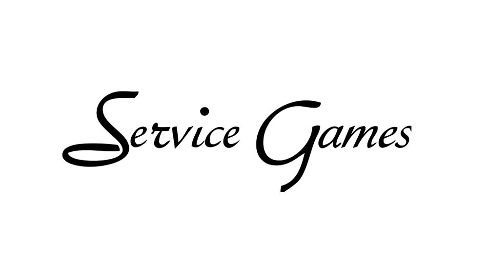
Sega is a direct abbreviation of "Service Games." When American businessmen Martin Bromley and Richard Stewart founded the company in the 1950s, their primary objective was not to develop high-speed hedgehogs or platforming adventures. Their business model was focused on providing amusement services—specifically slot machines—to United States military bases throughout Japan. The name "Service Games" was a literal description of their operations. As the company expanded and merged with other entities, "Service Games" was condensed to "Sega," a crisp, four-letter identifier that would eventually become synonymous with the golden age of arcade gaming.
A Chronology of Corporate Transformation
To understand how Sega became the cultural icon it is today, one must look at the timeline of its foundational years, a period defined by rapid pivots and strategic acquisitions.
The 1950s: The Service Games Era
Founded by Bromley and Stewart, Service Games of Japan established a foothold by importing and maintaining gaming equipment for American soldiers stationed abroad. At the time, the company was a logistical operation rather than a creative one.
1960: Nihon Goraku Bussan
By 1960, the company had evolved its product lineup to include jukeboxes, a staple of social entertainment during the era. It was during this period that the company operated under the name Nihon Goraku Bussan (Japan Amusement Enterprises), signaling a shift toward a broader entertainment focus.
1965: The Birth of Sega Enterprises
The true catalyst for the modern Sega occurred in 1965, when the company merged with Rosen Enterprises, a business founded by David Rosen that specialized in arcade photo booths. This merger formally established "Sega Enterprises." The branding of this era featured elegant, italicized serif lettering—a design aesthetic that reflected the sophisticated, adult-oriented nature of the slot machine and jukebox industry. It was a far cry from the aggressive, blue, futuristic wordmark that would define the company’s 1990s dominance.
1966–1980: The Arcade Expansion
In 1966, Sega began developing its own original arcade titles, with Periscope serving as a pivotal success. The game was a mechanical masterpiece, drawing players into a naval combat simulation that set the stage for Sega’s future in interactive entertainment. By 1969, the company was acquired by Gulf and Western Industries, which also owned Paramount Pictures. This period saw Sega refine its manufacturing prowess, eventually transitioning from mechanical games to the electronic arcade revolution of the late 1970s.
The Evolution of the Logo: A Design Analysis
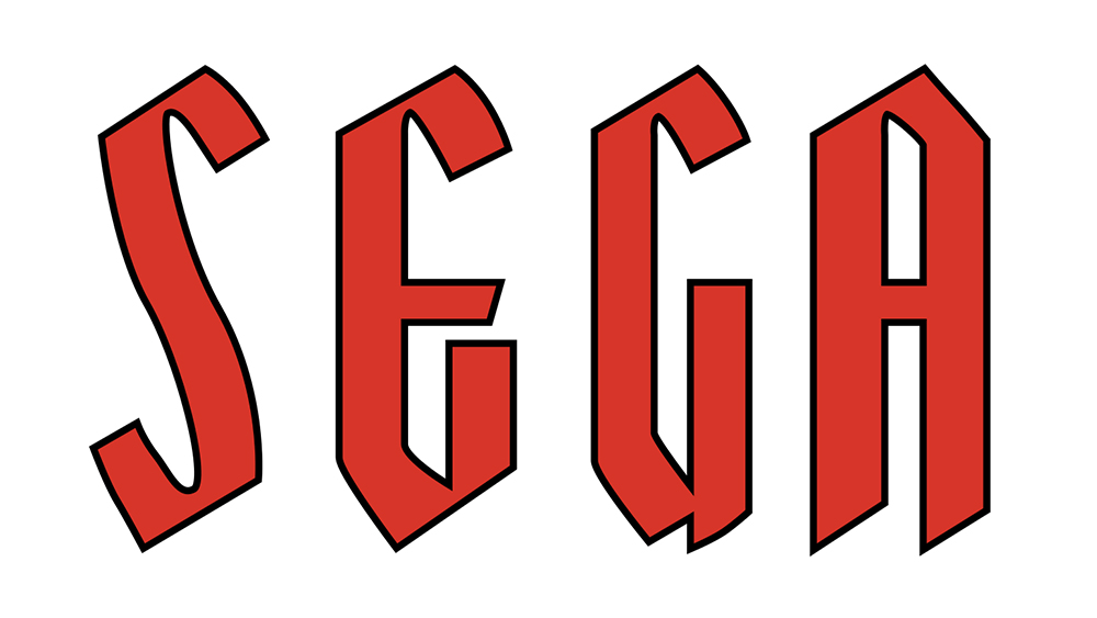
Sega’s visual identity has been an exercise in adapting to the changing technological environment. The original logo, used from the company’s inception until 1975, was characterized by tall, bold, sans-serif letters with diagonally cut tops. This typeface evoked a sense of fantasy and mystery, fitting for the arcade cabinets of the mid-20th century.
However, as the gaming industry shifted toward neon-lit, high-energy arcade halls, the company needed a visual identity that could "cut through the noise."
The Yagi Double Era
In 1975, Sega adopted the iconic wordmark we recognize today. The font, based on "Yagi Double," was chosen for its boldness and legibility. Interestingly, this same font would eventually find its way into the branding for CNN, demonstrating the versatility of the typeface. Initially, the logo was rendered in black, maintaining a serious, corporate tone.
The Blue Shift
In 1982, Sega made a crucial branding decision: it transitioned the logo to blue. In the saturated, chaotic environment of an 80s arcade, blue offered a sharp contrast to the typical red-heavy signage of competitors. The addition of a white outline further enhanced this visibility. This specific iteration—the blue wordmark with the white stroke—would become the hallmark of the Sega Genesis (Mega Drive) era, representing a bold, "cool" alternative to the more family-friendly, conservative branding of Nintendo.
Supporting Data: Arcade Success and Market Realities
Sega’s success was never accidental; it was built on a foundation of hardware innovation. Between 1966 and 1980, Sega’s arcade division generated significant revenue that funded its eventual move into home consoles.
- 1966: Periscope becomes the first major arcade success for the company.
- 1970s: Continued dominance in the electro-mechanical arcade market.
- 1982: Adoption of the iconic blue brand color to compete for consumer attention in arcades.
- 1990s: The "Sonic" era, where the blue logo became a symbol of global youth culture.
The company’s ability to pivot from a supplier of "amusement services" to a powerhouse of software development is documented in the company’s corporate archives, which emphasize that the "Sega" name was always intended to signify the delivery of an experience, whether that experience was a payout from a slot machine or a high-speed level in a Sonic game.
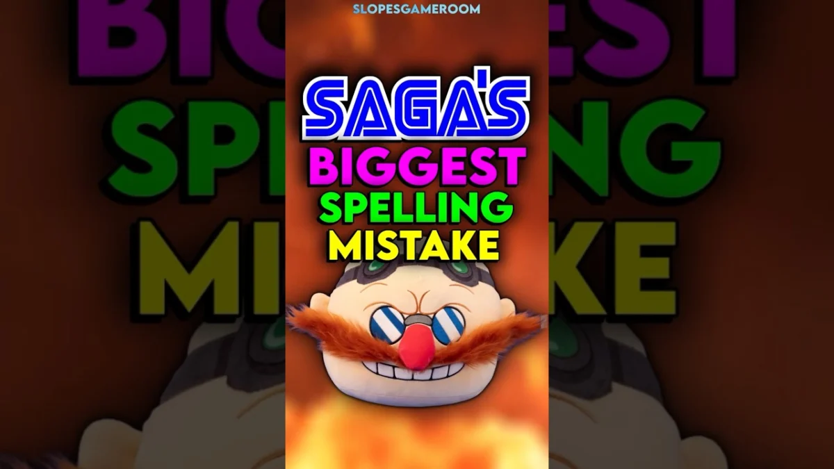
The "Mean Bean" Anomaly: A Lesson in Constraints
A fascinating footnote in Sega’s design history is the infamous misspelling in the title of Dr. Robotnik’s Mean Bean Machine for the Game Gear. Due to the limited screen resolution and space constraints of the handheld device, developers were forced to truncate or adjust the logo, leading to a bizarre, unintentional misspelling that has since become a piece of internet lore.
This incident serves as a perfect metaphor for the company’s history: Sega has often been a brand defined by the tension between ambition and the technical limitations of its time. Whether it was fitting a long title on a small screen or designing a logo that would stand out in a dark, neon-filled arcade, Sega’s design choices were almost always a reaction to the specific constraints of the medium.
Implications for Modern Branding
What can modern designers and brand strategists learn from the history of Sega?
- Flexibility is Key: Sega’s logo evolved from elegant, serif-adjacent lettering to a bold, futuristic wordmark. By allowing the brand identity to adapt to the medium (from mechanical machines to electronic consoles), they ensured the brand never felt dated.
- Context Matters: The shift to blue in 1982 was a tactical decision, not a purely aesthetic one. Designers must consider the environment in which their brand will live. A logo that looks great on a website might disappear in a crowded retail environment.
- Ownership of History: Sega has leaned into its history, embracing the "quirks" of its past—such as the Game Gear misspelling—rather than scrubbing them away. This builds authenticity and a stronger connection with a dedicated fanbase.
Conclusion
The history of Sega is much more than the story of a blue hedgehog or a failed console war. It is a narrative of corporate resilience, from its origins as a provider of services for U.S. military bases to its status as a global entertainment icon. By examining the evolution of its branding, we see a company that understood the value of simplicity, the importance of visual contrast, and the necessity of adapting to the times.
While the myths surrounding its name persist, the reality is far more interesting: Sega is a company that built its own identity through sheer persistence and an uncanny ability to reinvent itself for every new generation of players. As it continues to evolve in the modern era, the legacy of its iconic blue wordmark remains a testament to a company that has never been afraid to change the game.
