
 By Laily UPN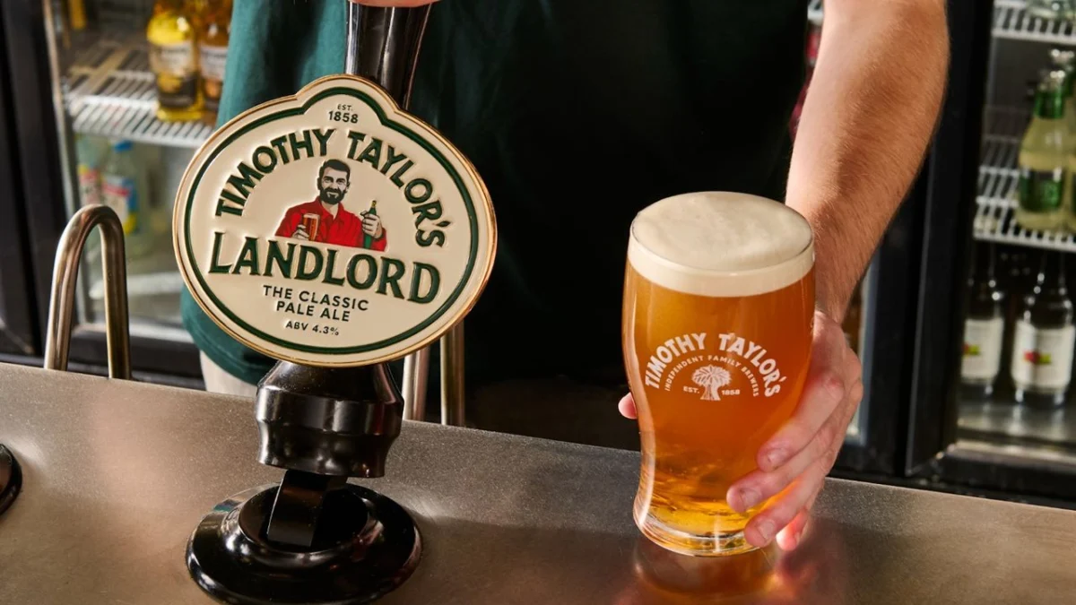
In the high-stakes world of corporate identity, the "rebrand" has become a volatile minefield. From the polarizing geometric shifts of luxury car manufacturers like Jaguar to the nostalgic tug-of-war at iconic American institutions like Cracker Barrel, the modern design landscape is littered with the wreckage of visual overhauls that failed to resonate with the people who matter most: the loyal consumer.
The latest brand to step into this fray is the venerable British brewery Timothy Taylor’s. Known for producing the UK’s best-selling cask ale, Landlord, the Yorkshire-based institution has unveiled its first significant visual identity update in over a decade. While the brewery frames the change as a strategic pivot toward future-proofing, the design community and long-time drinkers are asking a more uncomfortable question: in our desperate rush to appeal to a "Gen Z" aesthetic, are we erasing the very character that makes a brand authentic?
The Anatomy of the Change: A New Face for an Old Institution
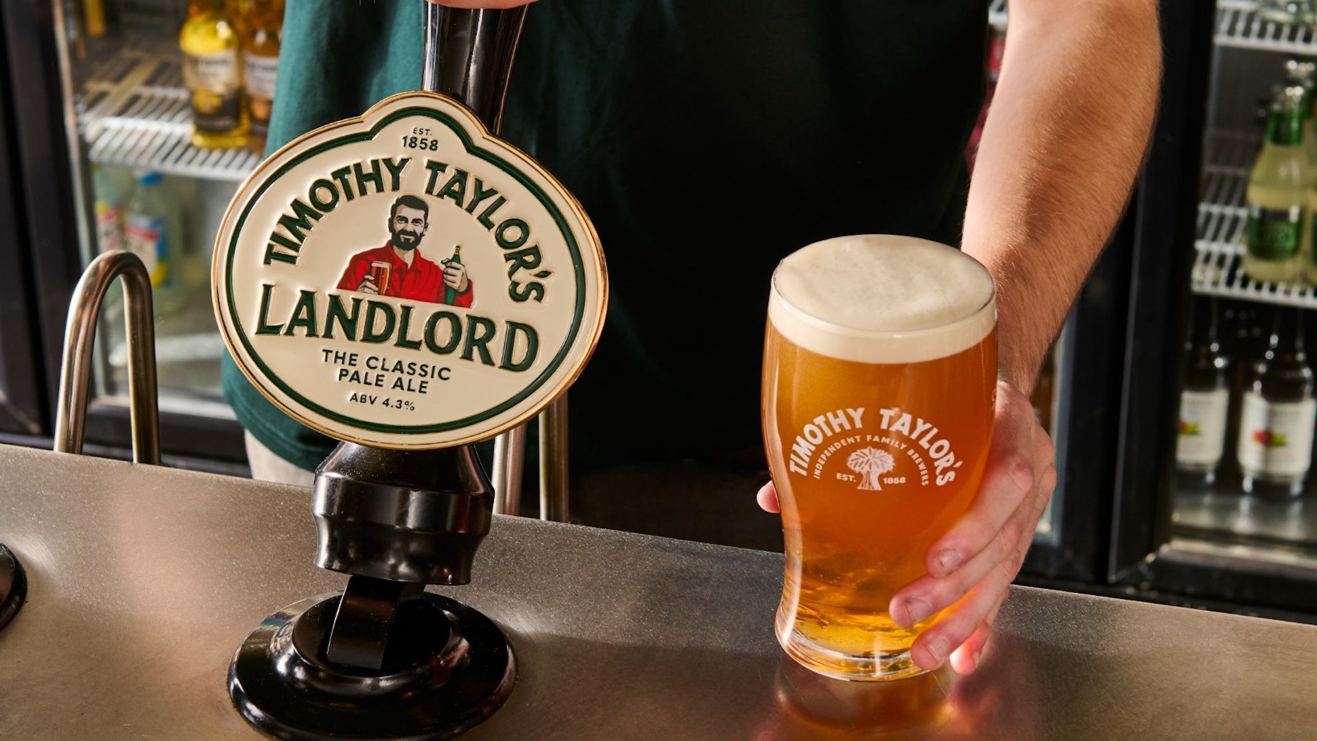
The refresh is comprehensive. It touches every aspect of the Timothy Taylor’s ecosystem, including a new logo, revamped packaging, updated pump clips, and—most controversially—a complete reimagining of the iconic "Landlord" character who has graced the front of the beer for years.
For decades, the Landlord was a figure of comfort, a caricature that felt like the archetypal pub owner: weather-beaten, experienced, and deeply rooted in the traditions of the British tavern. The new iteration, however, is a departure. The character is visibly younger, more athletic, and possesses a refined, polished aesthetic that wouldn’t look out of place in a boutique craft brewery in Shoreditch.
CEO Andrew Carter has been clear regarding the motivation behind the shift. In official statements, he emphasizes that the move is not intended to alter the product itself—the beer’s recipe remains untouched—but rather to align the presentation with the standards of modern quality and care. The brewery’s stated goal is to ensure they remain as relevant to the next generation of drinkers as they have been to the previous ones.
Chronology: A Decade of Consistency Meets a Sudden Pivot
To understand the weight of this backlash, one must look at the history of the brand. Timothy Taylor’s has spent the last decade cultivating an image of rugged, Yorkshire-born reliability. Their branding was a masterclass in "unintentional cool"—a look that didn’t try to be modern because it was too busy being classic.
- 2014–2023: A period of sustained growth. During this decade, Timothy Taylor’s solidified its position as a powerhouse in the cask ale market. The brand relied on a visual identity that felt permanent, utilizing heritage typography and a character that drinkers felt they could recognize from their own local pub.
- Early 2024: Internal discussions at Timothy Taylor’s began focusing on "future-proofing." With the rise of the "cask ale renaissance" among younger demographics, the brand identified a need to refresh its shelf presence to stand out against a crowded field of modern, minimalist craft beer competitors.
- Late 2024 (The Launch): The new visual identity was rolled out across digital platforms and physical retail. The shift was immediate and, for many, jarring. The removal of the "old bloke" in favor of a "hip" avatar became the lightning rod for criticism.
Supporting Data: The "Gen Z" Strategy and the Myth of Modernization
The brewery’s rationale is rooted in a broader industry trend: the hunt for the Gen Z consumer. Market research consistently shows that younger drinkers are gravitating toward cask ale, viewing it as a "slow," artisanal, and authentic alternative to the highly carbonated, mass-produced lagers of the past.
However, there is a fundamental disconnect in the execution. Brands like Burger King and Pepsi have recently successfully navigated the "heritage rebrand" trend by leaning into their history, resurrecting logos from the 70s and 80s to tap into a collective sense of nostalgia. They realized that in a world of AI-generated content and hyper-minimalist digital design, "imperfection" has become a luxury commodity.
Timothy Taylor’s has moved in the opposite direction. By opting for a sleeker, more "designed" look, they have inadvertently traded away the brand’s most valuable asset: its grit. When a brand becomes too "perfect," it becomes indistinguishable. In the visual clutter of a supermarket aisle, the old, slightly fussy, and undeniably distinct Landlord stood out. The new, polished version risks blending into the background of "generic premium" branding.
The Official Stance vs. The Consumer Outcry
The brewery maintains that the refresh is a necessary evolution. "The quality and care that go into every pint are reflected in how Timothy Taylor’s is presented today," says Carter. From a corporate governance perspective, this is a standard, defensible position. It is an attempt to ensure that the visual brand communicates the premium nature of the ale.

However, the consumer reaction—spanning from social media forums like Reddit to more formal critiques in publications like The Spectator—has been largely negative. Critics argue that the rebrand is "a disgrace," suggesting that the brewery has misunderstood its own customer base. The "woke" label, often misapplied in these situations, has been thrown around, though in reality, the issue is less ideological and more about aesthetic betrayal.
The backlash isn’t about politics; it’s about a loss of identity. Drinkers feel that the brewery has replaced a beloved, relatable character with a focus-grouped archetype that feels entirely alien to the culture of a British pub.
Implications for Heritage Brands
The Timothy Taylor’s incident serves as a poignant case study for any heritage brand considering a facelift. The primary lesson is that modernizing a brand does not require it to look modern.
- The Value of "The Imperfect": Modern digital design tools allow for flawless, sharp, and perfectly balanced logos. However, in the physical world, consumers are increasingly drawn to the "human" touch. The little peculiarities—the unfashionable colors, the serif fonts, and the weathered characters—are what prevent a brand from slipping into the homogeny of the "blanding" phenomenon.
- Cultural Currency of History: History is a commodity. For a brewery with a legacy as deep as Timothy Taylor’s, the brand’s history is its strongest differentiator. By scrubbing away the "old" to make room for the "new," brands risk diluting the very story that makes them worth drinking.
- The "Gen Z" Trap: Brands often assume that younger consumers want slick, digital-first aesthetics. In reality, Gen Z’s interest in craft ale is driven by a desire for authenticity. When a brand tries too hard to "speak the language" of the youth, it often ends up sounding like a parent trying to use slang—it feels forced and inherently dishonest.
Conclusion: Will the Landlord Survive?
Ultimately, Timothy Taylor’s will likely survive this transition. The beer inside the glass remains the same high-quality product that has defined the brand for generations. A logo change, however controversial, is rarely enough to kill a brand that has built up such immense consumer loyalty.
But there is a lingering sadness in the design community regarding this shift. Timothy Taylor’s possessed a level of genuine character that most global agencies spend millions of dollars trying to manufacture. They had something that couldn’t be bought, only earned through time and consistency. By choosing to chase a "modern" aesthetic, they have entered a race where there is no finish line, only a steady path toward becoming just another face in the crowd.
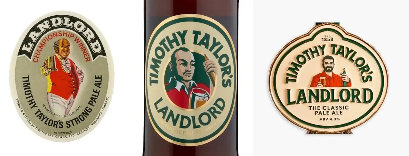
The lesson here is simple but frequently ignored: if you are a heritage brand, your greatest asset is your past. The "old bloke" on the front of the bottle wasn’t just a design element; he was a promise of continuity. In swapping him for a younger, more "fit" version, the brewery hasn’t just changed its packaging—it has altered its soul. Whether or not the next generation of drinkers cares about that distinction remains to be seen, but for the legacy drinkers, the loss is palpable.
As we move further into an era of digital homogeny, perhaps it is time for brands to stop looking at the future through the lens of a flat-screen and start looking at the past, where the real character lives.
 Asep Darmawan
  Basiran
  Nana
Nana 