
 By Reynand Wu
In the high-stakes world of public communication, visual clarity is not merely a design preference—it is a social responsibility. Recently, Transport for London (TfL) found itself at the epicenter of a digital firestorm after commuters reported seeing public safety advertisements on its network that appeared to carry a xenophobic subtext. The controversy, which unfolded across social media platforms in late October 2026, serves as a masterclass in how poor design choices, combined with an increasingly polarized public discourse, can lead to a PR disaster of significant proportions.
The Catalyst: A Design Gone Wrong
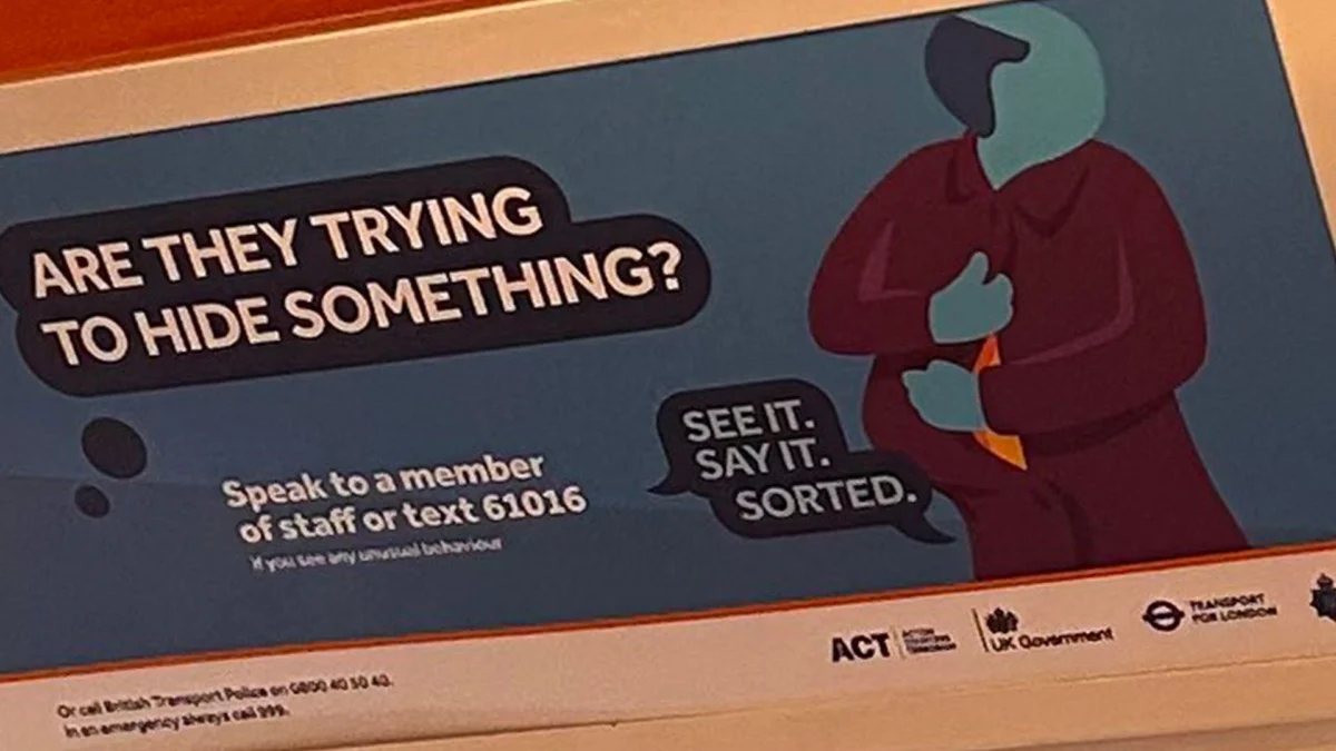
The center of the controversy was a poster featuring a minimalist, "Corporate Memphis"-style illustration. The graphic depicted a figure with ambiguous features, rendered in the flat, featureless aesthetic that has become synonymous with modern, generic corporate branding. Accompanying this illustration was the loaded, interrogative tagline: "Are they trying to hide something?"
For many commuters, the intersection of the abstract figure—which some interpreted as a woman wearing a hijab—and the accusatory, paranoid nature of the copy created an immediate and visceral reaction. Rather than being perceived as a neutral public safety message, the ad was widely interpreted as an insinuation directed at Muslim women, stoking fears of surveillance and racial profiling.
The public reaction was swift and unforgiving. On platforms like X (formerly Twitter), commuters shared images of the posters, labeling them "appalling," "disgusting," and a chilling manifestation of "1984-style" state paranoia. The incident highlighted a critical failure in the design process: when a brand chooses to use highly abstracted, "ethnically ambiguous" art, it leaves the door wide open for the viewer’s own biases and anxieties to fill the gaps.
A Chronology of the Outrage
The timeline of the incident reflects the rapid acceleration of modern digital outrage.
- October 24–25, 2026: Commuters begin posting images of the posters found on London Underground trains and station walls. Initial reactions range from confusion to deep offense, with users tagging the Mayor of London and TfL, demanding an explanation for what many perceived to be an Islamophobic campaign.
- October 25, 2026: As the posts go viral, the discourse shifts from questioning the intent of the ad to mocking the quality of the illustration. Some users point out that, upon closer inspection, the figure is meant to be a balding man looking over his shoulder. The realization that the design was so fundamentally flawed that it could be interpreted in two completely different—and contradictory—ways only added fuel to the fire.
- October 26, 2026: TfL issues a formal response, categorically denying that the posters were part of any official campaign. They characterize the presence of the ads as "unauthorized flyposting" and announce that they have alerted the British Transport Police (BTP) to investigate the illegal placement of the materials.
- Late October 2026: Skepticism grows. Social media users point out that news outlets had previously reported on official campaigns featuring similar visual aesthetics, leading to a breakdown in trust. Critics argue that TfL’s attempt to distance itself from the ads is a defensive maneuver to avoid accountability for a campaign that may have been poorly conceived, rather than a genuine case of external sabotage.
The Corporate Memphis Problem
The controversy has reignited a long-standing debate among designers regarding the "Corporate Memphis" style—the flat, brightly colored, often disproportionate illustrative style frequently used by tech giants and major corporations.
Critics of the style argue that its reliance on "universality" is a fallacy. By stripping characters of specific facial features and detailed characteristics, designers often end up with figures that feel "hollow" or "uncanny." In the context of a public safety campaign, this lack of detail is dangerous. If a PSA is intended to be inclusive and clear, it requires visual specificity. When you remove that, you force the audience to project their own identity markers onto the art.
In this instance, the "Corporate Memphis" aesthetic backfired spectacularly. The intent was likely to create a generic, "everyman" character, but the result was a visual Rorschach test. In a city as diverse as London, where public transit is a shared space for millions of people from all walks of life, the use of such a sterile, ambiguous style for a message regarding "hiding something" proved to be a catastrophic tonal miscalculation.
Official Responses and the "Flyposting" Defense
TfL’s response to the crisis was to utilize the "unauthorized" narrative. In a statement, the organization explained that their teams had been instructed to inspect trains and remove any posters found on the network. They further stated: "The incident has been reported to the British Transport Police as flyposting is an illegal activity."
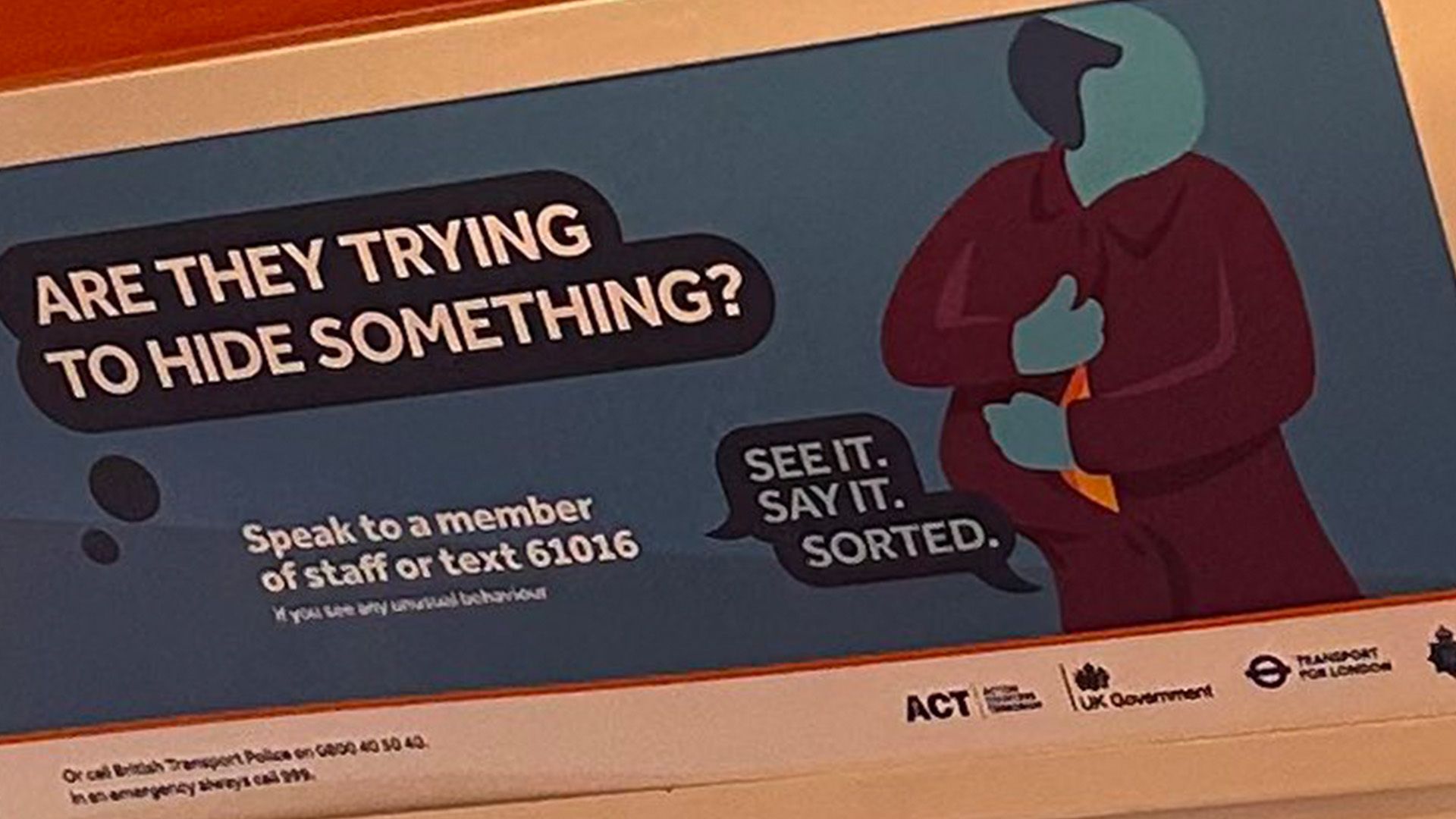
However, this response was met with intense scrutiny. If the posters were indeed flyposting, it suggests a significant security breach, as gaining access to ad panels on the London Underground is not a simple task for a casual passerby. Furthermore, the fact that the posters appeared to be professionally printed and installed in standard advertising slots led many to question whether they were truly "unauthorized" or if they were part of an official, albeit poorly vetted, campaign that TfL was now scrambling to disavow.
The BTP, for their part, have remained relatively quiet regarding the investigation. This lack of transparency has allowed conspiracy theories to flourish, with many social media users openly questioning if the posters were a "false flag" operation or an internal failure that the transit authority was too embarrassed to own.
Implications for Public Advertising
The fallout from this incident has broad implications for how public institutions handle advertising.
- The Vetting Gap: If the posters were indeed unauthorized, it exposes a vulnerability in the physical security of public advertising spaces. If they were authorized, it exposes a massive failure in the creative vetting process. Either way, the incident necessitates a review of how materials are approved and installed.
- The Tone of Authority: Public bodies must be hyper-aware of the language they use. In an era of heightened social sensitivity, copy that uses accusatory, vague, or paranoid language is likely to be viewed through a critical lens. "Are they trying to hide something?" is a phrase that carries heavy baggage; using it in a public space, regardless of the visual context, is an invitation for backlash.
- The Burden of Representation: Institutions have a duty to ensure that their communications do not inadvertently marginalize segments of their population. The fact that the image was so easily interpreted as a target of religious bias suggests that those responsible for the creative direction lacked the necessary diversity of perspective to foresee how the image would be received by the public.
The Wider Context: 2026, the Year of the Cancelled Ad
This incident is not an isolated event. 2026 has been marked by a series of high-profile advertising failures, ranging from controversial brand endorsements to poorly executed awareness campaigns. As consumers become more adept at deconstructing the imagery and messaging used by large entities, the margin for error has shrunk to almost zero.
The "Sydney Sweeney/Powerade" culture war and other recent controversies have shown that today’s audiences are not passive consumers of media. They are active participants who treat advertisements as cultural artifacts to be analyzed, debated, and often, attacked. Brands and public institutions that fail to recognize this shift—or that continue to rely on tired, corporate, or overly abstract visual languages—will find themselves increasingly at odds with the public they serve.
Conclusion: A Lesson in Clarity
The controversy surrounding the TfL poster is a cautionary tale for any organization that speaks to the public. It demonstrates that in the modern era, the "what" of a message is inseparable from the "how." When the visual tone conflicts with the intended message, the public will not wait for an official explanation; they will define the message themselves, often in the harshest terms possible.
For TfL, the immediate task is to restore trust and clarify the origins of the posters. For the broader design community, the lesson is clear: the era of "neutral" or "ambiguous" corporate illustration is coming to an end. In an increasingly complex and divided world, specificity, empathy, and clear intent are the only tools that can successfully navigate the public square without triggering a crisis.
As the investigation into the "Are they hiding something?" campaign continues, the incident will likely remain a fixture in discussions about the intersection of design, public policy, and the fragility of public trust. The posters may be gone from the walls of the Underground, but the questions they raised about representation, intent, and the power of imagery remain firmly in the public consciousness.
 Muslim
 Pevita Pearce
