
 By Asep Darmawan
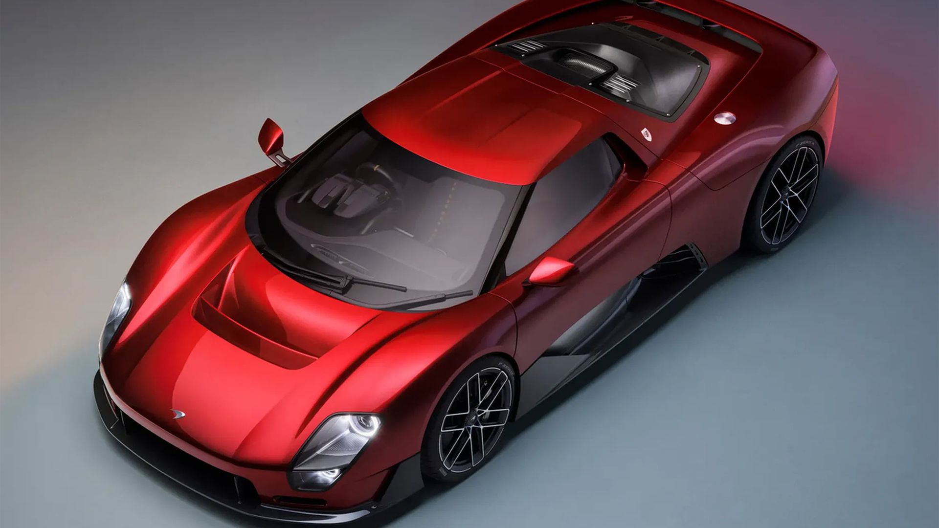
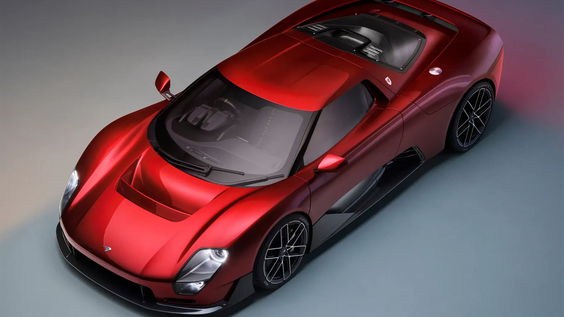
In the high-stakes world of automotive luxury and elite motorsport, a brand’s visual identity is more than just a badge—it is a promise of performance, a legacy of engineering excellence, and a beacon for the future. This week, the legendary British automaker McLaren unveiled a comprehensive overhaul of its global brand identity, signaling a pivotal shift as the company prepares for the next generation of high-performance engineering. By marrying the nostalgia of its 1920s origins with a minimalist, future-forward design language, McLaren has navigated the treacherous waters of corporate rebranding with a precision that many of its competitors have failed to achieve.
The Core Transformation: A New Visual Language
At the heart of the evolution is a refined, clean wordmark rendered in a modern sans-serif typeface. While the automotive industry has recently seen a trend toward “flat design” and simplified logos, McLaren’s iteration distinguishes itself through a deliberate nod to its heritage. The typography is noticeably lighter in weight than its predecessor, conveying a sense of agility and speed—core tenets of the McLaren brand.
Perhaps the most sophisticated element of the new identity is the subtle underscore beneath the lowercase ‘c.’ This design choice, which echoes the refined aesthetic of high-fashion branding, serves to ground the logotype while providing a sense of structural balance. It is a calculated move that elevates the brand from a purely industrial manufacturer to a premium lifestyle entity.
Chronology: From Auckland Origins to Global Dominance
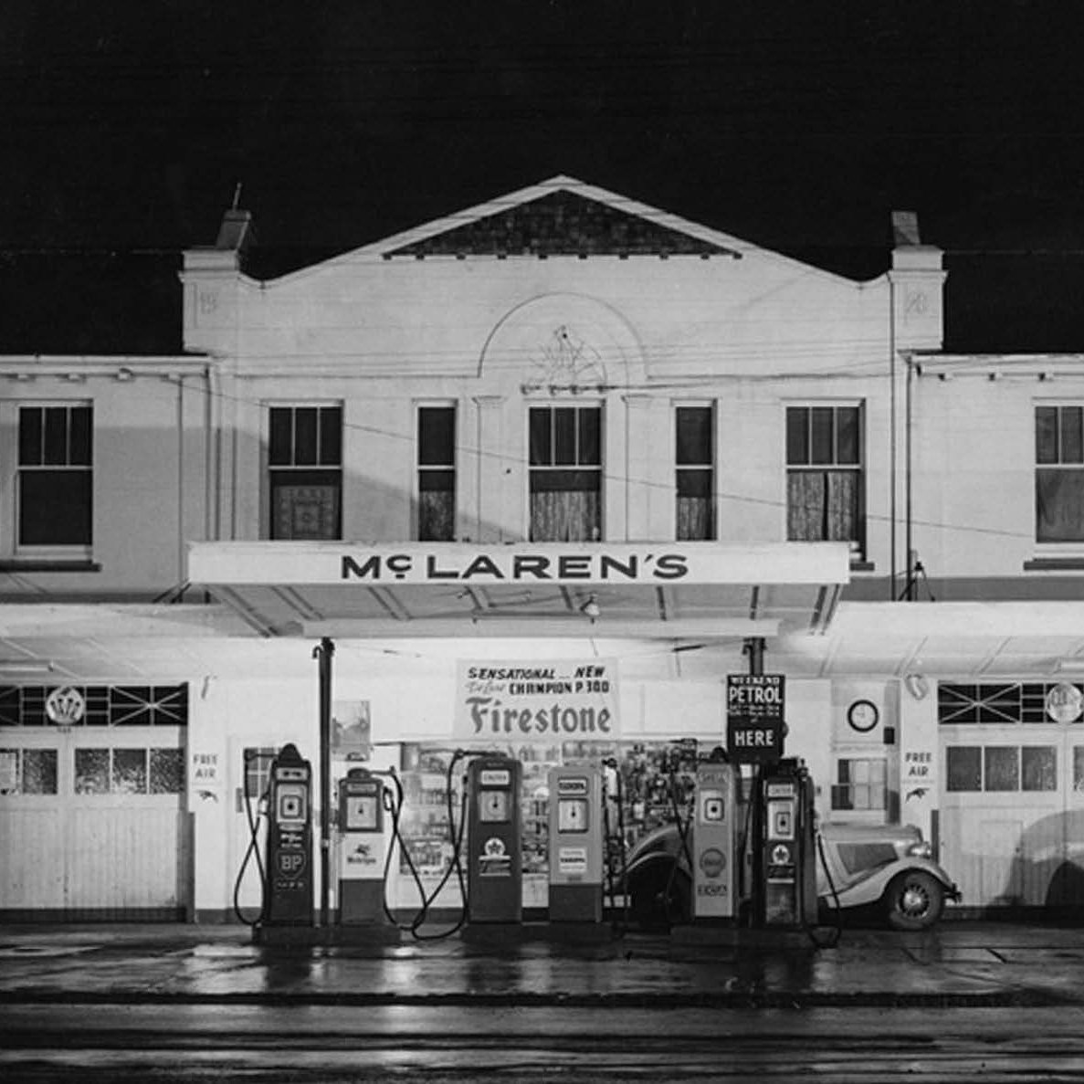
To understand the significance of this change, one must look back at the brand’s humble beginnings. The inspiration for the new wordmark is deeply rooted in the history of the McLaren family. Specifically, the design draws direct influence from the signage above the original McLaren family service station in Remuera, Auckland, which dates back to the 1920s.
This connection to the past is a strategic masterstroke. In an era where legacy brands are often accused of losing their identity in favor of generic, digitized aesthetics, McLaren has chosen to anchor its future in the very history that defined it.
- 1920s: The foundation of the McLaren family legacy begins with a service station in Auckland, providing the typographic inspiration for the 2026 rebrand.
- 1960s-2020s: The era of the iconic "speedmark," which became synonymous with the brand’s dominance on the Formula 1 circuit and its rise as a premier supercar manufacturer.
- September 2026: McLaren officially reveals its new, cohesive brand identity, signaling a transition toward a more integrated, cross-disciplinary future spanning automotive, racing, and lifestyle sectors.
Supporting Data and the "Speedmark" Legacy
While the new wordmark serves as the face of the brand, the company has wisely chosen not to abandon its most recognizable asset entirely. The iconic "speedmark"—a symbol that has graced the liveries of championship-winning cars and high-performance road vehicles for decades—will remain in active service.
However, its application is being strategically segmented. The speedmark will now function as a secondary identifier, specifically reserved for McLaren’s racing and golf sub-brands. This approach allows the company to maintain a sense of "continuity and enduring significance" for its global fanbase, ensuring that the emotional connection between the fans and the speedmark remains unbroken, even as the master brand moves into a more streamlined era.
Official Responses: The Vision of Leadership
The transition has been spearheaded by a unified vision from McLaren’s C-suite, emphasizing that this is not merely a superficial change, but a physical manifestation of a deeper corporate strategy.
"It’s a reflection of the journey we are on as a company," says David Woodhouse, Chief Creative Officer at McLaren Automotive. "It marks the beginning of a new chapter for McLaren, giving a physical expression to the ambition, creativity, and forward momentum that is shaping our future."
This sentiment is echoed by Lou McEwen, Chief Marketing Officer at McLaren Racing. "It celebrates the symbols and stories our fans, partners, and teammates already know and love, while giving us a more connected expression of where we’re heading next. It feels unmistakably McLaren," she added during the launch event. The leadership team’s rhetoric suggests that the rebrand is intended to unify the automotive and racing divisions under a single, cohesive banner, creating a stronger synergy between the road-legal performance vehicles and the high-speed track machines.
The Stakes: Lessons from Industry Peers
The timing of McLaren’s rebrand is particularly noteworthy given the current climate of automotive design. Industry observers have recently witnessed the turbulent reception of other luxury rebrands. When companies like Jaguar attempt to pivot their visual identity, they often face a backlash from purists who feel the change disconnects the brand from its core essence.
The "Jaguar effect"—where a miscalculated logo update can lead to a dip in public favor and brand equity—serves as a cautionary tale for any legacy firm. McLaren, however, has seemingly avoided this pitfall by opting for an evolutionary rather than revolutionary path. By maintaining a clear lineage to the 1920s service station and retaining the speedmark for performance contexts, the company has managed to satisfy both the traditionalist and the modernist.
Implications for the Future
What does this mean for the future of McLaren? The new identity is designed to be highly versatile. As the automotive industry shifts toward electrification and software-defined vehicles, brands are under immense pressure to look "tech-forward." The new, lighter, and more minimalist wordmark is perfectly optimized for digital interfaces, mobile applications, and the sleek, backlit badging required for the next generation of electric supercars.
Furthermore, the "fashion-forward" approach of the new design suggests that McLaren is looking to expand its footprint in the luxury lifestyle space. Similar to Ferrari, which has successfully transitioned into high-end fashion and lifestyle collaborations, McLaren’s new branding provides a cleaner canvas for co-branding opportunities and premium merchandise.
The move is also a signal to investors and stakeholders. A refreshed brand identity is often the harbinger of a new product roadmap. By signaling a "new chapter," McLaren is effectively priming the market for upcoming releases, likely focused on sustainable performance, advanced digital connectivity, and a more integrated consumer experience.
Conclusion: A Masterclass in Brand Evolution
In the final analysis, McLaren’s rebranding is a testament to the power of thoughtful, heritage-conscious design. It acknowledges that in the world of high-performance engineering, trust is the most valuable currency. By grounding its new, sleek identity in the history of its Auckland origins, the company has managed to signal a bold future without alienating the community that built its success.
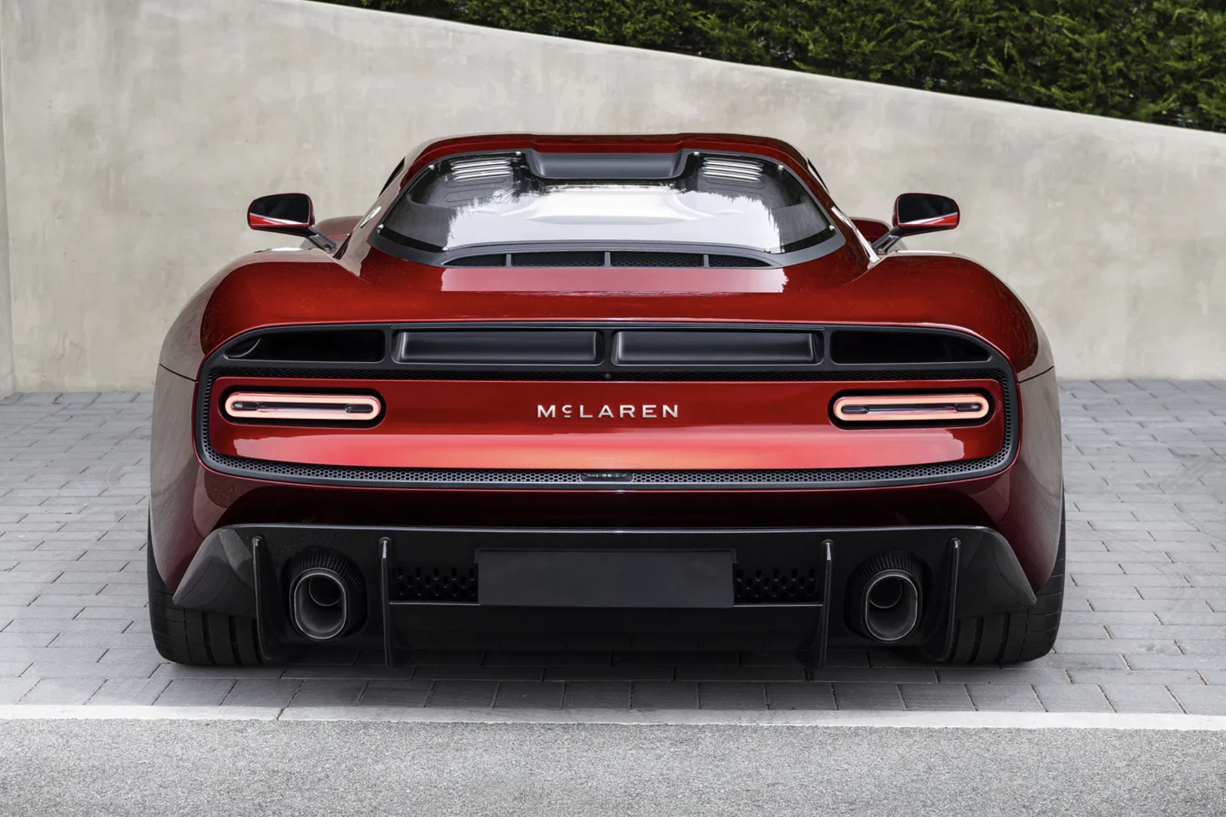
Whether this new look will achieve the same legendary status as the original speedmark remains to be seen. However, at a time when the automotive landscape is undergoing its most radical transformation in a century, McLaren has successfully positioned itself as a brand that is not just keeping pace, but leading the charge. The new identity is, quite simply, "unmistakably McLaren"—a brand that honors where it has been, while relentlessly pursuing where it is going next.
 Basiran
  Neng Nana
  rifanmuazin