
 By Layla Zulfa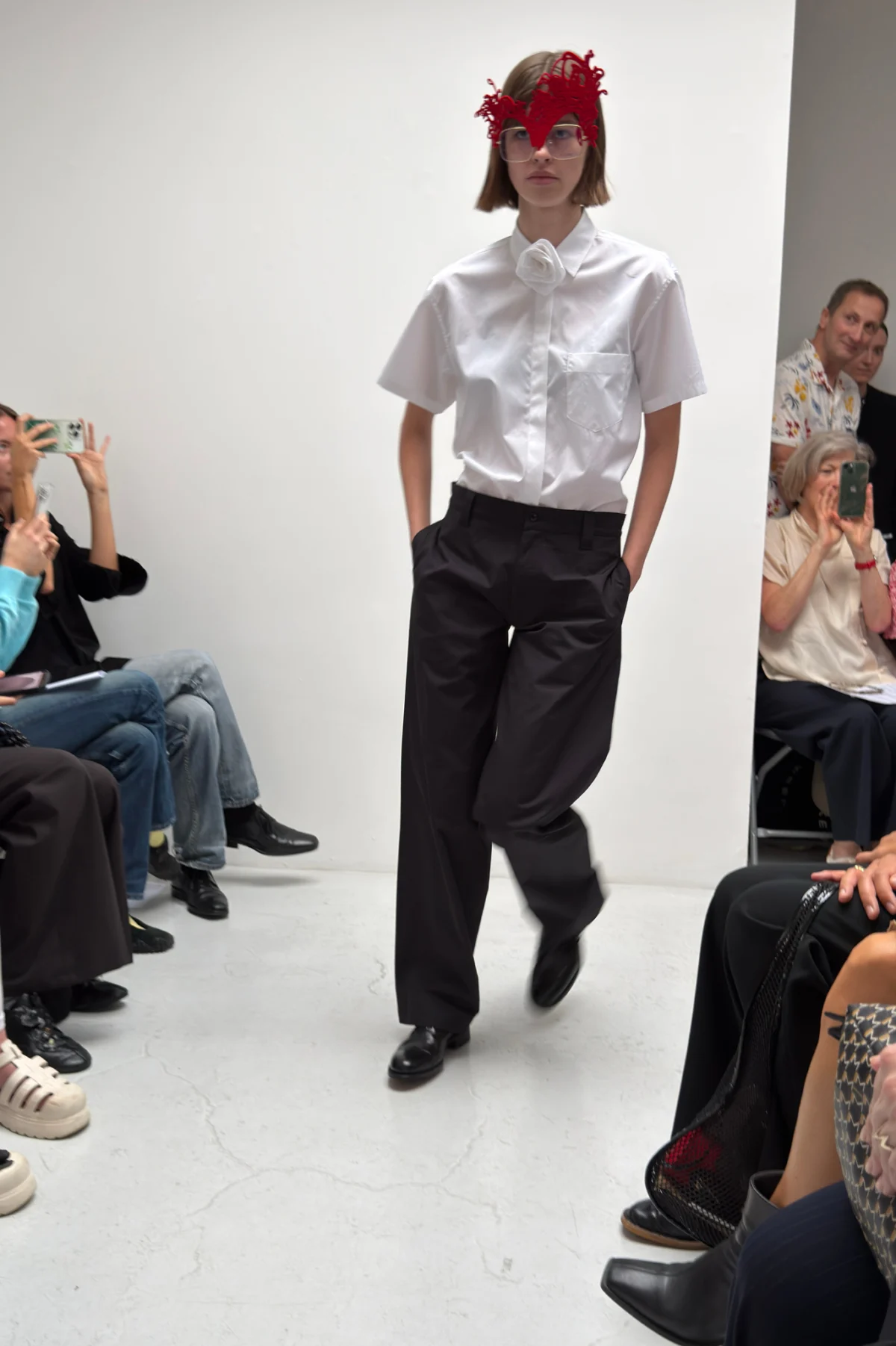
The recent showcase by design duo Matt Empringham and Freddy Coomes, operating under the label A Letter, was positioned as a definitive "step forward" for the brand. However, as the final model exited the makeshift runway, the consensus among industry insiders was one of cautious disappointment. While the collection promised a grounded, wearable evolution of British sartorial history, the reality presented to attendees was a disjointed exploration of unfinished concepts that struggled to reconcile high-concept design with the practicalities of everyday attire.
The Show: A Study in Repetition
The logistical constraints of the presentation were immediately apparent. With a compact cast of only five models, the designers opted for a double-circuit format, requiring each participant to walk the room twice. While the intent was to provide the audience with maximum exposure to the intricacies of the garments, the result was a repetitive visual cycle that drew undue attention to the flaws in the collection’s construction.
In the intimate setting of the venue, there was nowhere for the clothes to hide. The pacing felt lethargic, turning the showcase into a prolonged examination of garments that, perhaps, would have benefitted from the swiftness of a single pass. The decision to limit the cast size—likely a budgetary or aesthetic constraint—ultimately undermined the collection’s ability to build momentum, turning what should have been a dynamic presentation into a static, stuttering experience.
The Creative Vision: Deconstructing British Staples
Backstage, prior to the show, Freddy Coomes articulated a clear mission statement: the collection was intended to be "more grounded in clothes people can actually wear and enjoy." The design duo’s approach was rooted in the remixing of archetypal British staples—a nostalgic, almost anthropological look at the garments that have defined the UK’s sartorial landscape for decades.
On paper, the reference points were compelling. The collection drew inspiration from:
- The Donkey Jacket: The quintessential working-class outerwear piece.
- Vintage Men’s Chinos: Reimagined through a contemporary lens.
- Ben Sherman Gingham: A nod to the mod movement and British subculture.
- St. Michael’s Underwear: A cheeky, quintessentially British reference to the heritage of Marks & Spencer.
The designers promised a tactile, DIY-inspired execution. They spoke of zigzag stitches on elasticated waistbands, the juxtaposition of raw-edged transparent jersey against structured surfaces, and the splicing of rustic calico into delicate silk. In theory, this was an intriguing deconstructionist project—an attempt to elevate the mundane through experimental craftsmanship.
The Reality: Construction Concerns and Missed Marks
When the collection finally hit the runway, the "grounded" reality that Coomes promised felt elusive. The execution lacked the polish required to successfully bridge the gap between "experimental" and "unfinished."
The most glaring issues were structural. Slip dresses, which should have been elegant in their simplicity, were rendered in boxy, awkward silhouettes that seemed to fight against the body rather than drape over it. Necklines sat in a state of suspended uncertainty, neither draped nor tailored, leaving the garments looking as though they had been pinned together mere minutes before the show began.
Perhaps most distracting were the technical oversights: pocket linings peeked out from beneath hemlines, and unfinished, half-stitched seams were visible at critical junctures. While "raw-edged" design is a legitimate aesthetic choice, the transition between intentional design and accidental oversight was blurred. When a hem is left unstitched, the observer is left to wonder if it is a statement on the impermanence of fashion or simply a lack of time. In the case of A Letter, the latter seemed more probable.
Furthermore, the collection’s flirtation with transparency—including backs that left nothing to the imagination—felt at odds with the stated goal of creating "realistic clothing." While avant-garde design often pushes boundaries, it felt disjointed here, sitting uncomfortably alongside the conservative, heritage-inspired foundations of the collection. The source material—the iconic British staples—was largely obscured by the experimentation, leaving the audience to hunt for the references rather than experience them.
A Stumble in the Narrative Arc
Last season, A Letter garnered praise for a diaphanous, ethereal charm that felt both cohesive and innovative. There was a lightness to the work that suggested a brand finding its voice. This season, that lightness was nowhere to be found.
Instead of building on the momentum of their previous success, Empringham and Coomes delivered a collection that felt burdened by its own ambition. The "really nice step forward" that Coomes described was, in practice, a stumble. The collection lacked the cohesion of their previous work, replacing clarity of vision with a frantic array of techniques that didn’t quite coalesce.
Implications for the Brand
For an emerging label, the sophomore or third-year slump is a common hurdle. The pressure to innovate can often lead to over-designing, where the desire to prove one’s technical capability overrides the necessity of creating a functional, cohesive product.
For A Letter, the implications are significant. The brand has established itself as one that wants to engage with British heritage, but they have yet to prove they can do so without losing the wearer in the process. The market for "grounded, wearable" clothing is saturated with designers who prioritize fit, finish, and wearability above all else. If A Letter is to survive, they must decide whether they are a conceptual, art-school collective or a commercial brand that produces clothes people actually want to purchase.
At present, they are caught in the middle: too experimental to be truly "grounded," yet too derivative to be considered high-concept art.
Looking Ahead: The Path to Maturity
Despite the critique, there remains potential within the duo’s partnership. Matt Empringham and Freddy Coomes clearly possess a deep appreciation for the history of British style. Their ability to identify iconic garments is sound; it is the translation of those garments into a modern, polished aesthetic where they are currently failing.
To move forward, the duo might consider:
- Strict Editing: The collection would have benefitted from a reduction in the number of experimental techniques. By focusing on one or two key elements—perhaps the splicing of calico into silk—they could have created a stronger, more coherent message.
- Attention to Detail: In the world of high fashion, the difference between "raw" and "sloppy" is measured in millimeters. Investing more time in the finishing process would do wonders for the brand’s perceived value.
- Refining the "Grounded" Concept: If the goal is truly wearable clothing, the designers must consider the human form more carefully. Garments that do not fit correctly—regardless of the artistic intent—rarely resonate with the modern consumer.
As the industry looks toward the next season, the eyes of critics will be on A Letter. Will they return to the diaphanous charm that made them a name to watch, or will they continue to push into the murky territory of unfinished deconstruction? The challenge for Empringham and Coomes is to bridge the gap between their lofty ambitions and the tangible reality of the clothes they put on the rack. Until they do, the label remains a project of promise rather than a project of substance.
Conclusion
The A Letter showcase serves as a potent reminder that in the high-stakes world of fashion, the "behind the scenes" narrative is never a substitute for the final product. While the designers’ intentions were noble and their inspirations rooted in a rich cultural history, the execution failed to translate that vision into a successful runway event. Whether this is a momentary lapse or a sign of deeper structural issues within the creative process remains to be seen. For now, the brand must return to the drawing board, stripping away the excess and rediscovering the discipline required to turn "staples" into "standards."
 Nila Kartika Wati
  Suro Senen
  Muslim