
 By Ali Ikhwan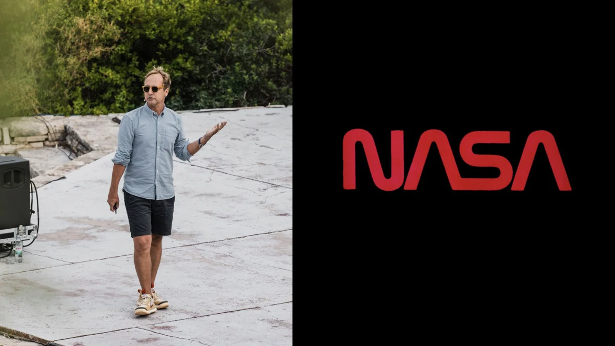
At last week’s Paradigms conference, held against the serene backdrop of Obanjan Island, Croatia, the global design community converged to discuss the future of visual identity. While the event featured a stellar lineup of creative directors from world-renowned design studios and tech giants, the most compelling narrative arrived from a surprising source: the United States’ premier federal space agency.
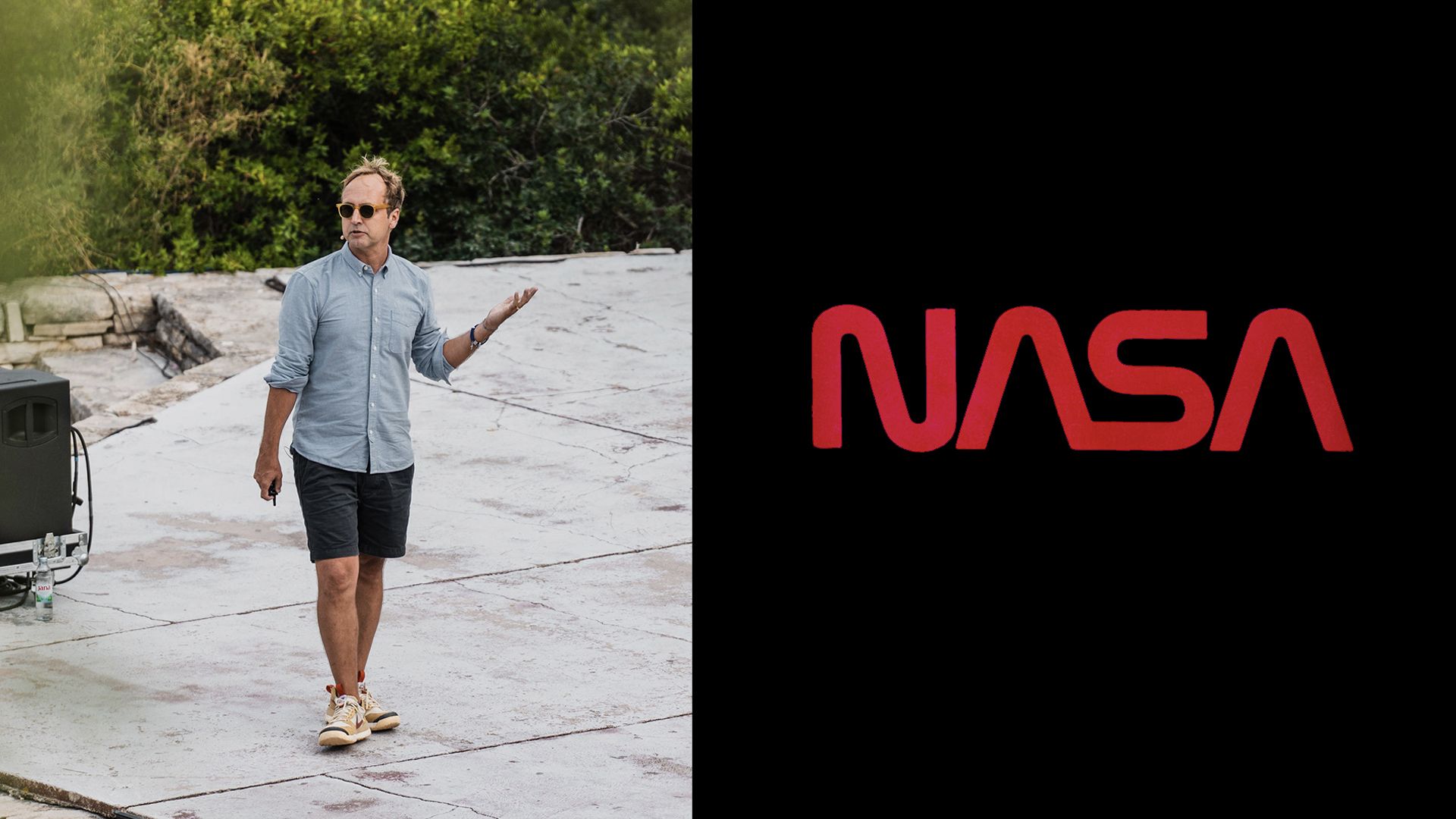
David Rager, the Creative Director at NASA, took the stage to pull back the curtain on the monumental task of stewarding one of the world’s most recognizable and revered brands. Tasked with managing the visual legacy of an organization that has captured the collective imagination for decades, Rager’s work is less about "rebranding" and more about curation, historical preservation, and the urgent maintenance of institutional trust in an era defined by deepfakes and algorithmic misinformation.
The Architect of the Worm’s Return
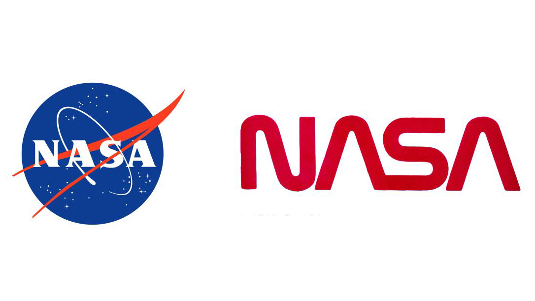
For design enthusiasts, the highlight of Rager’s tenure has been the successful rehabilitation of the legendary "worm" logo. The sleek, minimalist logotype, designed by Richard Danne and Bruce Blackburn in 1975, had been relegated to the archives in 1992, replaced by the more traditional, circular "meatball" insignia.
For nearly three decades, the worm remained a cult favorite among designers and space enthusiasts alike. Its return in 2020 was not merely a nostalgic nod; it was a strategic move to restore a sense of futuristic, high-tech optimism to the agency’s public-facing assets. Rager’s role in navigating the internal bureaucracy to formalize the coexistence of these two iconic marks has cemented his reputation as a bridge between NASA’s storied past and its ambitious future.
A Non-Linear Trajectory to Headquarters
To understand Rager’s approach to NASA’s brand, one must look at his unconventional path to the role. His creative foundation was not built in the halls of government, but in the DIY grit of the independent music scene. "My beginning in graphic design came through music," Rager explained. "I’ve always been in bands, and when I was in college, I started making flyers, posters, and album covers for my own band and then for friends’ bands. That led to freelance work and agency jobs."
This background instilled in him a philosophy of creative agility. After stints in the museum sector and founding a design studio in Paris, Rager eventually found himself in Los Angeles, where he joined the team at Disney. His proximity to NASA’s Jet Propulsion Laboratory (JPL) proved to be the turning point. As NASA underwent a period of internal reorganization, they sought a leader capable of professionalizing their visual output. Rager was brought on to manage the JPL team, but his influence quickly expanded to Headquarters, leading to his appointment as Creative Director in 2023.
The Peace Treaty: Meatball vs. Worm
The internal politics of NASA’s branding are surprisingly complex. In 1992, the agency’s leadership at the time felt the "worm" lacked the historical gravity of the Apollo era, leading to its sudden dismissal.
"My job for a year or so was writing a peace treaty between the two of them," Rager noted during his talk. Today, the two logos serve distinct purposes. The "meatball" represents the agency’s rich history and engineering heritage, while the "worm" signifies forward-thinking innovation and high-tech exploration. The success of this dual-brand strategy is best illustrated by the fact that the original 1975 design guidelines for the worm have been elevated from internal manual to fine art, recently acquired by the Museum of Modern Art (MoMA) in New York.
Organizational Challenges: Branding a Scientific Giant
Managing a brand within a massive federal agency presents unique hurdles, primarily because many of NASA’s stakeholders are scientists and engineers, not creatives.
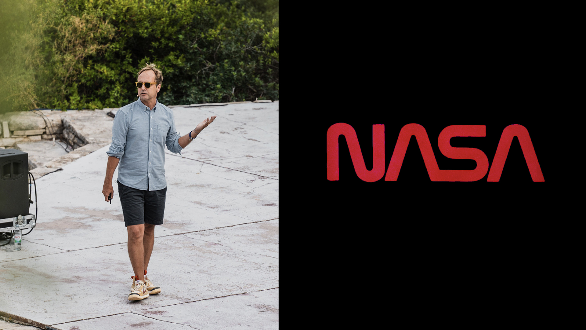
"A lot of my colleagues have only ever worked at one place," Rager explained. "For them, the brand is just wallpaper. You don’t even notice it." Rager’s strategy has been one of internal education. He hosts workshops and presentations designed to demonstrate that the visual identity is not merely an aesthetic choice, but a tool for organizational unity. By teaching scientists that consistent communication builds public trust and secures funding, he has successfully integrated design thinking into the agency’s broader mission.
The "Optimism" Metric: What NASA Actually Sells
Unlike corporate entities that compete for market share, NASA’s "product" is fundamentally different. "We’re not selling a product," Rager emphasized. "What we are selling is optimism and humanity."
The NASA brand acts as a vessel for collective achievement. When a rover lands on Mars or a telescope reveals a distant galaxy, the agency’s visual language must capture that sense of wonder. Because NASA is funded by the public, Rager views his design work as a form of accountability. Every graphic, every post, and every logo application serves as a reminder to the taxpayer that their investment is yielding something of profound, universal value.
The AI Dilemma: Protecting the Brand of Truth
Perhaps the most significant challenge in Rager’s current role is the rise of generative AI. In an era where hyper-realistic, AI-generated imagery can be produced in seconds, NASA’s brand equity—which is built entirely on the concept of objective, scientific truth—is under constant threat.
Rager has taken a firm, defensive stance: he has prohibited the use of AI imagery in official NASA communications. The pushback from staff, eager to utilize the latest efficiency-boosting tools, was significant. However, Rager’s reasoning remains unwavering.
"Our brand is built on trust," he stated. "When people look at an image from NASA, they need to understand that it’s real, that they can believe what they see. There are already enough people out there who are looking for excuses not to believe something is true, and we don’t need to fuel the fire."
He argues that NASA already possesses the most incredible image library in human history. "We have the kind of stuff that AI wishes it could make," he added, citing the agency’s vast repository of real-world photography and scientific data. For Rager, the solution is not to generate new, synthetic content, but to better utilize the treasure trove of existing reality that the agency has spent decades collecting.
Implications for the Future of Institutional Design
David Rager’s work at NASA represents a broader shift in how major institutions view their identity. In a world of fleeting trends, the long-term stewardship of a brand requires a commitment to history, a rigorous defense of authenticity, and an ability to translate complex technical missions into a visual language that resonates with the public.
As NASA prepares for the next generation of space exploration, Rager’s role as the guardian of the agency’s visual voice will only grow in importance. By keeping the "worm" flying high and the "meatball" grounded in its historic roots, he is ensuring that no matter how far humanity travels into the stars, the agency that takes us there remains as recognizable, trusted, and optimistic as the day it was founded.
For the design world, Rager’s journey serves as a potent reminder: even in the most bureaucratic of environments, a strong, clear, and honest visual identity can move the needle—not just for an organization, but for the spirit of an entire civilization.
 Ammar Sabilarrohman
  Nana Muazin
  Iffa Jayyana